Tip: You can use filters for better results
-
Latest News
-
Getting Started
-
Work Place
-
-
-
- Add Parts
- Assign Partners
- Interaction Buttons
- Workflow Buttons
- Ticket Info and COMS Buttons
- Schedule Tickets
- Edit Ticket Details
- Cancel Tickets
- Remove Tickets from the Ticket Clipboard
- Report Tickets
- Create Intervention Info
- Create Intervention Reports
- Cancel Appointments
- Clone Tickets
- Edit Privat Notes
- Inline Skill Editing
-
Admin Panel
-
Fieldcode FMA app
-
Customer Portal
About Forms
The Forms designer provides you with an overview of forms created for the Work place and allows you to create your own custom forms. Forms can be project-specific and workflow-based. Forms are fully adjustable, customizable, and adaptable to your specific business requirements.
Inside the Admin panel go to Fieldcode Plus → Forms designer
Expand the menu by clicking the expand arrow in the Navigation or click directly on Plus to reveal all options for Forms.
You can always contact support@fieldcode.com via email if you have open questions regarding your desired form configuration.
Forms are input masks for users of the system.
Custom forms give you the option to configure customizable input possibilities/input masks for your users of the system (dispatchers, engineers, etc.).
The default form will be loaded inside your custom form first by default. With the editor, you then can extend or shrink this default form with your very own custom fields. This will help you tremendously if you want to use the system tailored exactly to your branch-specific business needs.
Be advised that deleting certain specific default form fields is not possible in the editor because they are mandatory for our system.
Your company could eg. use a custom form for reporting, because you care about other aspects of a report like eg. other check list items.
Example scenario – Software service engineer:
A software company wants to use a special report that technicians must fill out, which includes different fields to fill out than the report provided by Fieldcode by default. For example, custom fields like OS name, IMEI, Version, or similar fields could be needed for this very special and unique report form.
Custom fields are an element inside a custom form and are displayed throughout the system for informational purposes.
Therefore it’s smart to first create the required custom fields and then create custom forms afterwards.
The unique name of a custom field = database name
The label of a custom field = name the user decided for, not relevant for database
Custom fields adapt depending on the chosen field type.
Let’s take checklists for example.
You’ll be only able to select the checklist item when using the field type “reporting” because only in this section usage of this field is logical.
Yes, you can!
You can start from scratch and drag & drop your whole new form type together by just entering a new name inside the form type field to start creating one.


Yes, they can and will!
Feel free to contact them anytime via the email if you have special requirements/questions regarding custom fields/custom forms.
Yes, you can configure this for generic item forms! When you for example pick the “Shipping” object (which contains a group of fields) you can inline-activate the object-creation.
Effect: A new shipping is created when the “object creation” toggle is activated. When the “object creation” toggle is deactivated, existing shipping entries will get overwritten.
About Object Types
The object type defines which form fields will later be selectable for the form.
| Object type | Description |
|---|---|
| TICKET | This type displays you all available form types for the object type ticket. It covers all forms that are available for tickets per se. |
| ITEM | This type displays you all available form types for the object type parts. It covers all forms that are available for parts per se. |
About Form Types
There are different types of forms across the Fieldcode systems. There are creation forms, editing forms, and cancellation forms. The name says it all: the purpose of the form determines the form type.
| Form type | Description |
|---|---|
| CREATE | This type helps you to create a customized ticket creation form (the one you see when clicking on Create Ticket). |
| EDIT | This type helps you to create a customized Edit form (the one you see, when you click on Edit Ticket). |
| CANCEL | This type helps you to create a customized Cancel form (the one you see, when you cancel a ticket). |
| REPORT | This type helps you to create a customized Report form (the one the engineer sees when creating a report for the ticket). |
| CANCEL APPOINTMENT | This type helps you to create a customized Cancel Appointment form (the one you see, when canceling a ticket appointment). |
| CHILD REPORT | This type helps you to create a customized Child Report form (reports are used within container tickets). |
| CLONE | This type helps you to create a customized Clone form. Clone forms can be used to create Clone profiles, which you can then use to clone only specific ticket data for specific projects/workflows. |
| CUSTOM | You can create your own form types and name them as you want. |
About Field Types
The field type determines how a particular field should behave. Below you will find a list of all available field types.

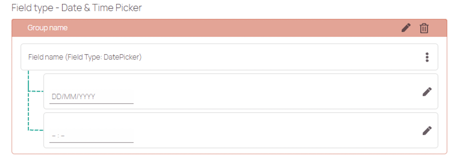


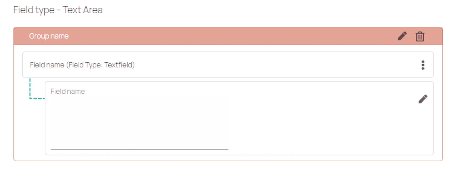

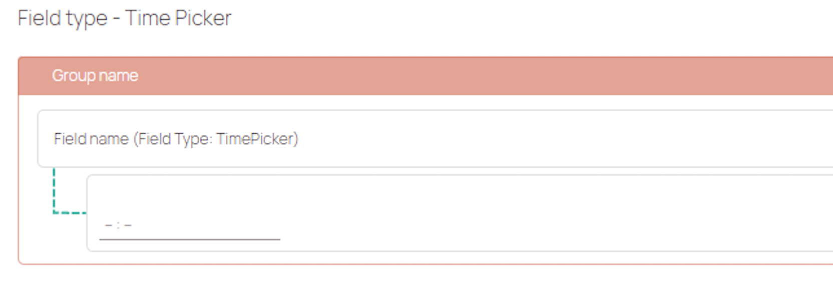

| Field type | Explanation | Adjustable settings |
|---|---|---|
| Input | A input field lets users input characters or numbers. The maximal character count for an input fields is 50. | Mandatory/Optional; Hide/Unhide field; Read only/Interactive; Allow/Not allow scanner input; Select default, Field filters; Field validations |
| Simple Paragraph Text | A simple paragraph text field lets users input characters or numbers. | Mandatory/Optional; Hide/Unhide field; Read only/Interactive; Allow/Not allow scanner input; Select default, Field filters; Field validations |
| Drop down | A dropdown field lets users select a field from the dropdown. You can give users a choice between different selections. | Mandatory/Optional; Hide/Unhide field; Read only/Interactive; Value Set option; Visibility option; Default value option; Field filters; Field validations |
| Checkbox | A checkbox field lets users select a checkbox from different checkboxes. You can give users a choice between different selections. | Mandatory/Optional; Hide/Unhide field; Read only/Interactive; Value Set option; Visibility option; Default value option; Field filters; Field validations |
| Date & Time | A date & time field lets users fill in a date & time manually. The date is in DD/MM/YYYY format. | Mandatory/Optional; Hide/Unhide field; Read only/Interactive; Value set options; Default value option; Field filters, Field validations |
| Date | A date field lets users fill in a date manually. The date is in DD/MM/YYYY format. | Mandatory/Optional; Hide/Unhide field; Read only/Interactive; Value set options; Default value option; Field filters, Field validations |
| Time | A time field lets users fill in a time manually. | |
| Attachment Upload | The Attachment Upload field lets users add attachments up to 15 MB size. Uploaded attachments will be visible inside the Attachments tab of Work place. | Mandatory/Optional; Label; Attachment categorization; Field filters, Field validations |
1. Forms UI explained
This section covers how the Forms Designer is structured. It is structured in three different blocks, which all serve a dedicated purpose.
- The first block lets you configure the general details of your custom form.
You can manage basic parameters and drag & drop fields in this block. - The second block lets you configure and arrange your form fields.
You can design and arrange your custom form in this block. - The third block lets you configure field details.
You can configure on an individual field basis and configure field settings, field filters, and field validations in this block.
How to exactly further build a custom form is further below explained in the drag & drop form fields section.
You will learn how to create custom forms, create pop-up forms, and how to create interface forms in the now following sections:
1.1 Forms UI overview
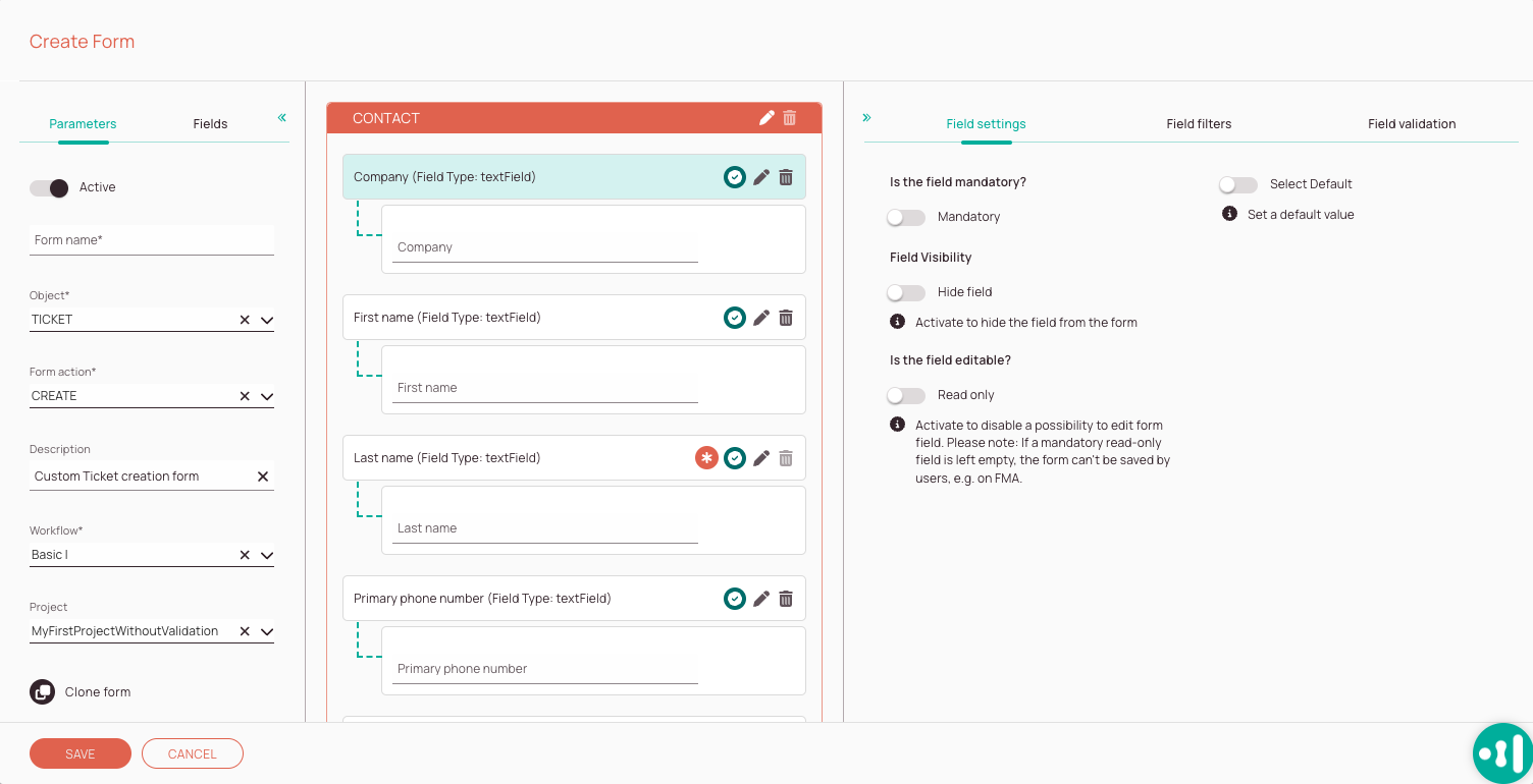
-
Parameters tab: The parameters tab allows you to set basic options, such as how the new form should be named, to which object the form applies, which action the form should perform (form type), gives you the option to describe the form, and you can configure to which workflow and project the form should apply. You also have the option to clone your whole form.
-
Fields tab: The fields tab displays all fields and custom fields and lets drag & drop fields over to your form. Indicators display the form type, count, and more.
-
Form Designer: In this area you can craft your custom form. Indicators display you which field type you are facing (and more) and the pencil lets you edit details of individual groups or fields, while the trash button lets you delete individual groups or fields.
-
Field settings tab: The field settings tab lets you configure individual field properties.
-
Field filters tab: The field filters tab lets you customize, under which circumstances an individual field should appear.
-
Field validation: The field validation tab gives you the option to configure field validations. The purpose of validations is to ensure that the user is only allowed to enter “suitable” and for your context “correct” data.
Parameters tab explained
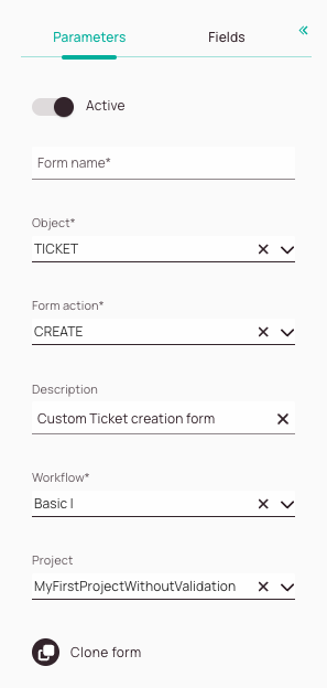
-
Active toggle: You can decide if your custom form should be activated in the system.
-
Form name field: It is mandatory to enter a name for your new form.
-
Object field: Decide the “category” for which you want to create a form. The field is mandatory.
Available object types are explained further below. -
Form action field: Decide for which action type the form should be tailored.
-
Description field: Describe the purpose/usage scenario for your custom form.
-
Workflow field: Select the workflow for which the form should be applied.
-
Project field: Select a project or more projects for which the form should be applied. If you don’t select any project the form will be visible for all projects.
-
Clone form button: Allows you to quickly clone your form. You can insert your cloned form inside a new opened form item and create a new custom form outgoing from the basis of the cloned form.
Fields tab explained
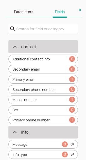
-
Search box for fields/categories: This allows you to search for certain fields or categories that are available in the system. The search works with labels and database names, which helps to ensure that you find the right field for your form. The unique name of a custom field = database name. The label of a custom field = name the user decided for, not relevant to the search database.
-
Form fields: The for the edition available form fields. They are grouped into different containers (eg. Device, Contact). You can also create custom form fields directly from the custom fields editor.
-
Field usage count indicator:
Indicates how often a field has been used inside this form.
Example: We use the secondary email field two times in this form.
Why? Because we simply use the same field multiple times OR because we might have created a so-called “render condition” field.
What is a render condition field? A “render condition” field can display different answer possibilities depending on the configuration. We use two times the email field, and we configured them so, that one of them only pops under a certain condition while the other one pops up under another condition. The count helps you to understand how many same fields you have for your render conditions. -
Linked indicator: Indicates that a field should only be used together with the other linked field or fields. Otherwise you could run into issues.
Field settings tab explained
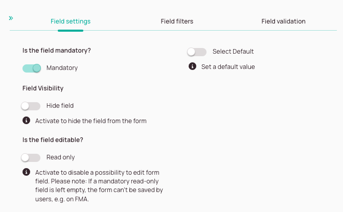
-
Mandatory toggle: Decide if the user has to fill in this particular field or can skip this field when filling in a form.
-
Hide field toggle: Decide if you want to hide this particular field from the form, so it is not visible to others (respectively only under certain conditions).
-
Read only toggle: Decide if your field should be read-only.
Read-only fields cannot be edited by form users and serve informational purposes. Please note: If a mandatory read-only field is left empty, the form can’t be saved by users, e.g. on FMA. -
Select default toggle: The default value will be the first pre-selected choice for the user of your form.
Form default value -> Is the default value that the user gave to the custom field in form creator and will be applicable only for this form.
Global default value -> Is the default value provided in the custom field page and applies to all forms.
Field logic: Add field logic to determine if this particular field should be visible nonetheless.
Eye icons: Determine which values should be selectable for this particular field.
Field filters tab explained
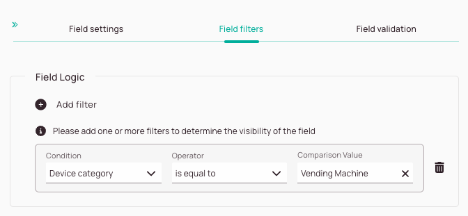
-
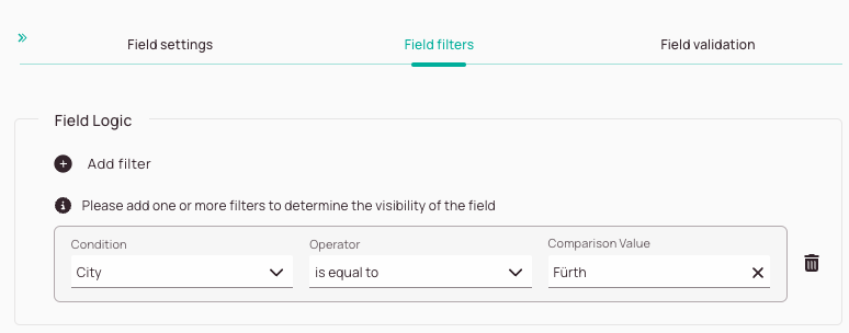
The Add filter button allows you to add field filters. With Field filters you can determine under which circumstances a field should be displayed.
-
Condition dropdown: This gives you the option to define a filter condition for your filter.
-
Operator dropdown: Compares the condition with the comparison (IS EQUAL TO, IS NOT EQUAL TO, IS LIKE, IS NOT LIKE, IN).
-
Comparison value dropdown: Defines with which value the condition is compared.
-
Trash button: Gives you the option to delete your current filter.
Field validations tab explained
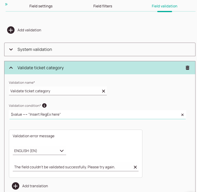
-
The Add validation button lets you add one or more field validations.
-
In this field you can enter a name for your validation.
-
You can enter a validation condition in the Validation condition field. The following languages are supported: RegEx or using our scripting syntax. You can enter your custom RegEx if you insert the below command: $value ~~ “Insert RegEx here”
You can also use our scripting syntax to create validations.
How operators are used correctly is explained further below in this section under How to pull up the field list and How to use and combine operators. -
This field lets you decide to which language you want to translate the validation error message.
-
In this field, you can enter an error message that should pop up in case the validation fails. You also have the option to customize the error message for other languages by clicking on the Add translation button.
-
The Add translation button lets you add other language variants for the error message.
-
The trash button lets you delete a field validation.
Field icons explained
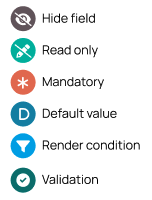
-
Hide field indicator:
Indicates that a field is hidden and will not be displayed to the user using the form. -
Read-only field indicator:
Indicates that a field is a read-only field. Read-only fields cannot be edited by form users and serve informational purposes.
Please note: If a mandatory read-only field is left empty, the form can’t be saved by users, e.g. on FMA. -
Mandatory field indicator:
Indicates that a field has been configured as “mandatory” for the form user. Example: It could be for example mandatory for the user to fill in a telephone number, because with out this field filled in the process cannot proceed. The form will warn the user, that he has to fill in this field in order to proceed with the process. -
Default field indicator: Indicates that a field is a default field.
Changing default fields is not advised as you may break your form.
Please note that there are two types of default values:
Global Default Value -> Is the default value provided on the Custom Fields page and applies to all forms.
Form Default Value -> Is the default value that the user assigned to the custom field in the form creator and is only valid for this specific form. -
Render condition field indicator:
Indicates that a field or group has been configured as “render condition” field. Example: We use the secondary email field two times in the example form above.
Why? Because we have created a so-called “render condition” field!
What is a render condition field? A “render condition” field can display different answer possibilities depending on the configuration. We use two times the email field, and we configured them so, that one of them only pops under a certain condition while the other one pops up under another condition. The render indication indicator helps you to understand if a field is a render condition. -
Validation field indicator:
Indicates that a validation has been configured for this field.
1.1.1. Custom Forms: Creating/Editing
- Click on the plus button right next to the search bar to add a new form.
- Provide details for your custom form or pop-up form.
- Craft your custom form.
All fields and their purpose are explained in the Form creator explained and how to craft exactly is explained in steps 2 to 4. - Decide with the active field if your form should be directly active in the system after creation.
- Enter a name for your form that is as distinctive as possible.
- Select the matching object type for your custom form.
- Select to which workflow your custom form should apply.
- Enter a description for your form that is as descriptive as possible.
- Select or enter a new custom form type in the matching form type field.
- Select a project to which your custom form should apply.
- Craft the fields of your custom form.
Continue with How to drag & drop form fields to a form.
1.1.2. About Pop-Up Forms
Currently, it is only possible to create pop-up forms without activating them. You can contact support@fieldcode.com via email if you want to have pop-up forms enabled for your specific business workflow.
The Pop-up form creator has the below-described options. Forms created using Pop-up form creator can be adjusted to be visible to technicians inside the Fieldcode Mobile Application and to dispatchers within the Work Place.
Pop-up form buttons can either move the workflow forward one step or make it stay in the same workflow step.
After a selection has been made by the user, the pop-up won’t pop up another time.
Steps 2-4 are not relevant for the Pop-up form creator, they are only applicable for creating custom forms with the form creator.
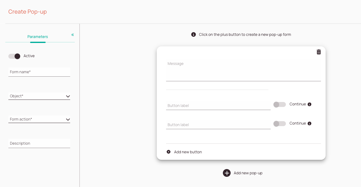
-
Active toggle: You can decide if your custom form should be directly active in the system.
-
Form name field: It is mandatory to enter a name for your new form. The field is mandatory.
-
Object field: Decide the “category” for which you want to create a form. The field is mandatory. Available object types are explained further below.
-
Form action field: Select which action your form should perform. The field is mandatory.
-
Description field: Describe the purpose/usage scenario for your custom form.
-
Message field: Enter a custom pop-up message that should be displayed to the engineer/dispatcher.
-
Button label field: Enter a button name for the button that will be selectable by the engineer/dispatcher.
-
Continue toggle: Allows you to decide if the matching button will initiate the next workflow step (if continue is enabled) or if the matching button stays on the current workflow step (if continue is disabled) after being pushed.
-
Add new button: Allows you to add another selectable option for the engineer/dispatcher.
-
Add new pop-up button: Allows you to add another pop-up-form.
-
Trash button: Allows you to delete the particular pop-up.
1.1.2.1. Pop-Up Forms: Creating/Editing
- Click on the plus button right next to the search bar to add a new pop-up form.
- Provide details for your custom form or pop-up form.
- Craft your pop-up form.
All fields and their purpose are explained in the Pop-up form creator sections. - Decide with the active field if your form should be directly active in the system after creation.
- Enter a name for your form that is as distinctive as possible.
- Select the matching object type for your custom form.
- Select to which workflow your custom form should apply.
- Enter a description for your form that is as descriptive as possible.
- Select or enter a new custom form type in the matching form type field.
- Select a project to which your custom form should apply.
- Enter the message that should pop up for your users in the message field.
- Add at least two buttons and label them.
You can add more buttons by pushing on the Add new button button. - Decide which button or buttons should continue the workflow by toggling the continue button to active for the matching button.
If a button doesn’t have the continue option, the ticket will stay in the current workflow step, after being pressed by the user. - Click Save.
1.1.3. Interface Forms: Creating/Editing

This specific feature set is only available for customers with an Enterprise plan.
Interface forms have a very specific purpose. Interface forms can be used to update individual ticket data on the interface partner’s side for the account partner. Thanks to this option, the entire payload does not have to be sent from the interface partner to the actual account.
You can contact support@fieldcode.com via email if you want to have interface forms configured for your specific business workflow.
1.1.4. Inline forms: Creating/Editing
You can learn more about inline forms inside the dedicated topic.
2. Dragging & Dropping Fields to a Form
You may see some fields where you don't have the option to delete. This means the field is a default system field, that cannot be changed.
You start by dragging & dropping the form fields (which are represented by chips) to the right side and arranging and sorting them by your needs. From there on you have other options to further customize your fields.
Let’s assume you want to create a different Contact form.
What you would do in this case is drag fields from different categories from the left side to the right side and create a new group with the pencil button and name the group for example Contact.
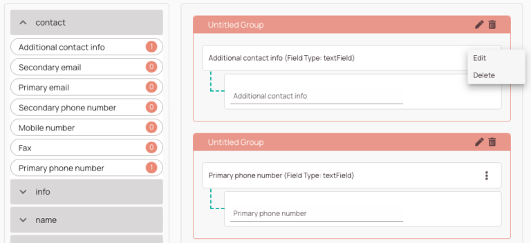
-
With the pencil button, you can edit the group category (container), while with the trash button, you erase a whole group category (container).
-
Opens the context menu of a field (Edit/Delete).
-
This is the open context menu of a custom form field.
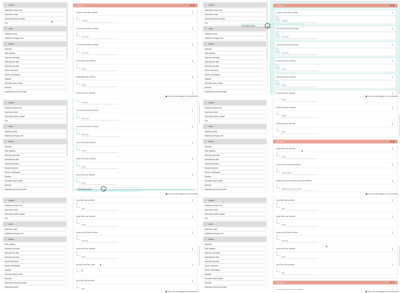
2.1 Changing Group Order/Field Order
You can easily change the order of fields by dragging & dropping them to another position.
- Click and hold on a field or a form container.
- Drag and Drop the field or group to your desired destination.
- Click Save.
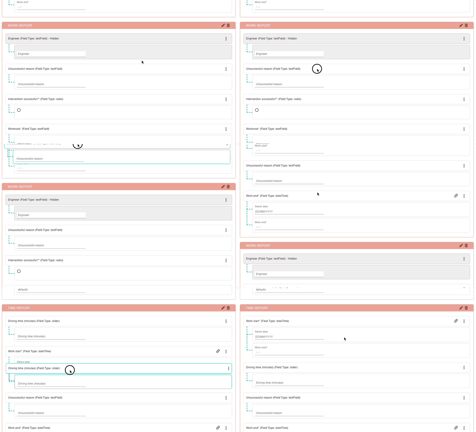
2.2 Creating Reusable Fields
For the same field depending on the city that is picked in the form, you want to have other answer options displayed. That's where correctly configured reusable fields could come into play. Please note that you can put in multiple equal fields into a form, however, the correct use case for reusable fields is if you want to apply conditional rendering. We show you how to do it correctly in the section below.
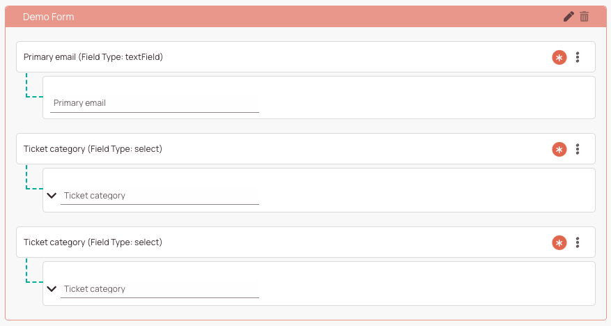
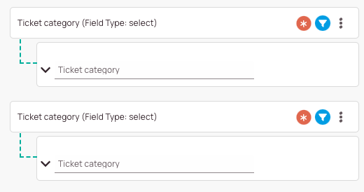
The concept for reusable fields is actually straight forward, but you have to understand how to create them correctly. First of all, it is essential to understand that for conditional rendering to work, at least two identical fields (or more) must be created. Then the conditions for each field should be defined. The two fields (or more) themselves must then have all answer choices for both conditions. Then you can exclude answer choices for each of the two fields. Depending on the condition set, one field will then appear at a time, and the other will not be visible because the condition does not occur. In the Form creator, however, both fields are visible and are indicated by the render condition symbol. The count symbol on the left side of the editor may also help you to distinguish render conditions.
Let’s assume you want to create a field, that depending on the city different ticket categories should be available as answer in the form.
- Drag the (ticket category) field two times into your form group.
- Click on the context menu and then edit for the first ticket category.
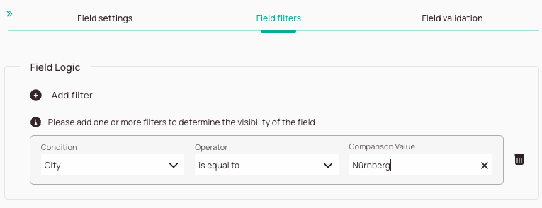
- For the first ticket category configure inside the Filters tab:
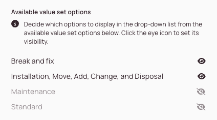
(City) is equal to (Nuremberg). - Disable the categories you don’t want for this city by clicking on the matching eye icon:
Eg. you could hide Break and Fix and IMACD. - Click Save.
- Click on the context menu and then edit for the second ticket category.
- For the second ticket category configure inside the Filters tab:
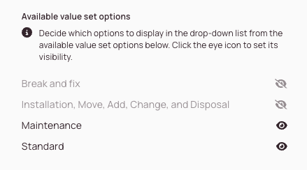
(City) is equal to (Fürth). - Disable the categories you don’t want for this city by clicking on the matching eye icon:
Eg. you could hide Maintenance and Standard. - Click Save.

2.3 (Optional) - Form Groups Fine-Tuning
- You can fill in the Group settings tab.
Group visibility: Decide with the toggle if you want to hide the group from the form, so the group is not visible to others (respective only under certain conditions).
The whole Contact form group should be hidden in the form because you want to use it later and not for now because you are drafting.

- You can fill in the Group Labels tab.
Default name: Allows you to give your group you’re creating a default name.
Translation: Allows you to add a translation for your group name, so they show in other languages too. By default, only the English label is displayed.s
Your custom form group should contain a name with translations for other languages.
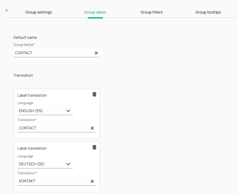
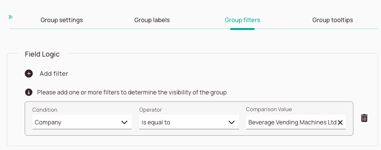
- You can fill in the Group filters tab. Field logic: Add field logic to determine if this group of fields should only be visible when certain conditions apply.
Your company "Beverage Vending Machines Ltd" wants to use a specific Contact form that contains extra fields for the user to fill in while creating tickets.
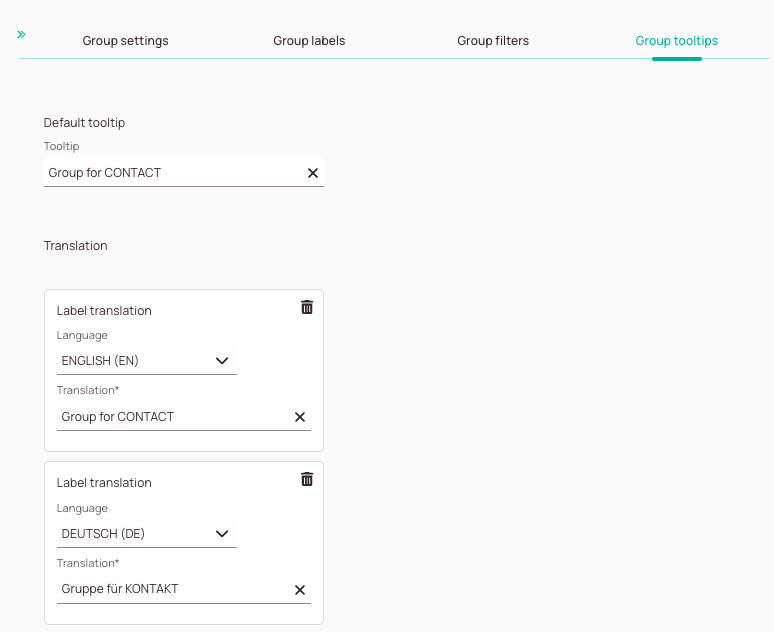
- You can fill in the Group tooltips tab. Default tooltip: This allows you to give users a practical tooltip for the form group. Translation: Allows you to add a translation for your tooltip, so they show in other languages too. By default, only the English label is displayed.
Your custom form group should contain a tooltip with translations for other languages.
2.4 (Optional) - Fields Fine-Tuning & Creating Validations
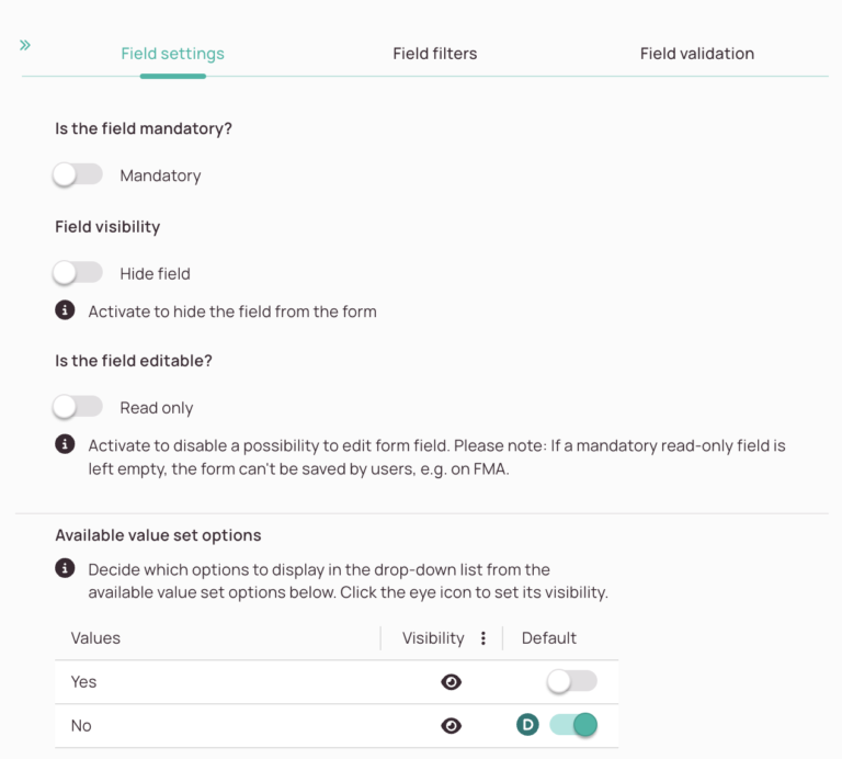
- You have the option to fill in the Field settings tab.
- Field mandatory: Decide if the user has to fill in this particular field or can skip this field when filling in a form.
- Field visibility: Decide if you want to hide this particular field from the form, so it is not visible to others (respectively only under certain conditions).
- Is the field editable?: Decide if your field should be read-only.
Read-only fields cannot be edited by form users and serve informational purposes.
Please note: If a mandatory read-only field is left empty, the form can’t be saved by users, e.g. on FMA. - Allow Scanner Input: Decide if FMA users should have the option to use the barcode scanner to input values.
- Available value set options:
- Default toggle: The default value is the value selected by default in the field.
Form default value -> Is the default value that the user gave to the custom field in form creator and will be applicable only for this form.
Global default value -> Is the default value provided in the custom field page and applies to all forms. - Eye buttons: You can determine which values should be actually visible for the user for this particular field.
You want a field to be mandatory for the user under certain conditions. For example, you want it to be mandatory to fill in the last name.
You want a certain field to be invisible under certain conditions. For example, a sub-model number is not required for a certain ticket type, therefore you limit the visibility for this certain ticket type.
You want certain fields to be pre-filled and not be able to be changed by the end user. Useful for certain projects that contain special identifiers.
You have generally created a lot of custom ticket categories, but some projects are so specific that they only need a selection from three specific categories. By hiding the remaining ticket categories for a field that relates to a specific project, you can easily unburden your user. Another use case that is displayed further above is if you want to utilize "reusable fields".
- You have the option to fill in the Field filters tab.
- Field logic: Add field logic to determine if this particular field should only be visible when certain conditions apply.
You want to make it easier for your user to create tickets if the ticket is related to vending machines. Therefore, you want the ticket category to always automatically default to "Maintenance" if the ticket is related to vending machines.
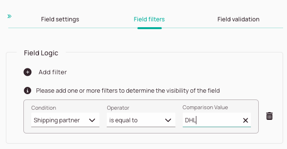
- You have the option to fill in the Field validations tab.
- Click on the Add validation button.
- Enter a name for your validation condition inside the Validation name field.
- Enter a validation condition inside the Validation condition field. The following languages are supported: RegEx or using our scripting syntax. You can enter your custom RegEx if you insert the below command: $value ~~ “Insert RegEx here” You can also use our scripting syntax to create validations. How operators are used correctly is explained further below in this section under How to pull up the field list and How to use and combine operators.
- Select a language for which you want to save a validation error message.
- Enter the validation error message that should be displayed in case of an validation error in the translation field.
- (Optional) Add more validation error messages for other languages. Do number 8 again for other languages.
- (Optional) Add more validation conditions by clicking the Add validation button. Start from number 3 again, if you want to add more validation conditions.
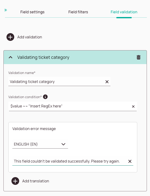
Just type @ inside the condition field in order to be able to select a field. You can combine fields with the help of operators to create custom validations.
a == b -> equals operator
a < b -> Less than operator
a <= b -> Less than or equals operator
a > b -> Greater than operator
a >= b -> Greater than or equals operator
a =~ b -> Text contains operator
a ~~ b -> Like operator
a in b -> In operator
!= -> negated version of equals operator
!=~ -> negated version of contains operator
!~~ -> negated version of like operator
!in -> negated version of the in operator
You can create a wide variety of field validations yourself. You can compare one field with another field and much more.
For example, to create a validation to ensure that a field cannot be filled in twice with the same data, you can utilize a relative operator.
Let’s say you want to for example ensure that the primary phone number field couldn’t be filled in with the same number as the phone number field.
The validation condition for this would be as follows:
@[Primary Phone Number] =! @[Mobile Phone Number]
Important: Between the fields and the operators, a space must be inserted by using the space bar.
@[Primary Phone Number] =! @[Mobile Phone Number]
"Item 1" IN @[Select your field]
5 out of 5 stars
1 rating
| 5 Stars | 100% | |
| 4 Stars | 0% | |
| 3 Stars | 0% | |
| 2 Stars | 0% | |
| 1 Stars | 0% |
