Tip: You can use filters for better results
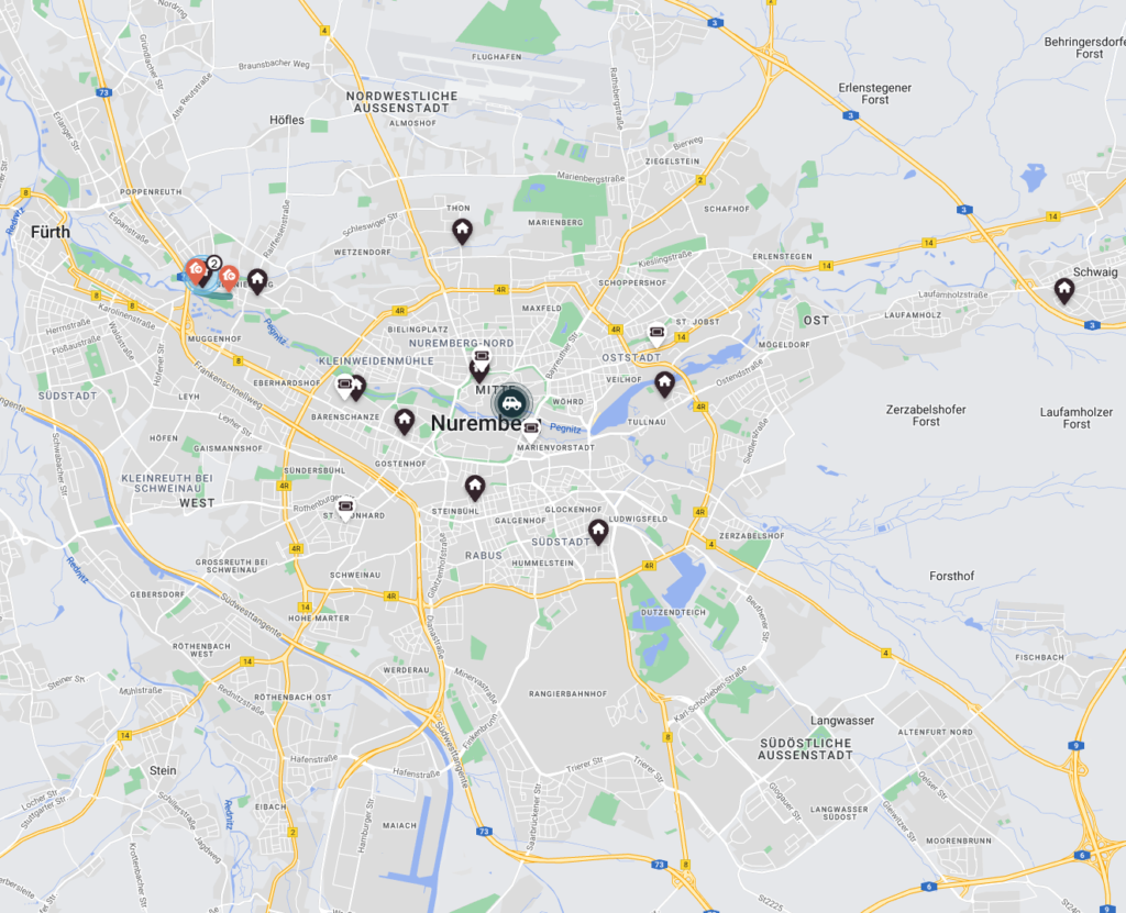
The Map shows tickets and/or engineers directly on a map to give you a better and alternate overview of progressing tickets..
Inside the Work place to the Map and expand ![]() the view to reveal certain map functions.
the view to reveal certain map functions.
The Map component assists dispatchers by giving them an alternate view of tickets on a world map in order to better visualize daily tickets and engineer routes.
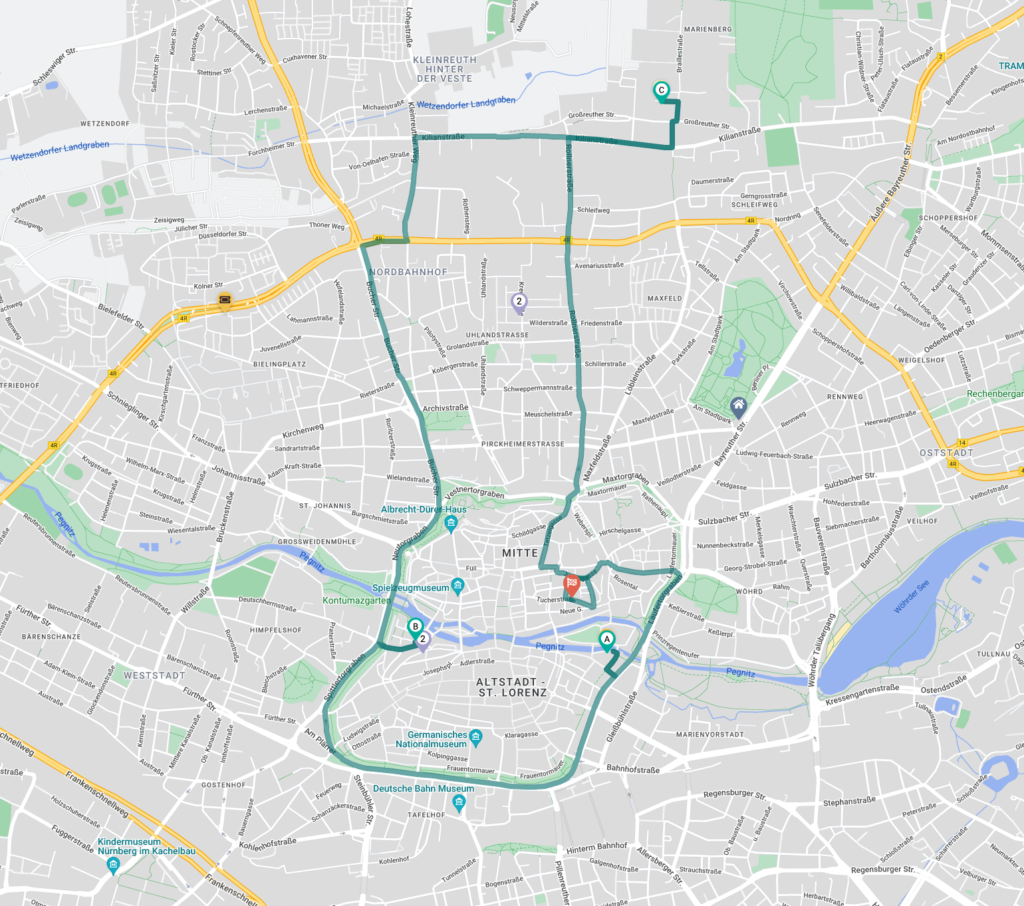
The Map component gives you the option to check the daily engineer routes for their assigned tickets, allows you to check route segment durations,
allows you to filter for dates, statuses, individual tickets and engineers and therefore is an alternative way to gain overview of daily dispatched tickets.
Yes, the map does.
Depending on the group that is selected inside the Ticket Pool or Timeline the Map by default displays info for these selected tickets.
By additionally activating component linking additionally you can absolutely ensure that the displayed data matches the data inside the Ticket Pool or Timeline.
The general idea of the map is to help dispatchers on their daily work.
Therefore the map is only displayed when the user is inside the Dispatch tab of the Ticket Pool as the map is a live-help.
The map can also be used for dispatching tickets.
Yes, it does.
When you click on a particular ticket in the Ticket Pool’s Dispatch tab, you will see the map automatically zooming to that specific ticket.
All tickets inside the map happen to have a popover with additional ticket details. This popover also smartly adjusts to the situation of the ticket.
To see this popover you just have to hover over a particular ticket. You will then be able to have a quick glance at the most relevant Ticket Details
By default distances in the map are displayed according to what is set under My Settings – however – if you want to change this behavior on the go – click on the distance unit in the map footer to change the displayed distance unit between meter or foot.
![]()
Yes, there is a possibility.
- To enter fullscreen mode simply click the fullscreen button (frame button) on the top right corner of the map to display the map in an expanded view.
- Alternatively you can freely drag the map component to your desired size.
![]()
If you change the engineer location the actual PIN location on the map may not update immediately.
The data will – however – still synchronize accordingly inside the map filter (not the popover).
Changes to the engineer location will be reflected on the map the next day latest.
Yes, the dispatcher will know the last submitted position of the technician if access to the location has been granted on the FMA.
The default and current setting is 5 minutes.
Dispatchers will not be able to see this information.
At the database level, the location is timestamped so that the system can determine if the location data is current. If the timestamp of the last location data update is longer than the specified interval in the past, the technician is displayed as offline.
Example 1: App sent technicians location/location date is current![]() Example 2: No current location data available
Example 2: No current location data available![]()
No, it is not.
You do not need to configure a permission for this feature to work.
Yes, the FMA will still work normally.
The technician can block the app’s access to location data/position at any time, if desired.
Only one/latest position will be stored for every technician.
Technically we overwrite this value every time new data arrives.
Geolocation is available based on a configurable interval after the technician has installed the app and confirmed access to location data.
Location data is not collected if the technician is logged out of the FMA.
Lowest possible configurable range: 1 minute
Default: 5 minutes
Engineers are free to opt-out at any time by logging out or revoking the app’s access to location data/position on FMA.