Tip: You can use filters for better results
-
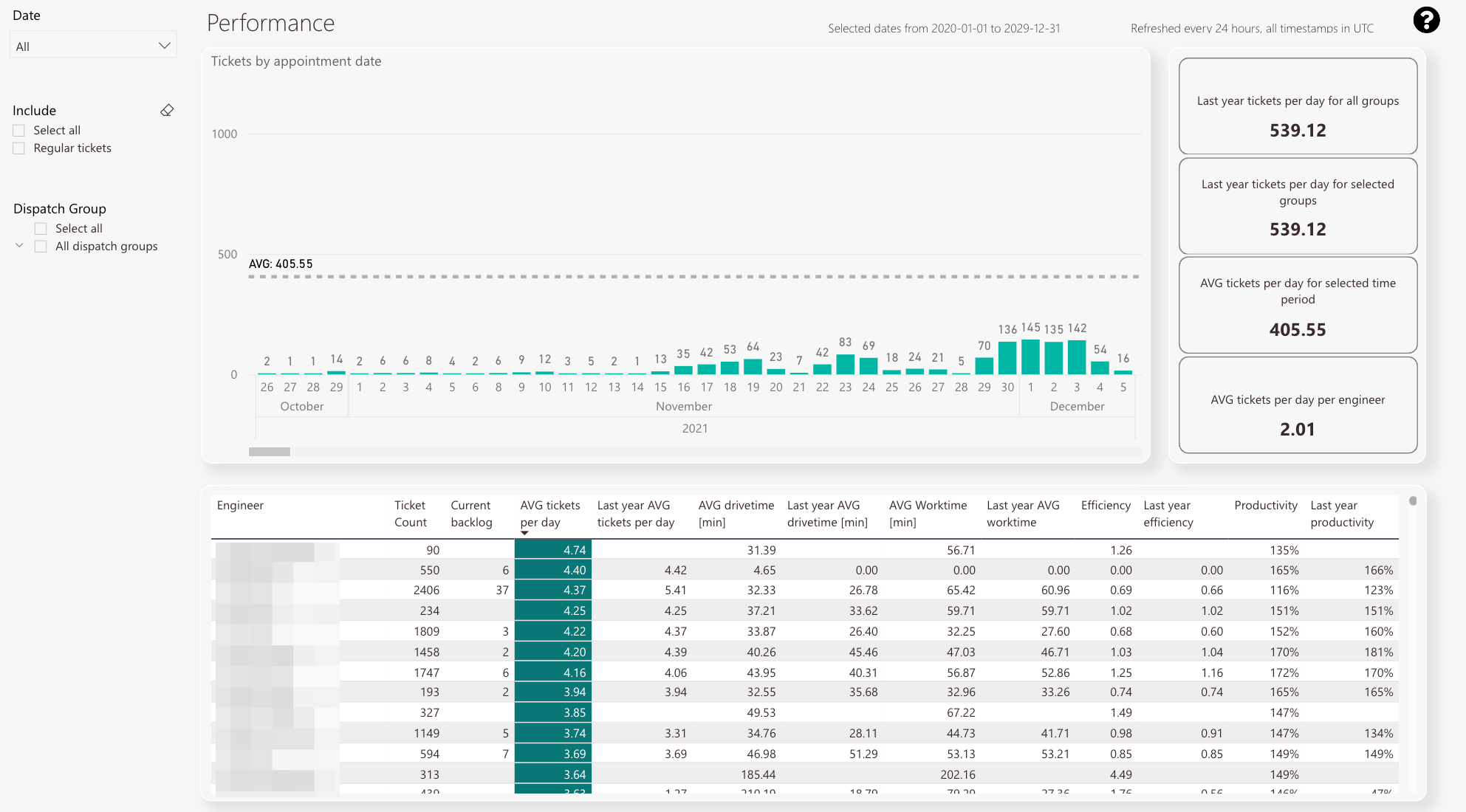
Ticket count by appointment date
-
Average ticket count
-
Tickets opened per day for all groups
-
Tickets opened per day for selected group
-
Average opened tickets per day for selected time period
-
Average opened tickets per day per engineer
-
Detail view including individual ticket count, ticket backlog, last years’ average tickets per day, average drive time in minutes, last years’ average drive time, last years’ average work time, efficiency factor, last years’ efficiency factor, productivity, and last years’ productivity
-
Date filter
-
Ticket filter
-
Dispatch group filter
-
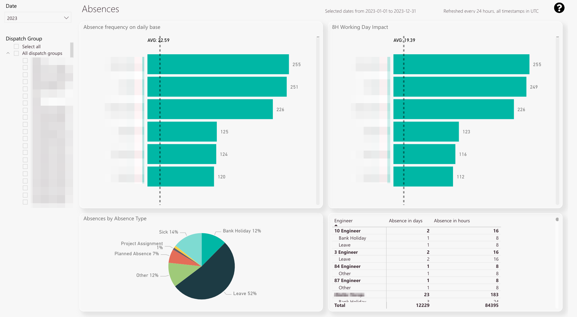
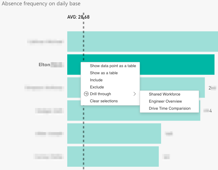
Absence frequency on a daily base
-
Average of all collected absence days
-
Affected working days per engineer normalized to an 8 hours working day
-
Average of all collected absence days (8 hours working days)
-
Absences separated by absence type
-
Detail view with absence type, affected days, and absences in hours
-
Year/Month filter
-
Dispatch group filter
-
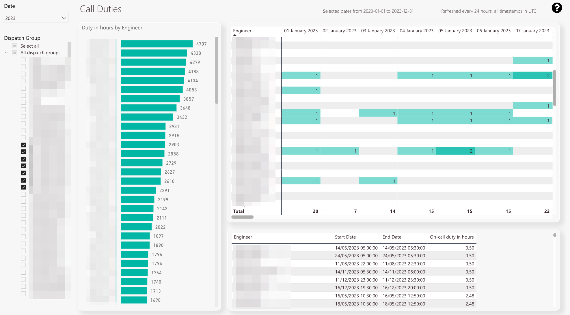
Total call duty hours per engineer
-
On-call duty matrix by date and engineer
-
Detailed data about on-call duty start time, on-call duty end time, and on-call duty in hours
-
Date filter
-
Dispatch group filter
-
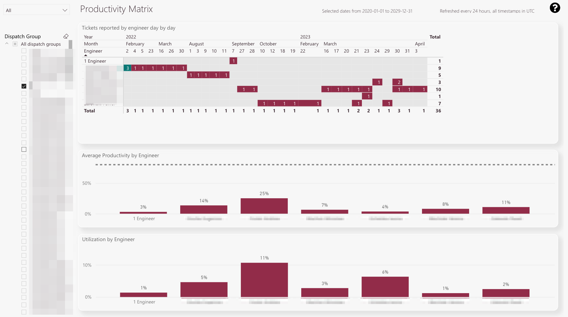
The matrix displays how many tickets a particular engineer reported in a practical matrix view.
The default goal is set to three tickets. -
Green means the engineer fulfilled the ticket goal
-
Red means the engineer did not fulfill the ticket goal
-
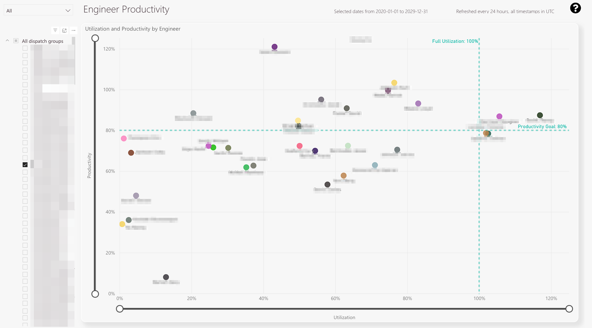
Productivity for individual engineers in selected dispatch group and for selected time period
-
Utilization for individual engineers in selected dispatch group and for selected time period
-
Dispatch group filter
-
Year/Month filter
-
The plot displays individual engineers and their individual performance in productivity and utilization
-
If the engineer crosses this border he is more than fully utilized
-
If the engineer crosses this border he surpassed the productivity goal
-
With the top and bottom knobs you can configure the displayed percentage span.
-
With the left and right knobs you can configure the displayed percentage span
-
Year/Month filter
-
Dispatch group filter
-
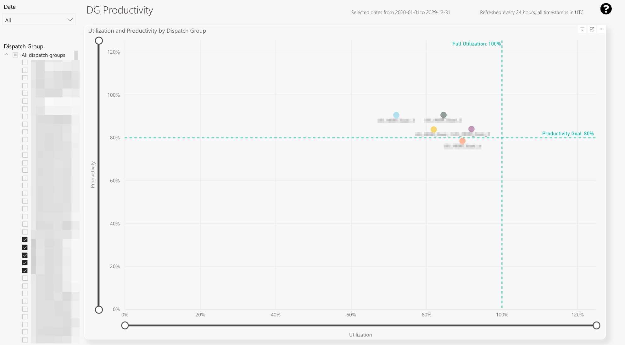
The plot displays individual dispatch groups and their individual performance in productivity and utilization
-
With the top and bottom knobs you can configure the displayed productivity percentage span
-
With the left and right knobs you can configure the displayed utilization percentage span
-
Year/Month filter
-
Dispatch Group filter
-
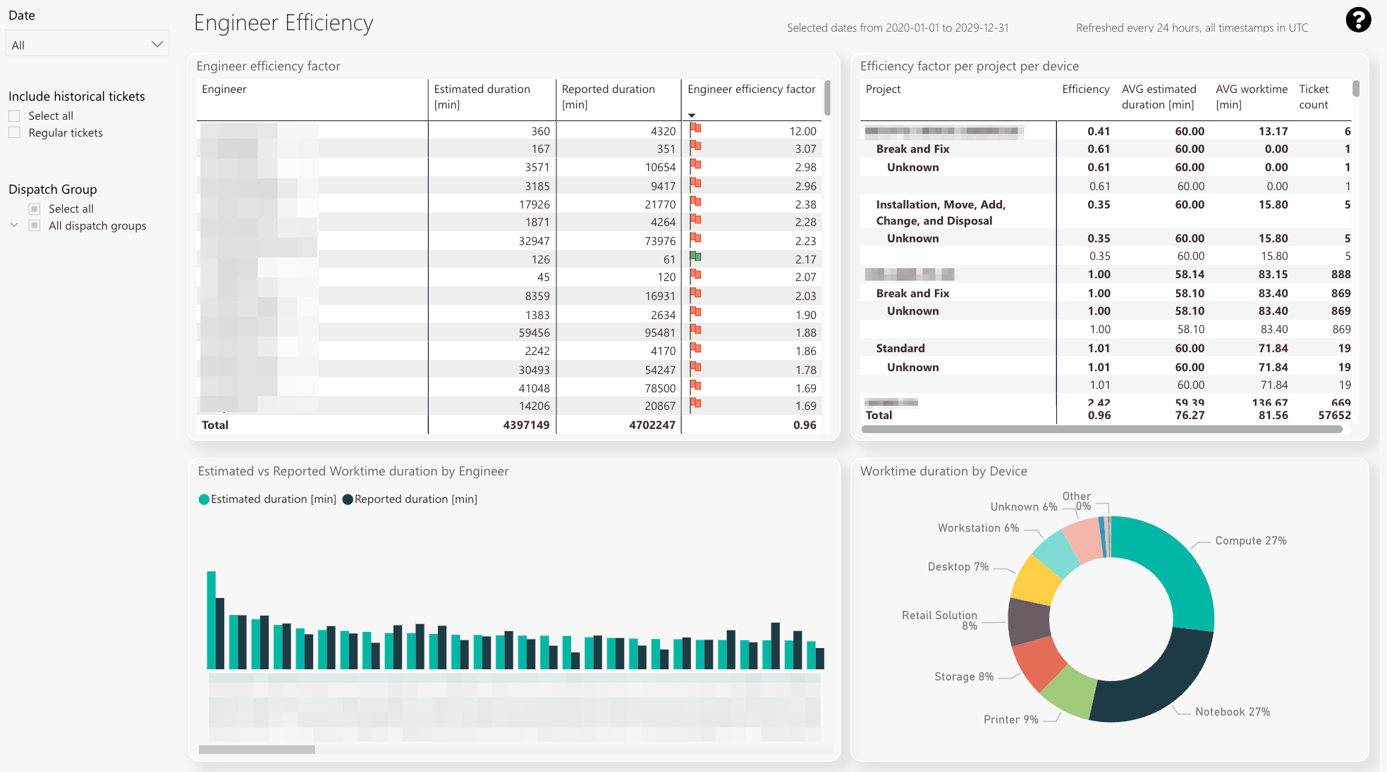
The engineer efficiency table displays the estimated duration compared to the actual work time duration in minutes.
The calculated efficiency factor for the selected dispatch group and the engineer factor for the corresponding technician is also displayed in this table. -
The efficiency factor per project with average estimated durations and average work times in minutes
-
Estimated duration compared to work time duration by engineer
-
Work time duration by device.
The data assists you to better understand which devices take up most of the engineer’s work time. -
Date filter
-
Include historical tickets filter
-
Dispatch group filter
-
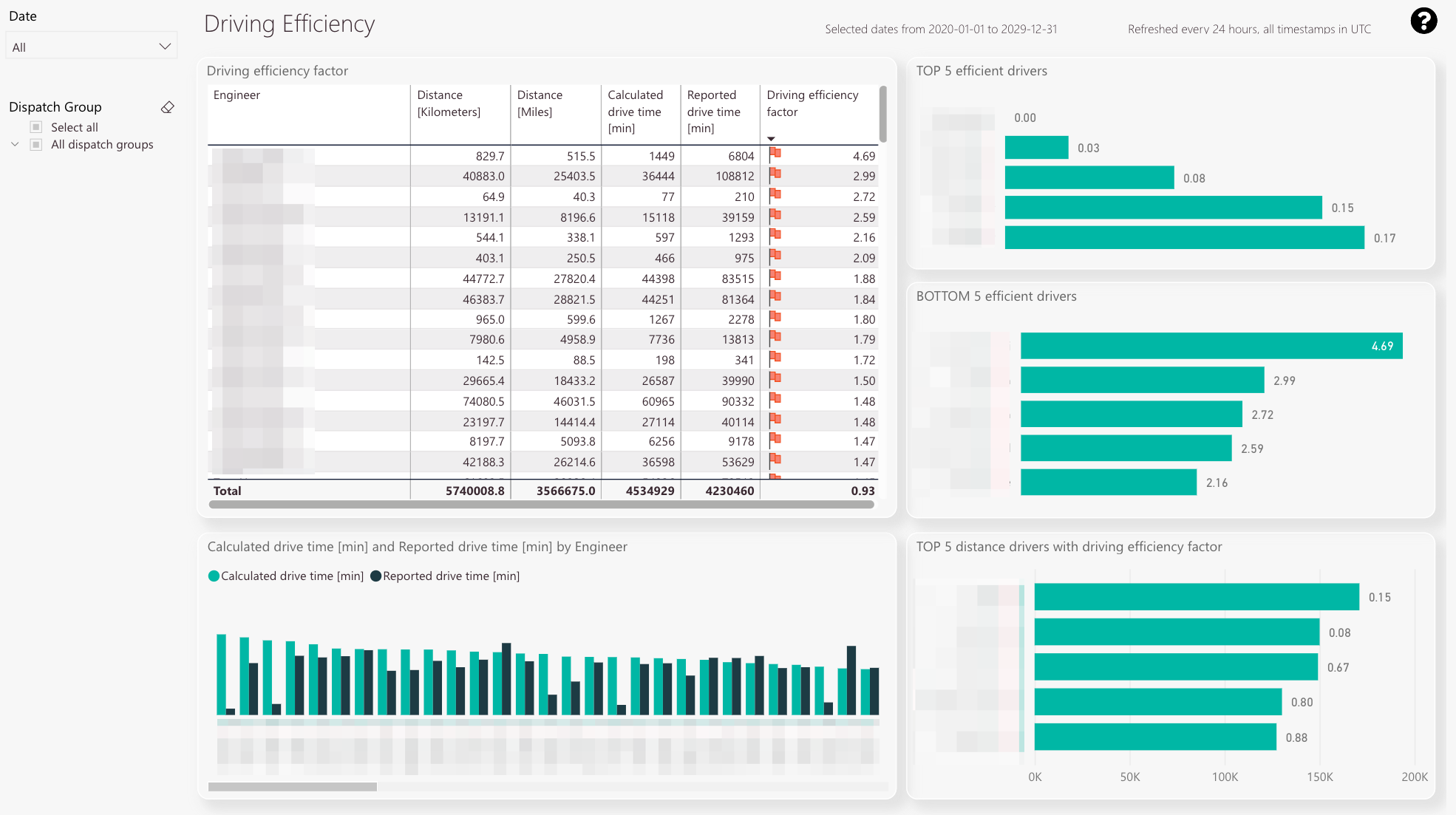
The driving efficiency table displays the calculated drive time compared to the reported drive for selected parameters in minutes.
The resulting driving efficiency factor is also displayed. -
You can check the top 5 of the most efficient drivers for selected parameters.
-
You can check the least 5 efficient drivers for selected parameters.
-
The calculated drive time compared to the reported drive time in a graphical processed view.
-
You can check the top 5 distance drives for selected parameters with the efficiency factor compared between engineers.
-
Year/Month filter
-
Dispatch group filter
-
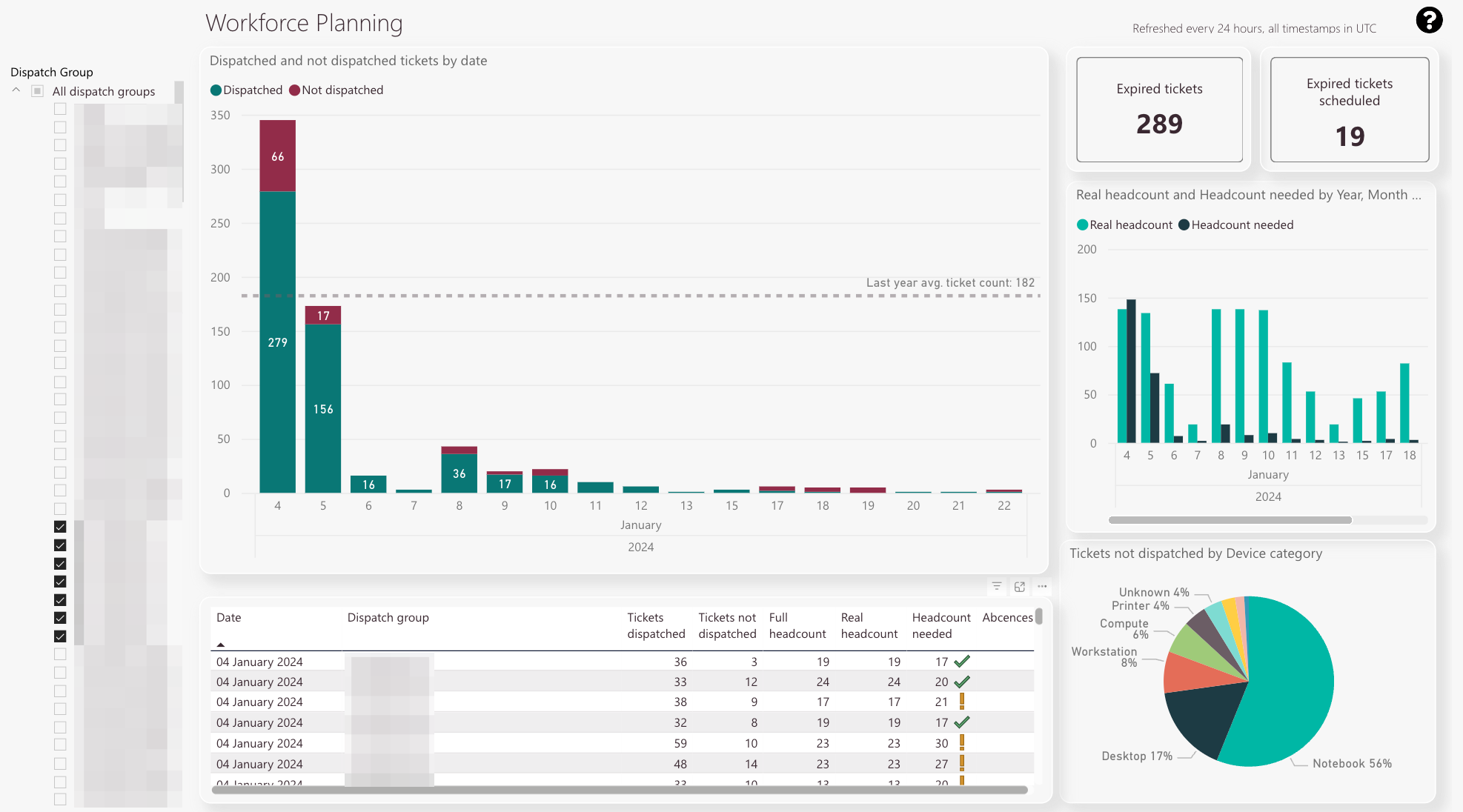
The workforce forecast table displays dispatched tickets compared to not dispatched tickets by date.
The last’s year average ticket count is displayed with a line. -
Expired tickets count
-
Expired tickets scheduled count
-
Real headcount compared to required headcount
-
Tickets that were not dispatched separated by device category.
This pie diagram assists you in finding out which categories need attention in particular. -
The detail view gives you even more valuable insights with summarizing everything mentioned above in a table
-
Dispatch group filter
-
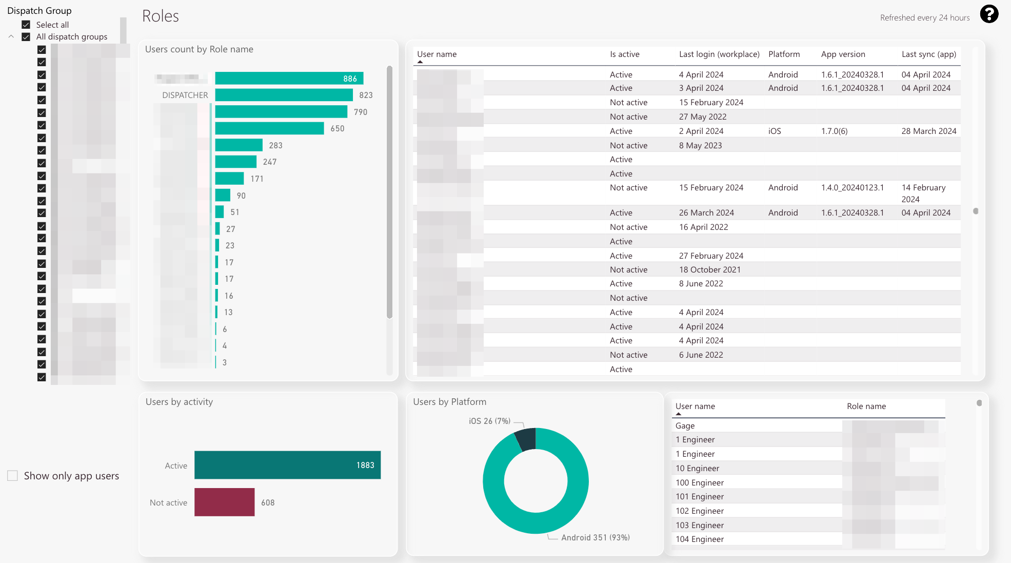
You can check the user count for each created role
-
You can check which users are active in the system and when they last logged into the different Fieldcode applications. Additionally, you can check the app versions your users currently utilize. Having insights into those statistics can lead to strategic measures, eg. telling your users that they need to update their apps, etc.
-
Toggling this button allows you to show only the app users in the list view
-
You can check the active and inactive user count
-
A graphical comparison between iOS and Android usage for your selected dispatch group or dispatch groups
-
You can check which particular user has which particular role in the system in this chart
-
Dispatch group filter
-
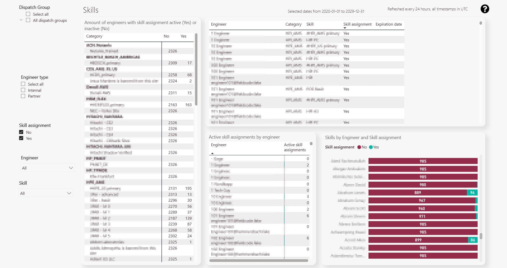
You can check skill categories, how many engineers have assigned the skill category, and how many tickets are opened with the particular skill category
-
You can check particular engineers and their skills and check if skill assignment is activated or inactivated for particular engineers.
Active engineers are indicated as Yes.
Inactive engineers are indicated as No. -
Active Skill Assignments by Engineer: Displays the number of active skills assigned to each engineer.
-
Engineer by skill assignment activity line chart: Displays skill assignment status over time. Active skills are represented in green, while inactive skills are represented in red.
-
Engineer Type Filter: Allows you to filter engineers by type.
Select all – Displays all available engineers.
Internal – Displays engineers who belong to and work within your tenant.
Partner Engineers – Displays users associated with partner organizations that collaborate with your company. -
Dispatch Group filter
-
Skill active filter
-
Engineer filter
-
Skill assignment active filter
-
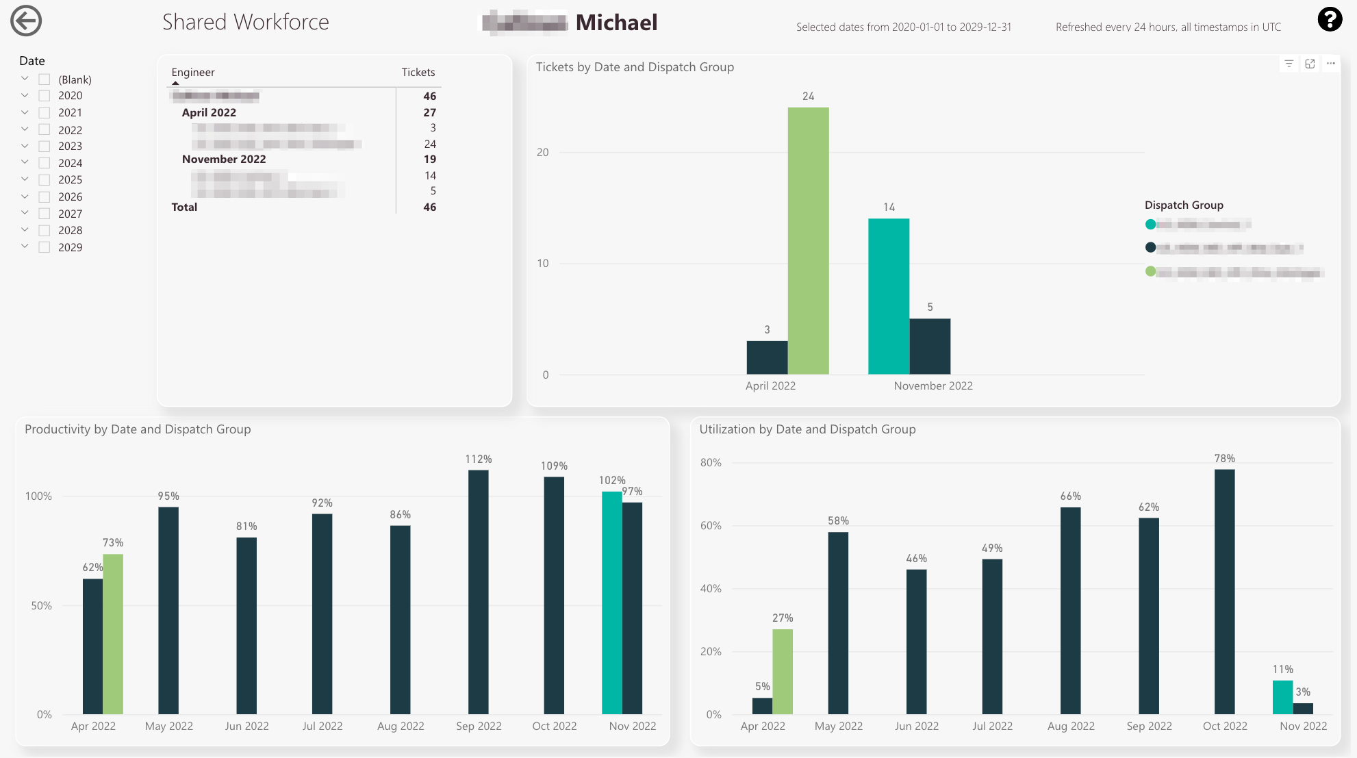
You can check the ticket count for the selected engineer
-
You can compare ticket counts separated by dispatch groups
-
Legend of dispatch groups
-
You can compare productivity percentages by different dispatch groups
-
You can compare the utilization percentages by different dispatch groups
-
Year/Month filter
-
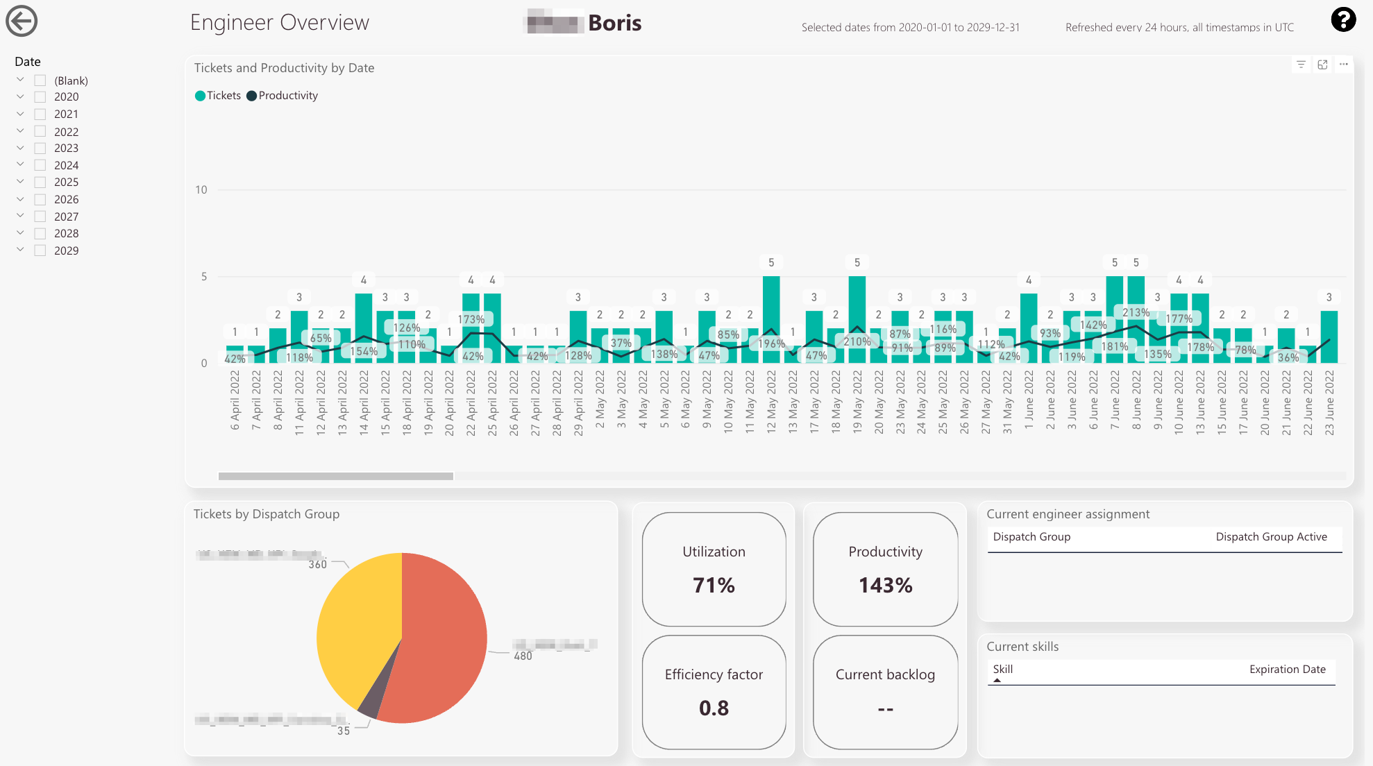
You can check the tickets done by an engineer on a per-day base, including the exact productivity percentage for the date
-
You can check how many tickets the selected engineer has done for particular groups. This is useful if the engineer is for example assigned to multiple groups
-
You can check the utilization, productivity, efficiency factor and the current backlog for the selected engineer
-
You can check to which dispatch groups the selected engineer is currently assigned
-
You can check which skills are currently assigned to the selected engineer
-
Date filter
-
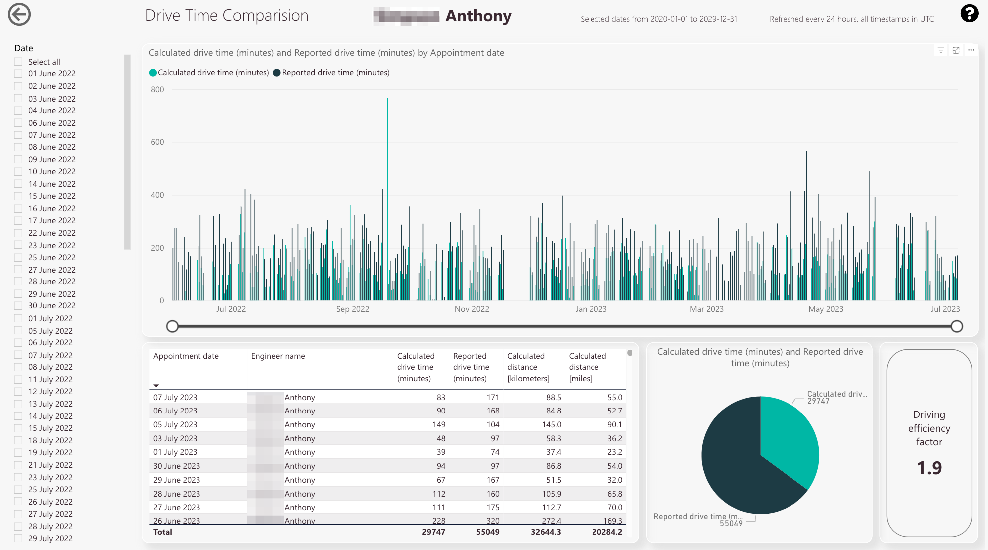
You can compare the calculated drive time with the reported drive time for the selected engineer
-
The two knows allow you to drill down from macro view to micro view and vice versa
-
You can check the appointment dates and the matching calculated drive time/reported drive time/calculated distance in kilometers
-
You can compare the total calculated drive time to the total reported drive time
-
You can check the driving efficiency factor to the selected engineer
-
Year/Month filter