Tip: You can use filters for better results
-
Latest News
-
Getting Started
-
Work Place
-
-
-
- About Buttons
- Action Buttons
- Schedule Tickets
- Ticket Info and COMS Buttons
- Add Parts
- Assign Partners
- Remove Tickets from the Ticket Clipboard
- Inline Skill Editing
- Create Intervention Info
- Create Intervention Reports
- Cancel Tickets
- Cancel Appointments
- Clone Tickets
- Edit Ticket Details
- Edit Privat Notes
- Report Tickets
- Close Tickets
-
Admin Panel
-
FMA 2 App
-
Customer Portal
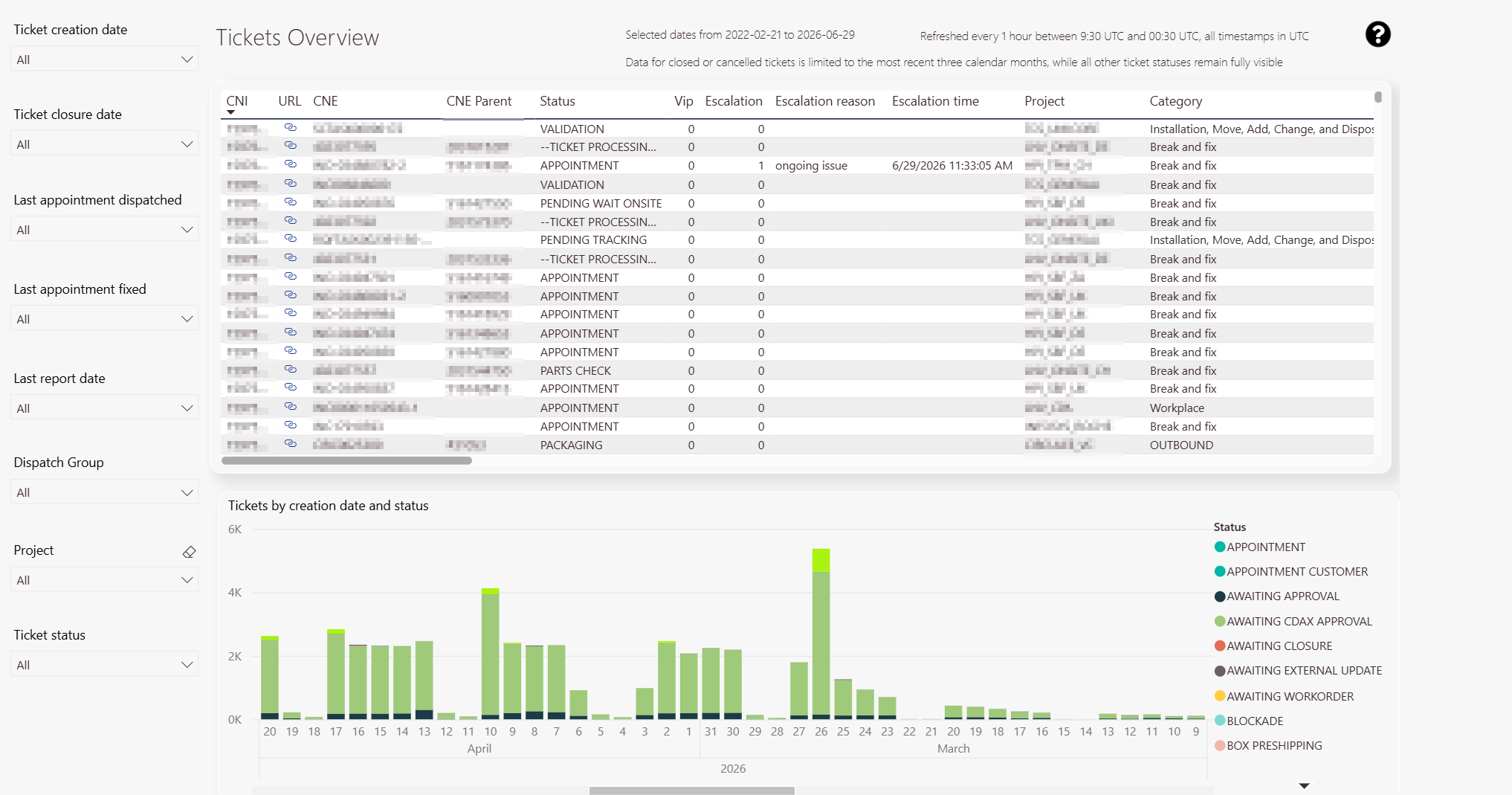
How to use the Tickets overview Report
The Tickets Overview tab displays your tickets in a tabular view.
The Ticket map tab displays the tickets on a global map view.
What is the particular purpose of the Tickets Overview Report?
The tickets overview report displays an extensive overview of all tickets in the system.
The overview contains almost every data associated with a particular ticket (eg. street names, projects, categories, etc. pp.).
The tickets overview is a different way (compared to the Ticket Pool) to see Ticket Details more graphically processed.
You also have the option to export data from the tickets overview report (please scroll down to the section if you want to learn how to do it).
Who benefits most from the Tickets overview report?
This view has no specific person group and can be useful for almost everybody working with the Fieldcode system. Dispatchers and managers for example can both profit from ticket heat maps, while backend officers have detailed overviews of tickets in different statuses, that help them to optimize processes.
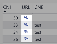
Deep-Link functionality
You can use the so-called deep-link functionality to quickly jump to a selected ticket in the Ticket Details component of Work Place directly from the Tickets Overview tab.
Tickets overview tab
You can decide for which groups, projects, and creation years you want to see ticket data.
Also, you can check out the ratio of the various ticket status to each other.
You can also adjust the width of the displayed data.
Ticket Export Functionality Explained
- Move your mouse to the upper-right top of the ticket overview table to reveal the context menu/more options menu.
- Left-click.
- Click on Export data.
- Choose which data you want to export (Default: Data with the current layout).
- Click the Export button.
- Your browser should now download a .xls file with all the ticket data included.
-
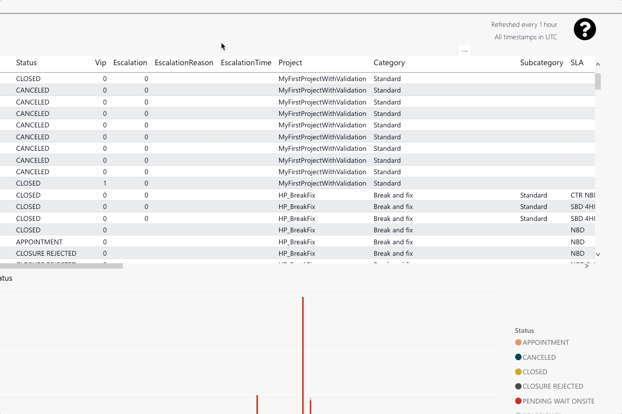
You can check all individual ticket details of each ticket. You can find info about the CNI, a link to the ticket, the current status of the ticket, if the ticket has a VIP or Escalation status, the escalation reason and time, the project, the category, the subcategory, the Service Level Agreement, the current LSDT, the creation and closure time, the assigned dispatch group, the assigned engineer, the company, the city, the state, the ZIP code, the street, the street number, the country, the Device category, the device subcategory, the device model, the warranty, the category, the timezone, appointment cancellations, the last appointment from and to times, the total drive times, the total work minutes, and eventual partner assignments.
-
You can compare ticket count by status, spliced by creation date and status.
-
The slider gives you the option to adjust the time span (with the help of a left knob and a right knob).
-
Dispatch group splicer
-
Project splicer
-
Status splicer
-
Ticket creation date splicer
-
Ticket closer date splicer
-
Last appointment dispatched splicer
-
Last appointment fixed splicer
-
Last report date splicer
If you cannot find particular tickets in the table view, the cause might be that those tickets do not have any assignments.
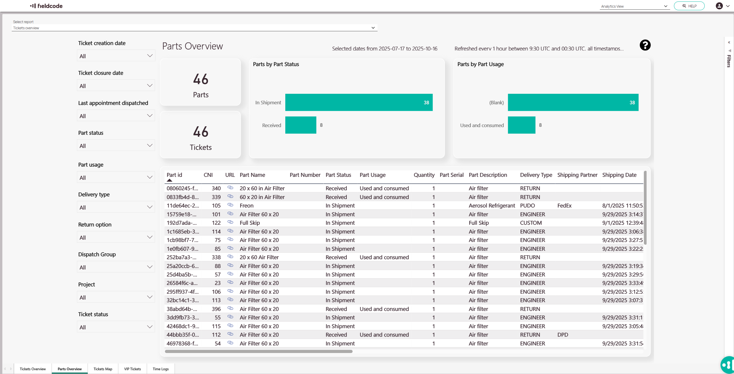
Parts overview tab
The Parts Overview tab provides a comprehensive snapshot of parts and related tickets, helping users monitor status, usage, and shipment activity. It is divided into two main sections: a summary panel and a detailed data table.
-
Unused Parts by status
-
Parts Usage overview
-
Standard Filters
-
Detailed Tickets List
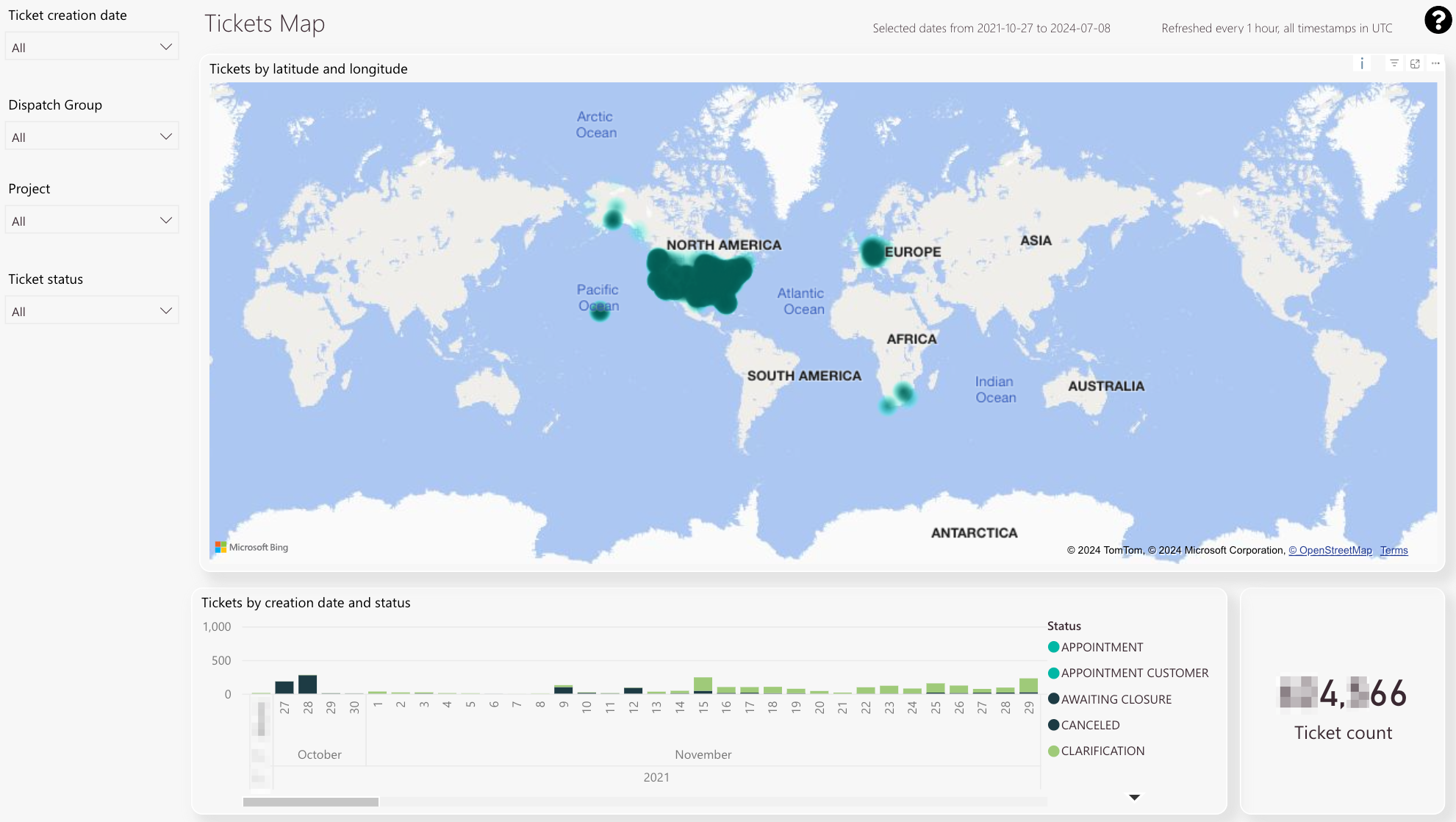
Ticket map tab
You can decide for which groups, projects, and creation years you want to see ticket data.
Also, you can check out the ratio of the various ticket status to each other.
You can also adjust the width of the displayed data.
-
Heatmap of tickets on a map.
-
The scrollbar gives you the option to scroll through dates.
-
Ticket count for selected analytic filters.
-
Ticket creation splicer
-
Dispatch group splicer
-
Project splicer
-
Ticket status splicer
-
The slider gives you the option to adjust the time span (with the help of a left knob and a right knob).
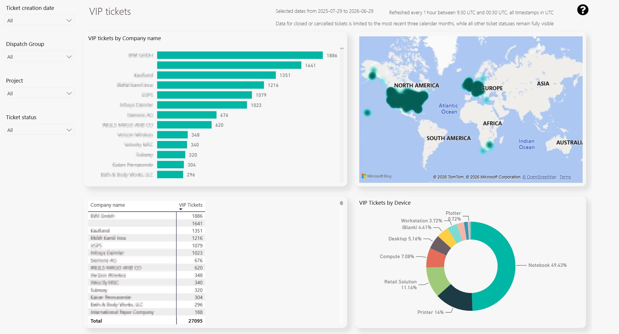
VIP tab
-
VIP ticket amount per company.
-
Heat map of VIP tickets.
-
Detail view displaying average ticket durations and driving times for VIP tickets.
-
VIP tickets per device
-
Dispatch group splicer
-
Ticket creation date splicer
-
Project splicer
-
Ticket status splicer
The VIP tab displays the number of VIP tickets by company name and gives you detailed insights into the average duration and average driving times for those VIP tickets. Furthermore, a heat map displays hot zones for VIP tickets and there is a chart that shows the number of VIP tickets per device.
5 out of 5 stars
2 ratings
| 5 Stars | 100% | |
| 4 Stars | 0% | |
| 3 Stars | 0% | |
| 2 Stars | 0% | |
| 1 Stars | 0% |