Tip: You can use filters for better results
-
Latest News
-
Getting Started
-
Work Place
-
-
-
- About Buttons
- Action Buttons
- Schedule Tickets
- Ticket Info and COMS Buttons
- Add Parts
- Assign Partners
- Remove Tickets from the Ticket Clipboard
- Inline Skill Editing
- Create Intervention Info
- Create Intervention Reports
- Cancel Tickets
- Cancel Appointments
- Clone Tickets
- Edit Ticket Details
- Edit Privat Notes
- Report Tickets
- Close Tickets
-
Admin Panel
-
FMA 2 App
-
Customer Portal
About the Objects Designer
The Objects Designer provides an overview of the created Work place models and allows you to create your own. The model defines the key characteristics of your custom object, the fields and potential relationships to other objects, and more.
Inside the Admin panel go to Plus → Objects Designer
Objects Designer Structure
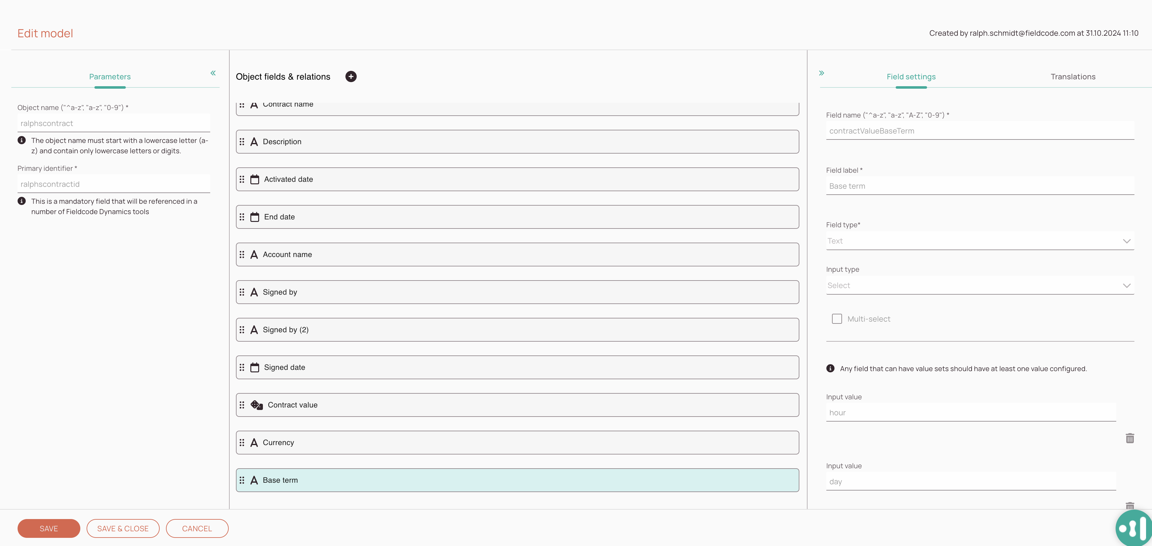
This section covers how the Objects Designer is structured. The Object Designer is structured in three different blocks, which all serve a purpose.
- The first block lets you configure general details of your custom model.
You can define the object name and define the primary identifier. - The second block lets you configure and arrange your object fields, relations, and dynamic lists.
You can design and arrange your object fields in this block. - The third block lets you configure field settings and translations.
You can configure on an individual field basis and configure field settings, and field translations in this block.
-
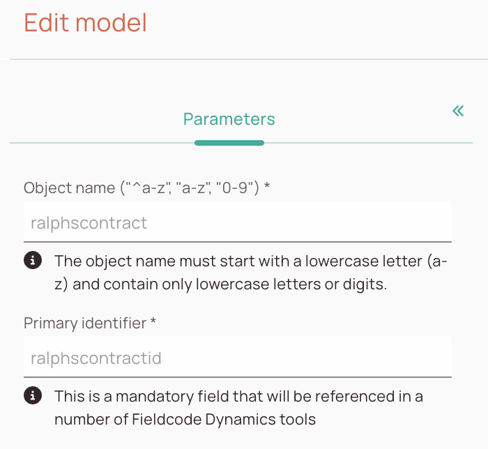
Parameters section: In this section, you define your object’s name. The backend uses this name, so it has to meet certain requirements, such as being written together and avoiding special characters.
-
Objects designer section: In this section, you can add fields to your model and customize the order of the fields by dragging and dropping them. You can add fields, relations, and dynamic fields to your model and drag them all together to your desired order.
-
Field settings section: In this section, you can adjust all the individual field settings.
-
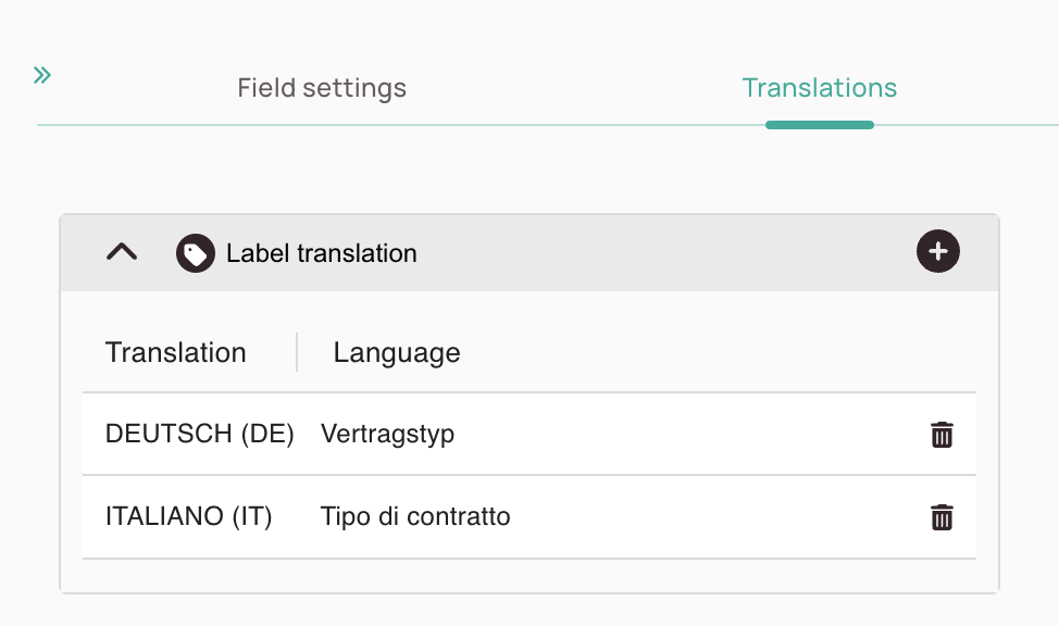
Translations section: In this section, you can add custom translations for the fields.
About the Parameters Tab
-
Object name field: You can decide if your custom form should be activated in the system.
-
Primary identifier field: It is mandatory to enter a name for your new form.
About the Translations Tab
-
The Add filter button allows you to add translations for a selected field/relation/dynamic list.
-
Inline edit button: Gives you the option to inline edit the translation.
-
Trash button: Gives you the option to delete the current translation.
About Field Types
Text:
- The Text field type should be used for text-based scenarios.
- The Text type can be combined with the following input types:
Text field, Text Area, Select, Checkbox, Radio.
Number:
- The Number field type should be used for number-based scenarios.
- The Number type can be combined with the following input types:
Text field, Select, Slider.
Boolean:
- The Boolean field type should be used for true or false-based scenarios.
- The Boolean type can be combined with the following input types:
Radio, Checkbox.
Date Time:
- The Date time field type should be used if you want your users to enter a date and time.
- The Date Time type can be combined with the following input types:
DateTime Picker.
Date:
- The Date field type should be used if you want your users to enter a date only.
- The Date type can be combined with the following input types:
DateTime Picker.
Time:
- The Time field type should be used if you want your users to enter a time only.
- The Time type can be combined with the following input types:
DateTime Picker.
About Input Types
Select:
- The select input type gives users the option to select a value or multiple values from a dropdown.
- If users should be able to select multiple values at once, the multi-select checkbox should be on.
- If users should be able to pick only one value, the multi-select checkbox should be off.
- Values have to be defined for the select input type.
DateTime Picker:
- The DateTime Picker lets users pick either dates and times or both combined dependent on the previously selected field type.
- If the Date Time type is selected, the user will be able to enter a date and a time.
- If the Date type is selected, the user will be able to enter a date.
- If the Time type is selected the user will be able to enter a time.
1.1. Field Settings
What is the purpose of fields when creating objects?
Fields are an core part of your object. Without fields your object would not work.
-
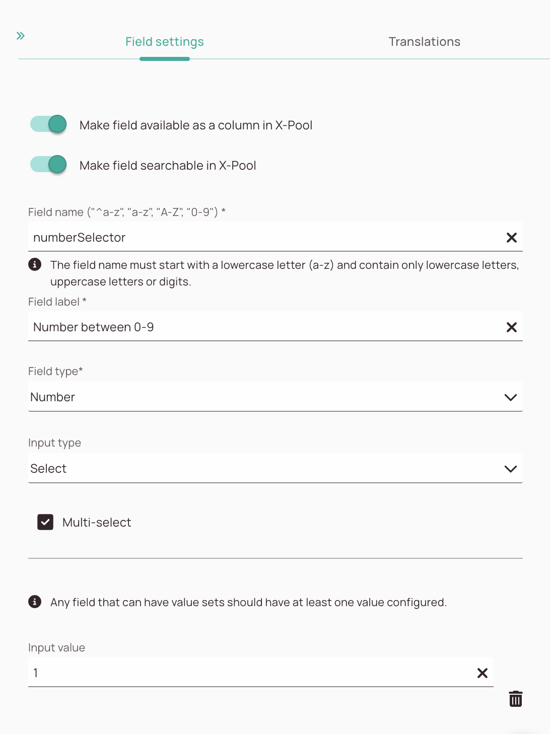
“Make field available as a column in X-Pool” toggle: Users can arrange the X-Pool columns according to their personal preference. This toggle is turned on by default and allows end users to use this field for column customization. If turned off this particular field won’t be visible and customizable inside the X-Pool.
-
“Make field searchable in X-Pool” toggle: You can make your field searchable inside the X-Pool. This toggle is turned on by default and allows users to find the field via the X-Pool search.
-
Field name field: The field name field is used by the backend. Therefore it has to meet certain requirements, such as being written together and the avoidance of special characters.
-
Field label field: Here you can define the field label. The field label is displayed to the end user and should explain to the end user what the field is about.
-
Field type dropdown: Here you can select the field type from the dropdown.
-
Input type dropdown: Here you can select the input type from the dropdown. Which input type is selectable depends on the chosen field type.
-
Multi-select checkbox: This checkbox allows users to pick more than one value at once. Dependent on field type/input type it can be grayed out.
-
Input value field: Here you can enter values that users can pick later. Dependent on field type/input type you can enter values or not.
-
Trash button: You can delete values with the trash button.
-
Plus button: You can add additional values by clicking the plus button.
1.2. About Relations
What is the purpose of relations when creating objects?
This section is not finished yet, stay tuned!
1.3. About Collections
What is the purpose of collections when creating objects?
This section is not finished yet, stay tuned!
1.4. About Dynamic Lists
What is the purpose of dynamic lists when creating objects?
This section is not finished yet, stay tuned!
What are dynamic list filters?
This section is not finished yet, stay tuned!
2. Creating/Editing Objects
This section is not finished yet, stay tuned!
0 out of 5 stars
| 5 Stars | 0% | |
| 4 Stars | 0% | |
| 3 Stars | 0% | |
| 2 Stars | 0% | |
| 1 Stars | 0% |


