Tip: You can use filters for better results
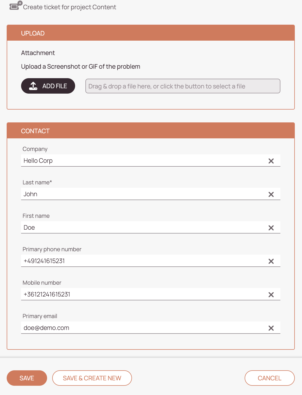
📃 Create Form
Used when creating a new ticket/object record.
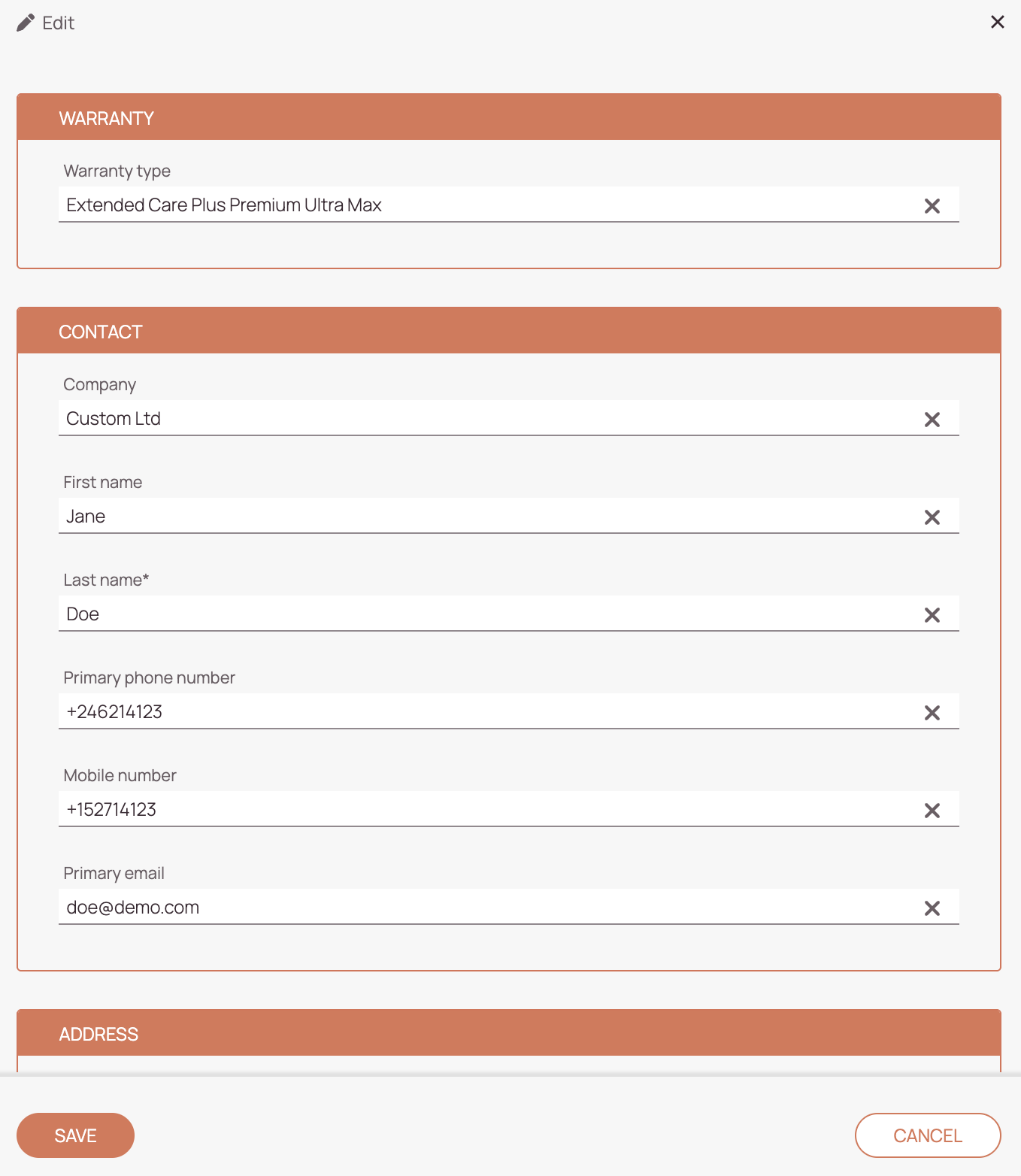
📃 Edit Form
Used to modify existing ticket or appointment data.
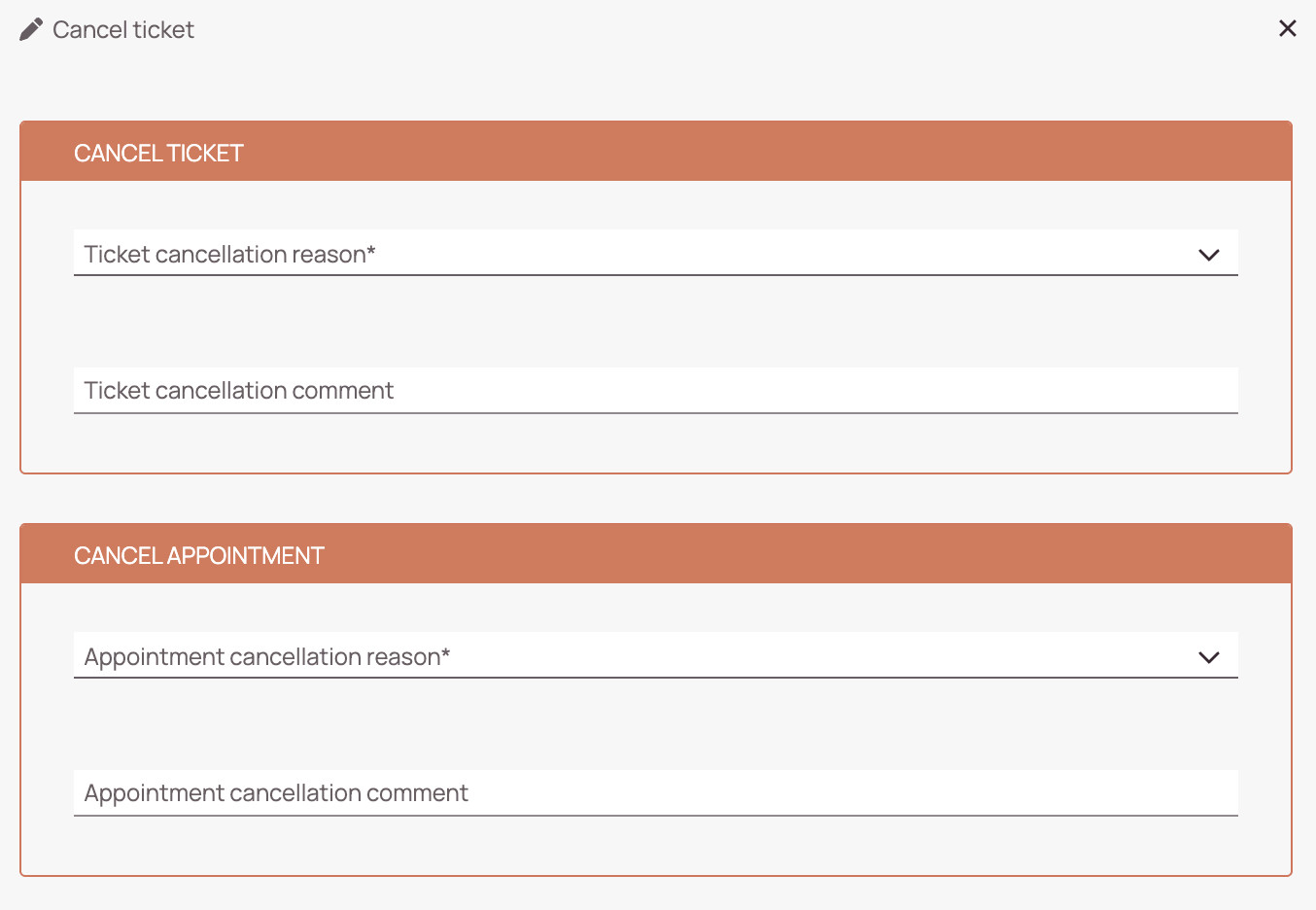
📃 Cancel Form
Used to cancel an appointment or ticket.
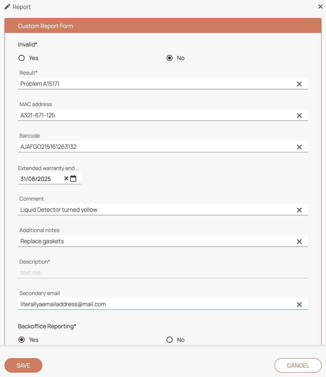
📃 Report Form
Used to submit a report after completing a task.
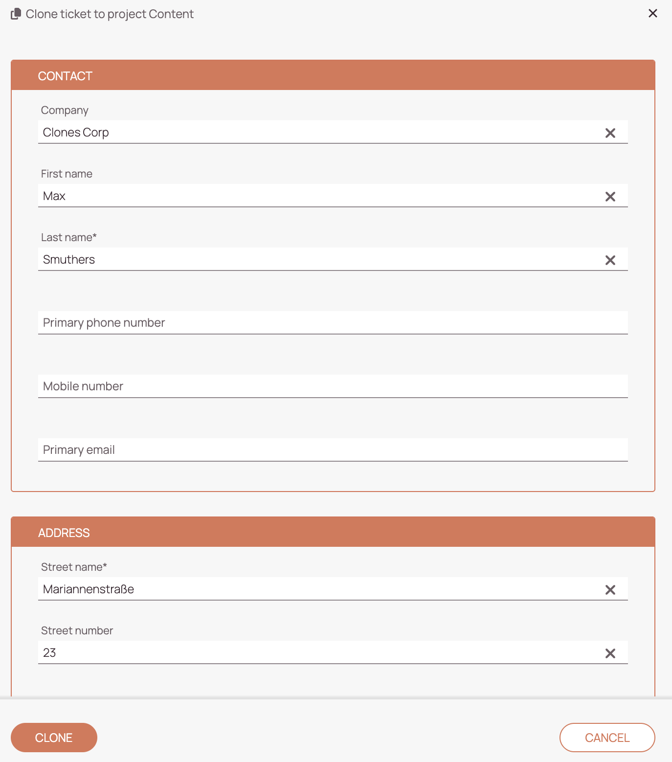
📃 Clone Form
Used to submit a report after completing a task.
-
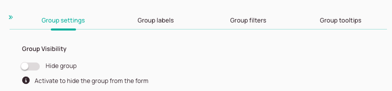
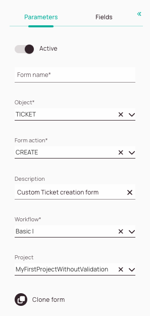
Active toggle: You can decide if your custom form should be activated in the system.
-
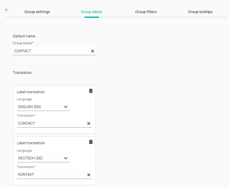
Form name field: It is mandatory to enter a name for your new form.
-
Object field: Decide the “category” for which you want to create a form. The field is mandatory.
Available object types are explained further below. -
Form action field: Decide for which action type the form should be tailored.
-
Description field: Describe the purpose/usage scenario for your custom form.
-
Workflow field: Select the workflow for which the form should be applied.
-
Project field: Select a project or more projects for which the form should be applied. If you don’t select any project the form will be visible for all projects.
-
Clone form button: Allows you to quickly clone your form. You can insert your cloned form inside a new opened form item and create a new custom form outgoing from the basis of the cloned form.
-
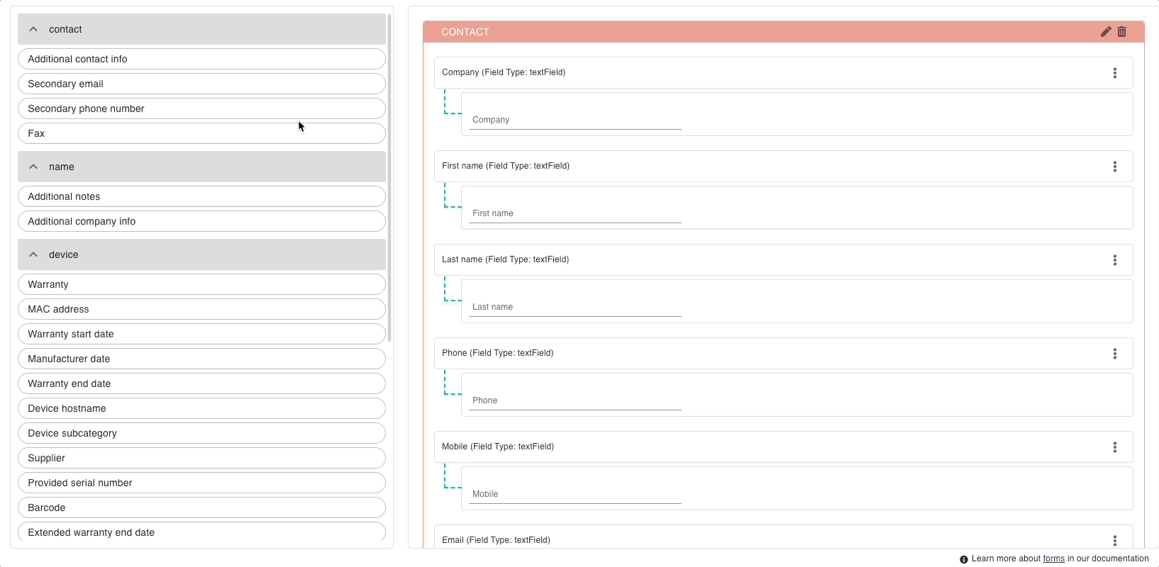
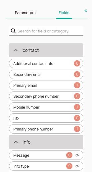
Search box for fields/categories: This allows you to search for certain fields or categories that are available in the system. The search works with labels and database names, which helps to ensure that you find the right field for your form. The unique name of a custom field = database name. The label of a custom field = name the user decided for, not relevant to the search database.
-
Form fields: The for the edition available form fields. They are grouped into different containers (eg. Device, Contact). You can also create custom form fields directly from the custom fields editor.
-
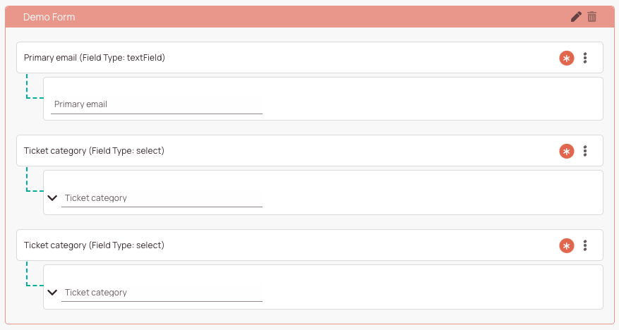
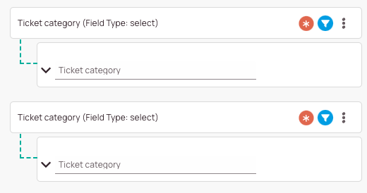
Field usage count indicator:
Indicates how often a field has been used inside this form.
Example: We use the secondary email field two times in this form.
Why? Because we simply use the same field multiple times OR because we might have created a so-called “render condition” field.
What is a render condition field? A “render condition” field can display different answer possibilities depending on the configuration. We use two times the email field, and we configured them so, that one of them only pops under a certain condition while the other one pops up under another condition. The count helps you to understand how many same fields you have for your render conditions. -
Linked indicator: Indicates that a field should only be used together with the other linked field or fields. Otherwise you could run into issues.
-
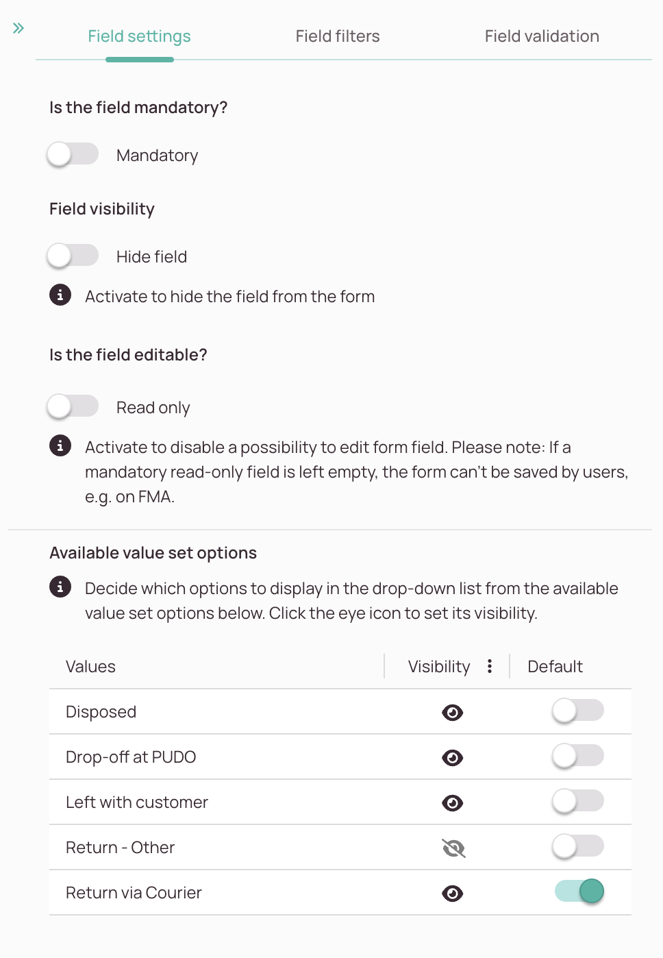
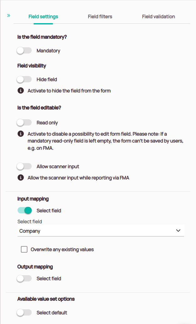
Mandatory toggle: Decide if the user has to fill in this particular field or can skip this field when filling in a form.
-
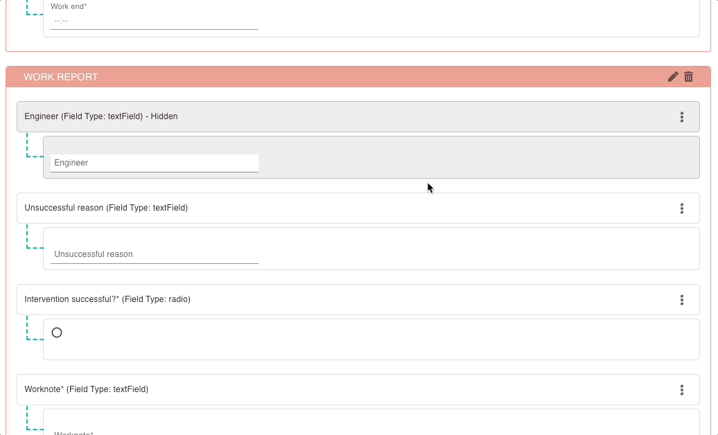
Hide field toggle: Decide if you want to hide this particular field from the form, so it is not visible to others (respectively only under certain conditions).
-
Read only toggle: Decide if your field should be read-only.
Read-only fields cannot be edited by form users and serve informational purposes.
Please note: If a mandatory read-only field is left empty, the form can’t be saved by users, e.g. on FMA. -
Allow scanner input: Enabling this allows engineers to scan bar codes and QR codes using the camera on their mobile device to quickly fill in fields like the serial number.
-
Input Mapping: Activate to automatically fill in this field with a value from another field.
-
Output mapping: Use this option to have the input from this fieldsent as input for another field.
-
Select default toggle: The default value will be the first pre-selected choice for the user of your form.
Form default value -> Is the default value that the user gave to the custom field in form creator and will be applicable only for this form.
Global default value -> Is the default value provided in the custom field page and applies to all forms.
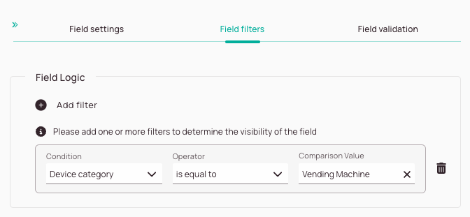
Field logic: Add field logic to determine if this particular field should be visible nonetheless.
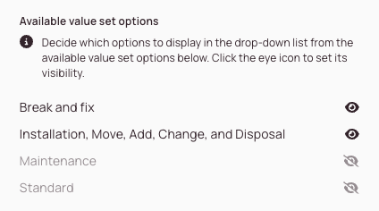
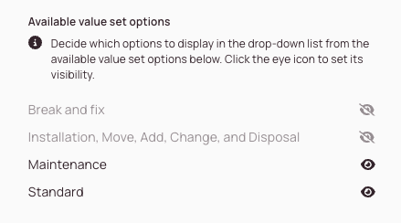
Eye icons: Determine which values should be selectable for this particular field.
-
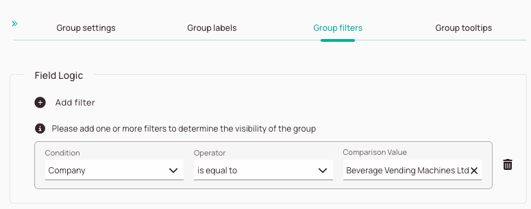
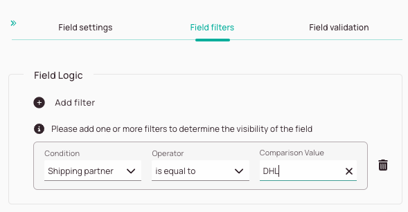
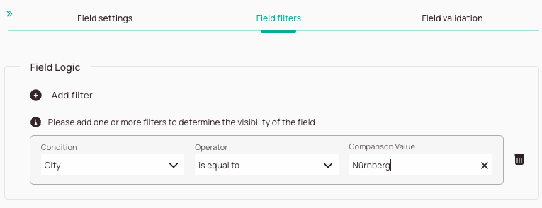
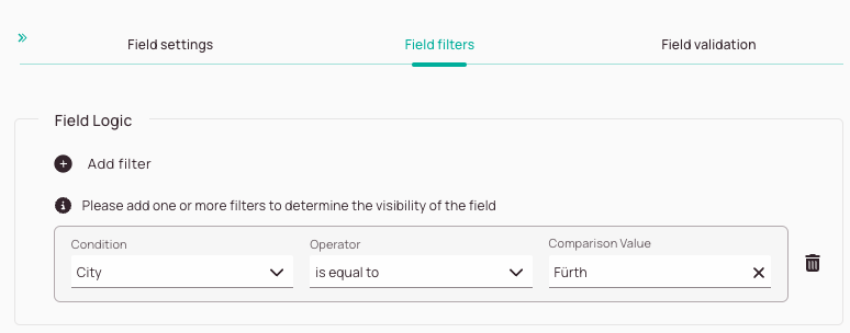
The Add filter button allows you to add field filters. With Field filters you can determine under which circumstances a field should be displayed.
-
Condition dropdown: This gives you the option to define a filter condition for your filter.
-
Operator dropdown: Compares the condition with the comparison (IS EQUAL TO, IS NOT EQUAL TO, IS LIKE, IS NOT LIKE, IN).
-
Comparison value dropdown: Defines with which value the condition is compared.
-
Trash button: Gives you the option to delete your current filter.
-
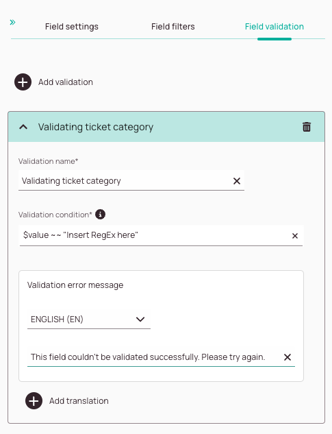
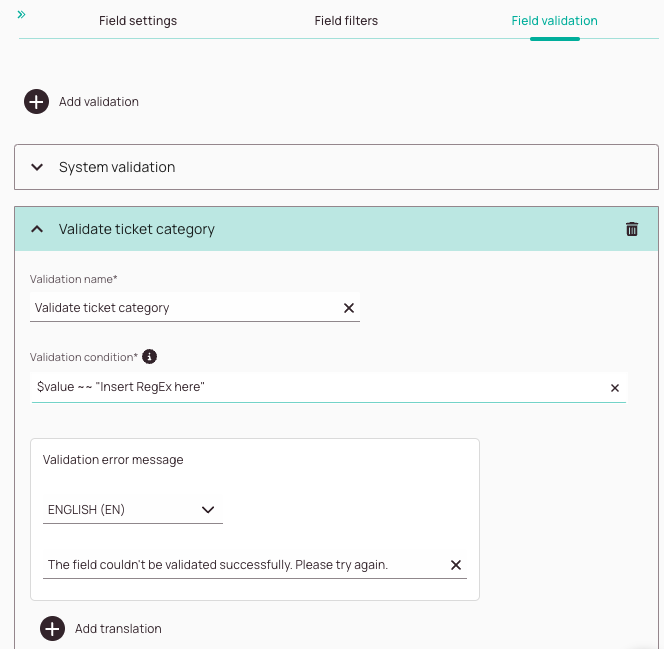
The Add validation button lets you add one or more field validations.
-
In this field you can enter a name for your validation.
-
You can enter a validation condition in the Validation condition field. The following languages are supported: RegEx or using our scripting syntax. You can enter your custom RegEx if you insert the below command: $value ~~ “Insert RegEx here”
You can also use our scripting syntax to create validations.
How operators are used correctly is explained further below in this section under How to pull up the field list and How to use and combine operators. -
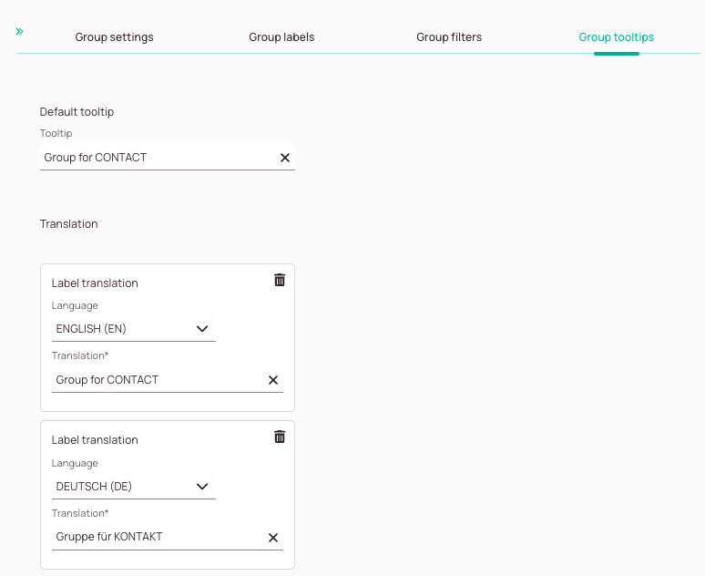
This field lets you decide to which language you want to translate the validation error message.
-
In this field, you can enter an error message that should pop up in case the validation fails. You also have the option to customize the error message for other languages by clicking on the Add translation button.
-
The Add translation button lets you add other language variants for the error message.
-
The trash button lets you delete a field validation.
-
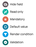
Hide field indicator:
Indicates that a field is hidden and will not be displayed to the user using the form. -
Read-only field indicator:
Indicates that a field is a read-only field. Read-only fields cannot be edited by form users and serve informational purposes.
Please note: If a mandatory read-only field is left empty, the form can’t be saved by users, e.g. on FMA. -
Mandatory field indicator:
Indicates that a field has been configured as “mandatory” for the form user. Example: It could be for example mandatory for the user to fill in a telephone number, because with out this field filled in the process cannot proceed. The form will warn the user, that he has to fill in this field in order to proceed with the process. -
Default field indicator: Indicates that a field is a default field.
Changing default fields is not advised as you may break your form.
Please note that there are two types of default values:
Global Default Value -> Is the default value provided on the Custom Fields page and applies to all forms.
Form Default Value -> Is the default value that the user assigned to the custom field in the form creator and is only valid for this specific form. -
Render condition field indicator:
Indicates that a field or group has been configured as “render condition” field. Example: We use the secondary email field two times in the example form above.
Why? Because we have created a so-called “render condition” field!
What is a render condition field? A “render condition” field can display different answer possibilities depending on the configuration. We use two times the email field, and we configured them so, that one of them only pops under a certain condition while the other one pops up under another condition. The render indication indicator helps you to understand if a field is a render condition. -
Validation field indicator:
Indicates that a validation has been configured for this field.
-
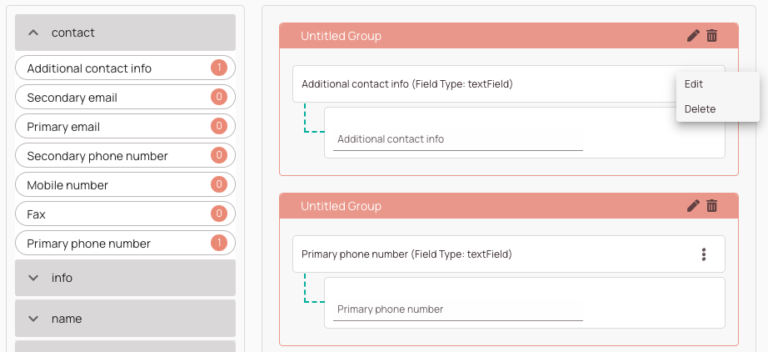
With the pencil button, you can edit the group category (container), while with the trash button, you erase a whole group category (container).
-
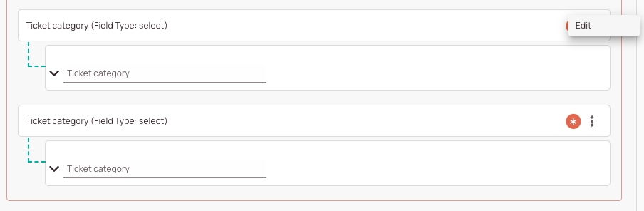
Opens the context menu of a field (Edit/Delete).
-
This is the open context menu of a custom form field.