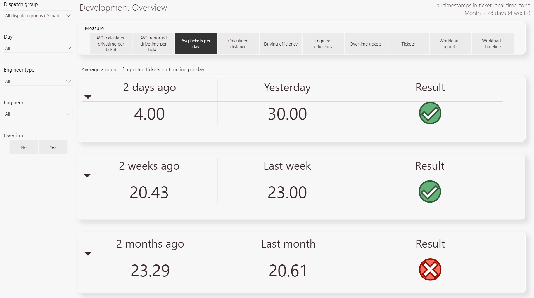
Tip: You can use filters for better results
-
The dispatch group filter lets you filter the analytic results clustered by dispatch group or multiple dispatch groups.
-
The day filter lets you filter the analytic results by the day or days of the week
-
The engineer type filter lets you filter the type of engineer internal or external.
-
The engineer filter lets you filter by engineer.
-
You can choose whether to consider overtime or not.
-
Choose from a variety of different measures to make your comparison.
-
This header explains the calculation used for the selected measure.
-
Displays the results of the measure selected by comparing: Yesterday- 2 days ago, Last week- 2 weeks ago, Last month – 2 months ago
-
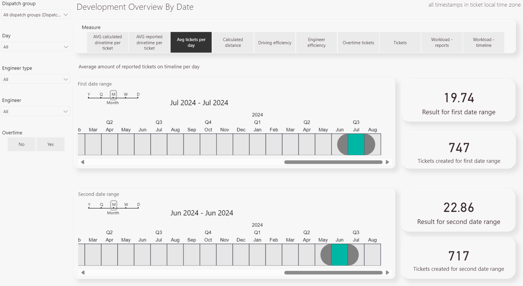
The dispatch group filter lets you filter the analytic results clustered by dispatch group or multiple dispatch groups.
-
The day filter lets you filter the analytic results by the day or days of the week
-
The engineer type filter lets you filter the type of engineer internal or external.
-
The engineer filter lets you filter by engineer.
-
You can choose whether to consider overtime or not.
-
Choose from a variety of different measures to make your comparison.
-
This header explains the calculation used for the selected measure.
-
Select the custom date ranges you want to compare with the selected measure.
-
Displays the results of the selected custom date ranges based on the selected measure.
-
In preparation!
-
In preparation!
-
In preparation!
-
In preparation!
-
In preparation!
-
In preparation!
-
In preparation!
-
In preparation!
-
In preparation!
-
In preparation!
-
In preparation!
-
In preparation!
-
In preparation!
-
In preparation!
-
In preparation!
-
In preparation!
-
In preparation!
-
In preparation!
-
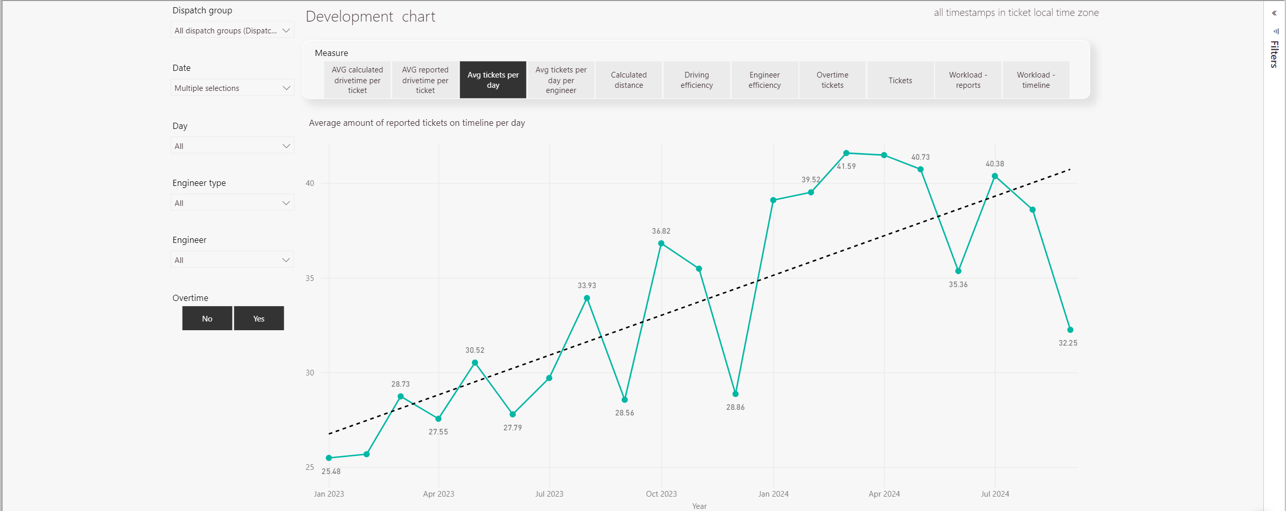
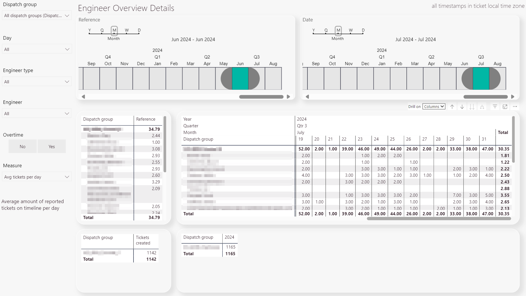
The dispatch group filter lets you filter the analytic results clustered by dispatch group or multiple dispatch groups.
-
The date filter lets you filter the analytic results by a specific date.
-
The day filter lets you filter the analytic results by the day or days of the week
-
The engineer type filter lets you filter the type of engineer internal or external.
-
The engineer filter lets you filter by engineer.
-
You can choose whether to consider overtime or not.
-
Choose from a variety of different measures to make your comparison.
-
This header explains the calculation used for the selected measure.
-
Displays the results of the selected measure in a table format.
-
Displays the results of the selected measure in a graph format.
-
The dispatch group filter lets you filter the analytic results clustered by dispatch group or multiple dispatch groups.
-
The day filter lets you filter the analytic results by the day or days of the week
-
The engineer type filter lets you filter the type of engineer internal or external.
-
The engineer filter lets you filter by engineer.
-
You can choose whether to consider overtime or not.
-
Choose from a variety of different measures to make your comparison.
-
This label explains the calculation used for the selected measure.
-
Select the custom date ranges you want to compare with the selected measure.
-
Displays the results of the selected custom date ranges based on the selected measure.
-
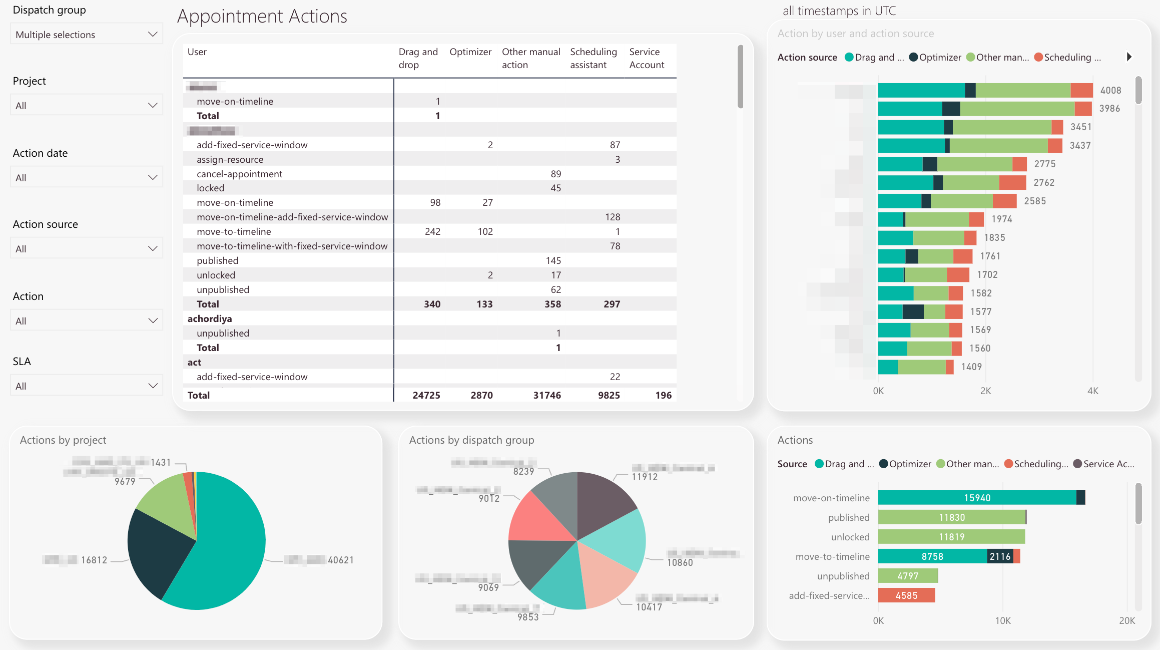
The dispatch group filter lets you filter the analytic results clustered by dispatch group or multiple dispatch groups.
-
The project filter lets you filter the analytic results clustered by project or multiple projects.
-
The action date filter lets you filter the occurred actions clustered by a particular date or multiple dates.
-
The action source filter lets you filter by action source. Action Sources of action can be, for example, the dragging and dropping of tickets, the use of the optimizer, or other manual actions. Manual actions are carried out manually by the user without the help of automatic system functions like eg. the Optimizer.
-
The action type filter lets you filter by action types. There are a lot of action types to discover and reading the title could already indicate to you which action does what. The move-to-Timeline-action-with-fixed-service-window, for example, displays all analytic data for the user action where users moved a ticket to the Timeline and entered a fixed service window.
-
The SLA filter lets you filter analytic results by a particular Service Level Agreement value or multiple SLA values. SLAs can be configured inside SLA Profiles.
-
The Appointment Actions table displays filtered results for all users to which selected filters may apply. You can check the individual action count displayed for each action, as well as summarized totals for each action. Actions are usually calculated by how much a user has done them for the selected action date time frame.
-
The All Timestamps in UTC chart displays you the action count and action source by user. This chart can help you to analyze which users perform most actions inside Work place and which users perform less actions in Work place. The chart can be drilled-down to a particular user or a particular action by clicking a value inside the Appointment Actions table.
-
The Actions by project pie chart displays you how actions are split up per projects. This chart can help you to analyze which particular projects required most actions.
-
The Actions by dispatch group pie chart displays you how actions are split up per dispatch group. This chart can help you to analyze which particular dispatch groups required most actions.
-
The Actions chart gives you a general idea about which actions where performed most for selected filters. This chart can help you to analyze where you may need to readjust dispatcher processes to better utilize the smartness which Work place provides.
-
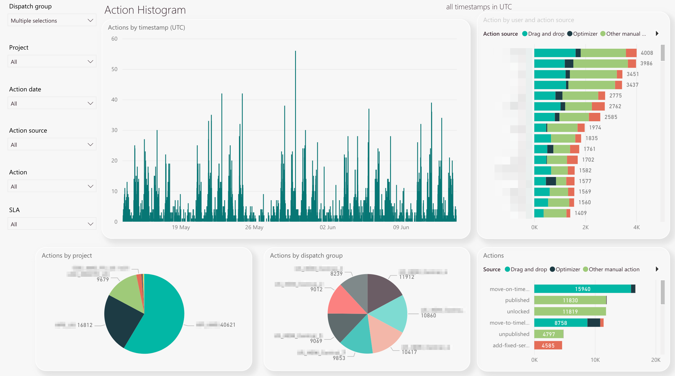
The dispatch group filter lets you filter the analytic results clustered by dispatch group or multiple dispatch groups.
-
The project filter lets you filter the analytic results clustered by project or multiple projects.
-
The action date filter lets you filter the occurred actions clustered by a particular date or multiple dates.
-
The action source filter lets you filter by action source. Action Sources of action can be, for example, the dragging and dropping of tickets, the use of the optimizer, or other manual actions. Manual actions are carried out manually by the user without the help of automatic system functions like eg. the Optimizer.
-
The action type filter lets you filter by action types. There are a lot of action types to discover and reading the title could already indicate to you which action does what. The move-to-Timeline-action-with-fixed-service-window, for example, displays all analytic data for the user action where users moved a ticket to the Timeline and entered a fixed service window.
-
The SLA filter lets you filter analytic results by a particular Service Level Agreement value or multiple SLA values. SLAs can be configured inside SLA Profiles.
-
The Actions by timestamp table displays the count of actions in a practical timetable. This helps you to identify for example “peak” or “lowest action times.
-
The Action by user and action source chart displays you the distribution of different actions sorted by highest action count. This helps you to identify which actions where performed most, and how many actions occurred in total per user. Interpreting this data can help you to spot users with the most actions.
-
The Actions by Project pie chart displays you the distribution of different actions sorted by project. This helps you to identify the projects for which the most actions were required.
-
The Actions by dispatch group pie chart displays you the distribution of different actions sorted by dispatch group. This helps you to identify the dispatch groups for which the most actions were required.
-
The Actions chart displays actions sorted by action type. This helps you to identify which action was performed most in general.
-
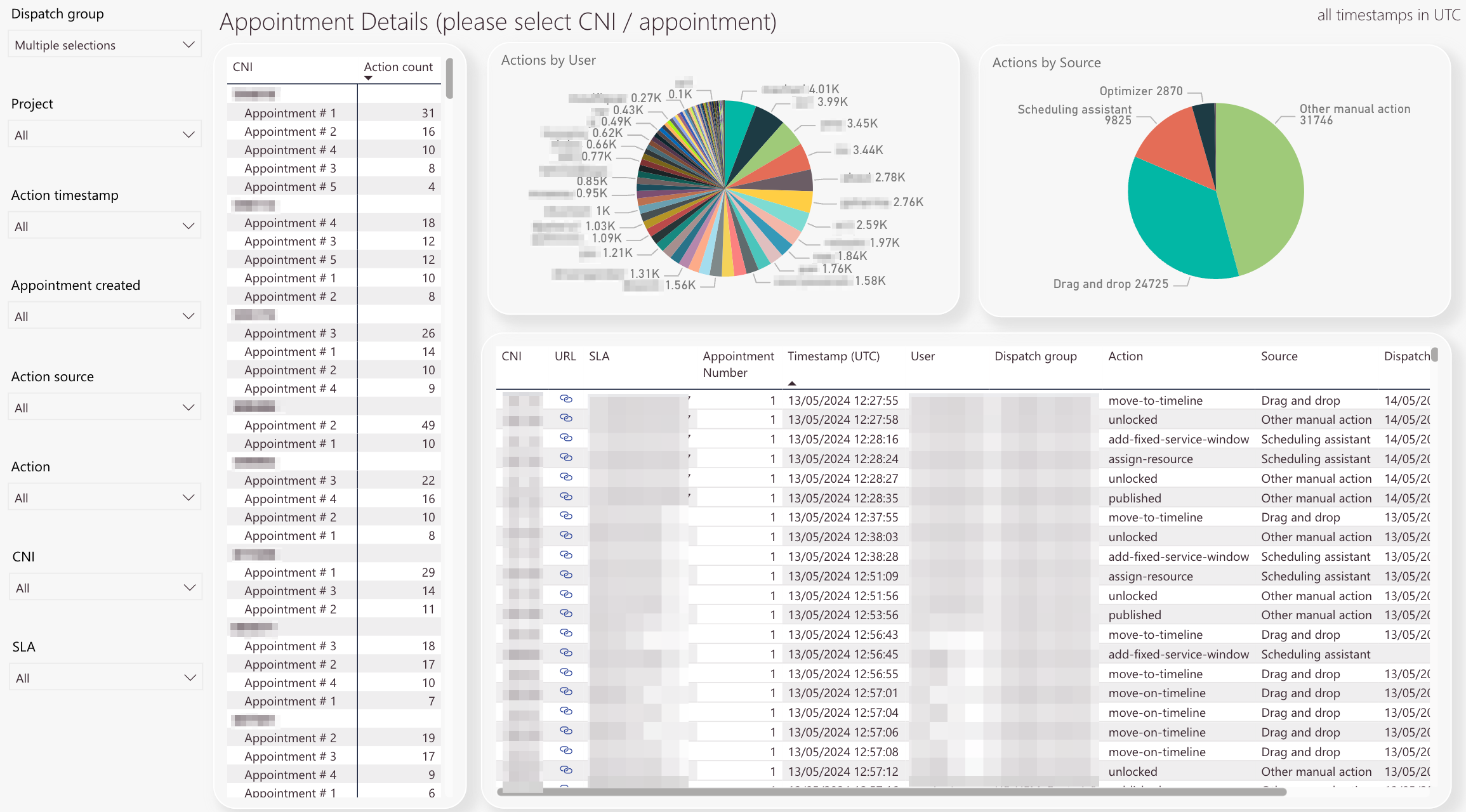
The dispatch group filter lets you filter the analytic results clustered by dispatch group or multiple dispatch groups.
-
The project filter lets you filter the analytic results clustered by project or multiple projects.
-
The Action timestamp filter lets you filter the analytic results clustered by action timestamp. A timestamp is a particular date or multiple dates displayed at once.
-
The Appointment created filter lets you filter the analytic results clustered by the appointment creation timestamp. A timestamp is a particular date or multiple dates displayed at once.
-
The action source filter lets you filter by action source. Action Sources of action can be, for example, the dragging and dropping of tickets, the use of the optimizer, or other manual actions. Manual actions are carried out manually by the user without the help of automatic system functions like eg. the Optimizer.
-
The action type filter lets you filter by action types. There are a lot of action types to discover and reading the title could already indicate to you which action does what. The move-to-Timeline-action-with-fixed-service-window, for example, displays all analytic data for the user action where users moved a ticket to the Timeline and entered a fixed service window.
-
The CNI filter lets you filter the appointment details analytic results by individual ticket or multiple tickets.
-
The SLA filter lets you filter the appointment details analytic results by a particular SLA definition or multiple SLA definitions. This helps you to analyze data by particular SLA definitions.
-
The Appointment details table displays the action count of a particular ticket per appointment. If you click on a particular CNI or appointment you will see that all the other charts update their data accordingly.
-
The Actions by User pie chart displays the action count by user. If you click on a particular CNI you will see how many actions came from which user and the other charts will update accordingly.
-
The Actions by Source pie chart displays the action type count per selected parameter. You can find out on a per-ticket-base which actions and how many of them were performed by reading this chart.
-
The Detail chart displays all details per CNE with precise timestamps. Clicking the blue chain button lets you quickly jump to the particular Ticket Details of the ticket inside Work place, so you can check the particular ticket directly in the system.
-
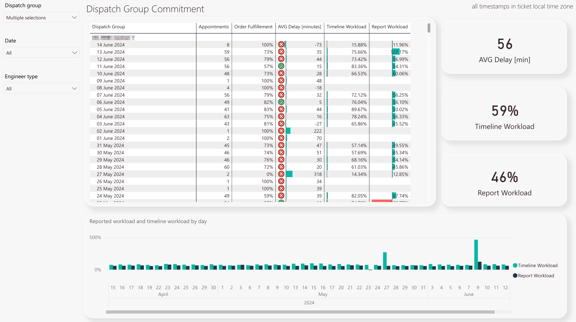
The dispatch group filter lets you filter the analytic results clustered by dispatch group or multiple dispatch groups.
-
The date filter lets you filter the analytic results for a specific date or multiple dates.
-
The engineer type filter lets you filter the analytic results by engineer type. You can split your analytic results by internal engineers, partner engineers or both of them combined.
-
The Dispatch Group Commitment table displays commitment details per date and per dispatch group. It displays how many appointments where done on a particular date, how the order fulfillment percentage was, how much delay (in minutes) per date happened, it displays the Timeline Workload, and the Report Workload. If the delay surpasses the 15 minute mark, a red cross will indicate this critical delay. A green checkmark means that the average delay doesn’t surpass the 15 minute mark.
-
The Average Delay (in minutes) box displays the total average delay in minutes for the filtered analytic parameters.
-
The Timeline Workload (in percent) box displays the total timeline workload for the filtered analytic parameters.
-
The Report Workload (in percent) box displays the total report workload for the filtered analytic parameters.
-
The Reported workload and Timeline workload by day histogram displays the Timeline Workload compared to the Report Workload for ach day.
-
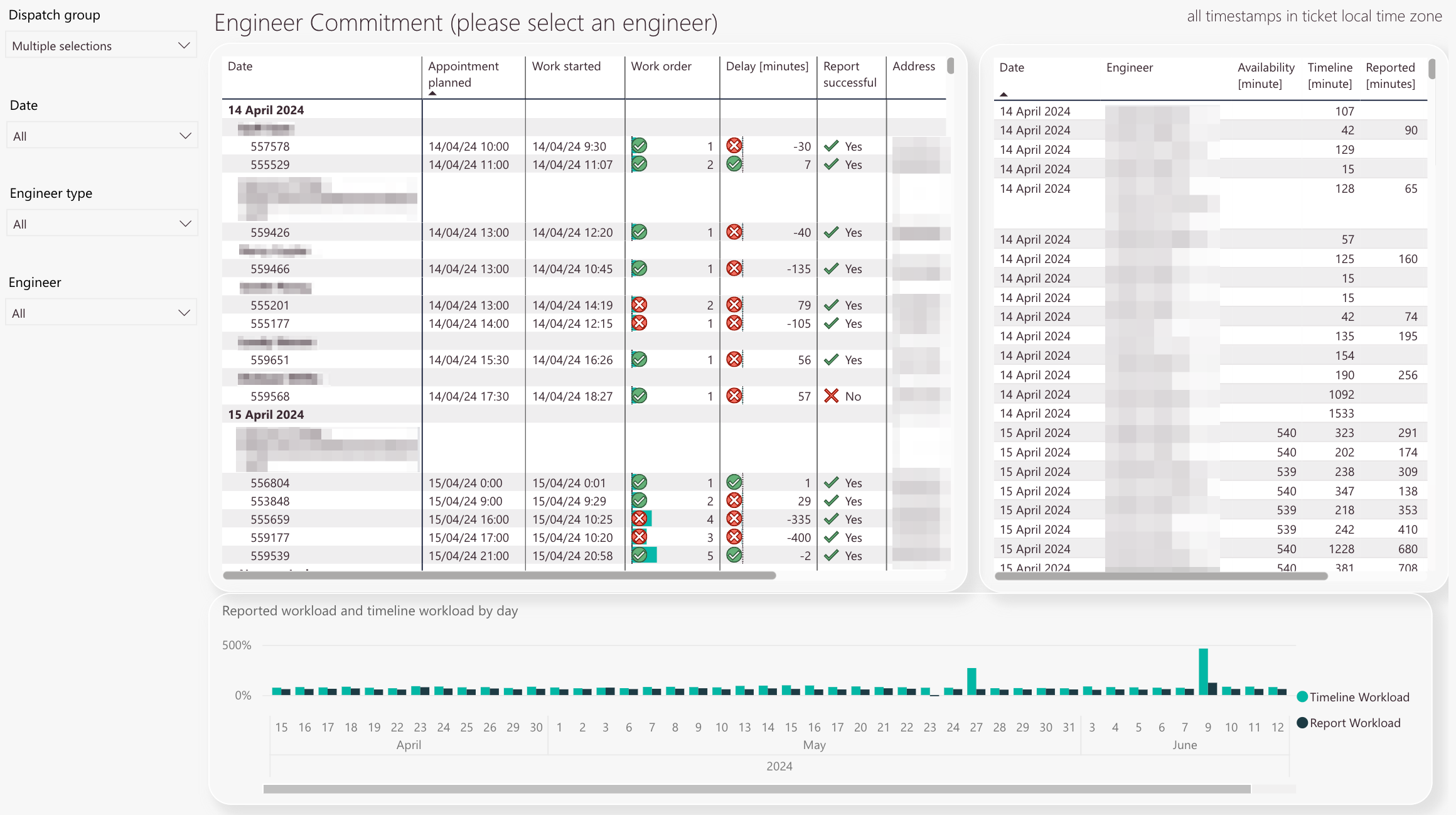
The dispatch group filter lets you filter the analytic results clustered by dispatch group or multiple dispatch groups.
-
The date filter lets you filter the analytic results for a specific date or multiple dates.
-
The engineer type filter lets you filter the analytic results by engineer type. You can split your analytic results by internal engineers, partner engineers or both of them combined.
-
The engineer filter lets you filter the analytic results by a particular engineer or multiple engineers.
-
The Engineer Commitment table displays commitment details per date and per engineer. It displays when an appointment was planned, when the work started, if the work order has been followed, if there was an delay for the work order, if the reporting went succesful, and the address. If the delay surpasses the 15 minute mark, a red cross will indicate this critical delay. A green checkmark means that the average delay doesn’t surpass the 15 minute mark.
-
The engineer details chart displays individual engineer details like date, engineer, availability minutes, Timeline minutes, reported minutes, Timeline Workload, and Report Workload.
-
Reported workload by day and Timeline workload by day in comparison
-
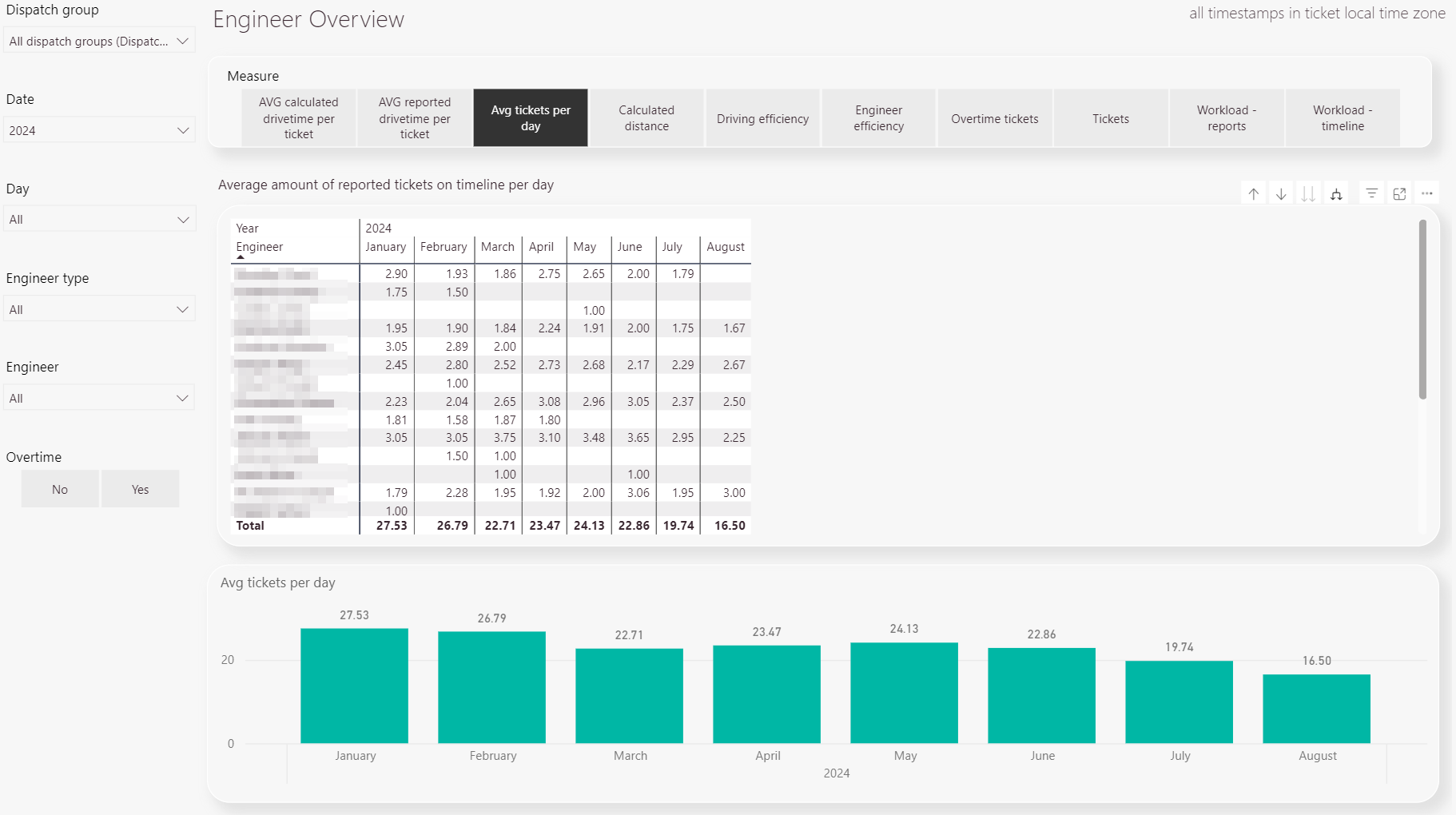
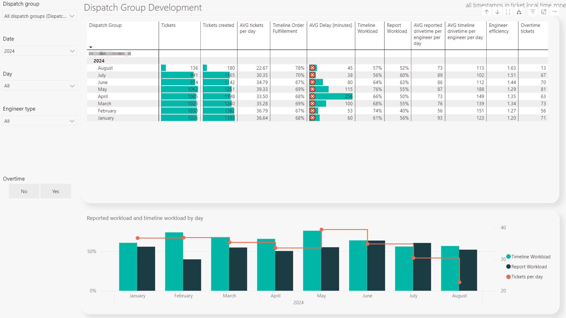
The dispatch group filter lets you filter the analytic results clustered by dispatch group or multiple dispatch groups.
-
The date filter lets you filter the analytic results by a specific date.
-
The day filter lets you filter the analytic results by the day or days of the week
-
The engineer type filter lets you filter the type of engineer internal or external.
-
You can choose whether to consider overtime or not.
-
Displays the results of the selected measure in a table format.
-
Displays the results of the selected measure in a graph format.
-
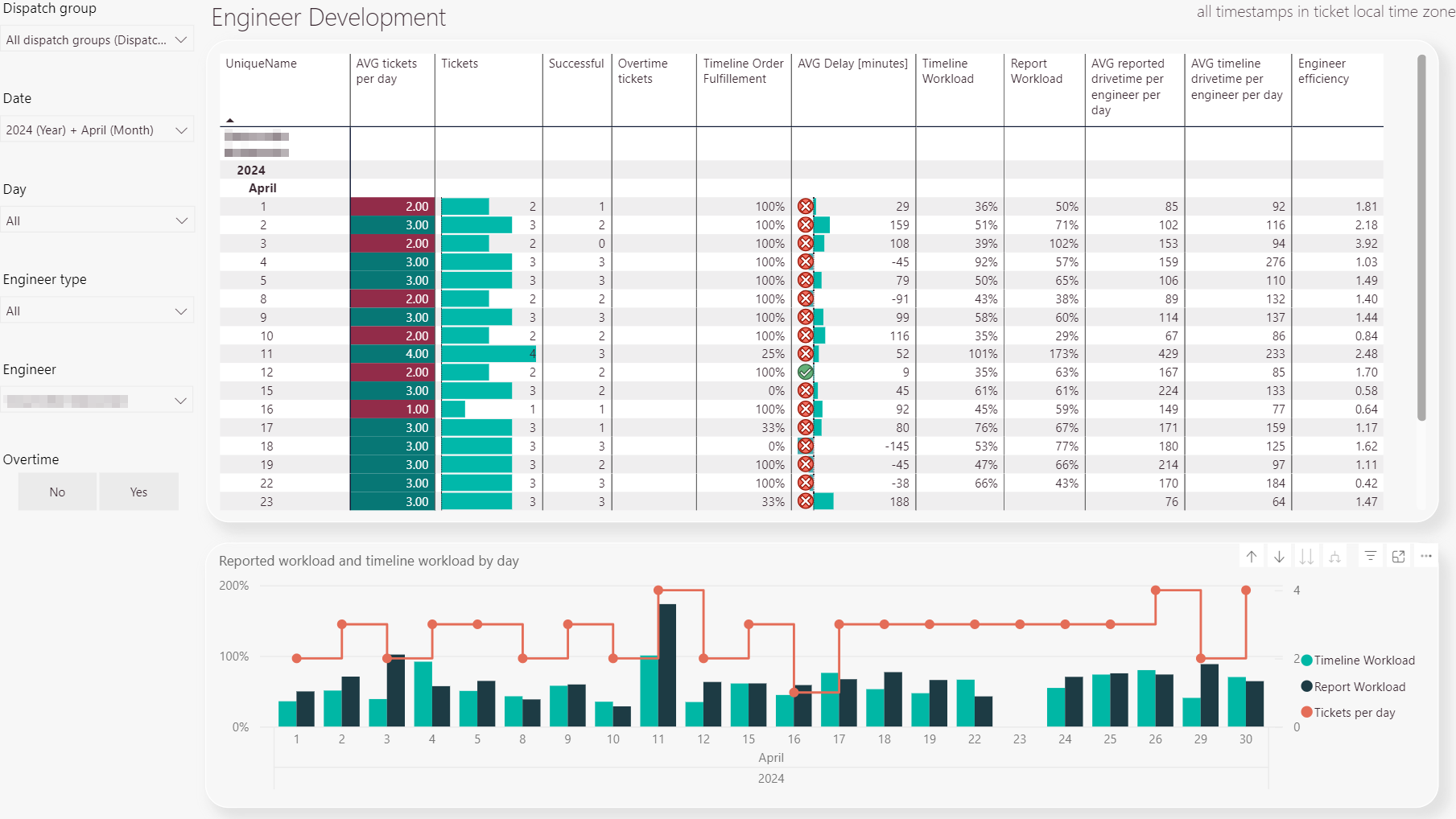
The dispatch group filter lets you filter the analytic results clustered by dispatch group or multiple dispatch groups.
-
The date filter lets you filter the analytic results by a specific date.
-
The day filter lets you filter the analytic results by the day or days of the week
-
The engineer type filter lets you filter the type of engineer internal or external.
-
The engineer filter lets you filter by engineer.
-
You can choose whether to consider overtime or not.
-
Displays the results of the selected measure in a table format.
-
Displays the results of the selected measure in a graph format.