Tip: You can use filters for better results
-
Latest News
-
Getting Started
-
Work Place
-
-
-
- About Buttons
- Action Buttons
- Schedule Tickets
- Ticket Info and COMS Buttons
- Add Parts
- Assign Partners
- Remove Tickets from the Ticket Clipboard
- Inline Skill Editing
- Create Intervention Info
- Create Intervention Reports
- Cancel Tickets
- Cancel Appointments
- Clone Tickets
- Edit Ticket Details
- Edit Privat Notes
- Report Tickets
- Close Tickets
-
Admin Panel
-
FMA 2 App
-
Customer Portal
We are currently still laying the groundwork for Fieldcode Plus, so please treat this topic as a pre-read. If you need Fieldcode Plus configured right now, please reach out to the Support.
About the Components Designer
To work properly with models, you have to create your custom workplace view, which should consist of custom components (namely X-Pool and X-Details). To realize this you have to design the component’s inner guts so that you can properly use the custom components from the Views designer. Let’s therefore take a closer look at how the Components designer works.
Inside the Admin panel go to Plus → Components Designer
Component Designer Structure
This section covers how the Components Designer is structured.
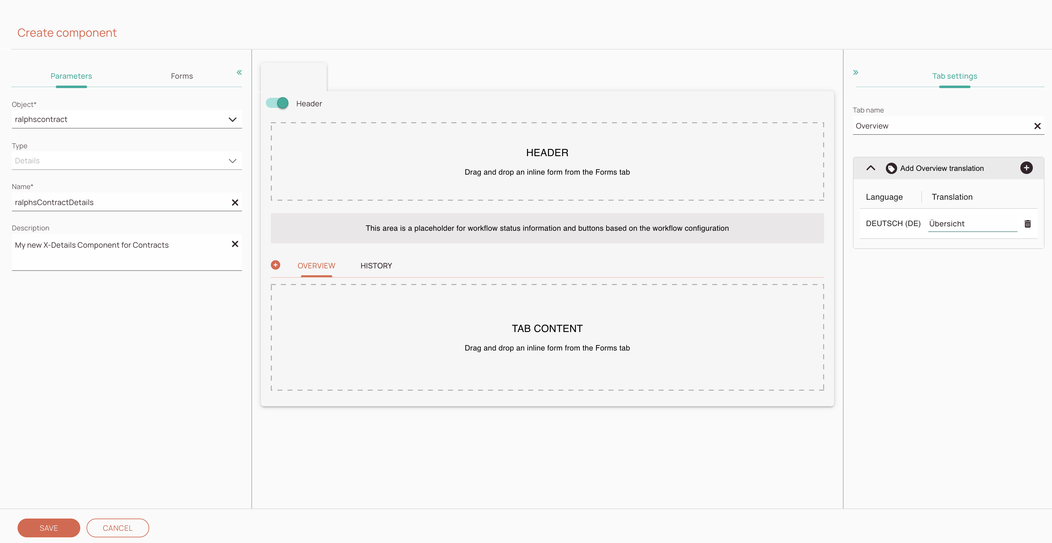
The components designer is structured in three different blocks, which all serve a purpose.
- The first block lets you configure the general details of your custom component.
You can select the object, select the component type, and name your new component. - The second block lets you configure and arrange your component.
You can design and arrange your custom components with custom forms. - The third block lets you configure tab settings and translations.
How to create custom components is described further below.
-
Parameters section: In this section, you select the object that should be used for this component. You also decide which component type you want to style and can also name your new component and describe your new component inside this section.
-
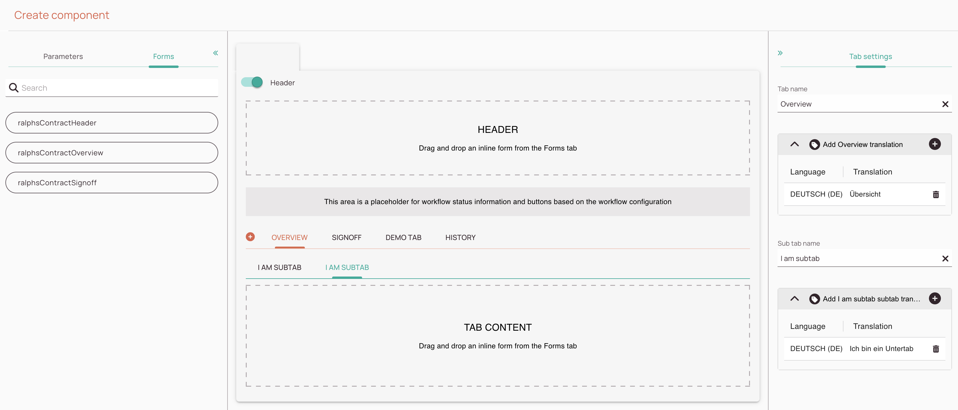
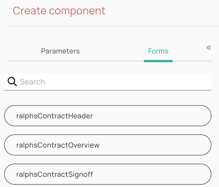
Forms section: From this section, you can drag and drop forms onto the Components designer section. You can also search through your existing forms by using the search bar inside the section.
-
Components designer section: In this section, you can add forms to your component (and preview the outcome) and can arrange the tabs via Drag and drop. You can also add new tabs to your component from here.
-
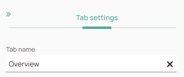
Tab settings section: In this section, you can adjust the individual tab names and add translations for your tabs.
-
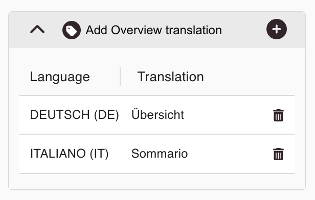
Translations section: In this section, you can add custom translations for your tabs.
About the Parameters Tab
-
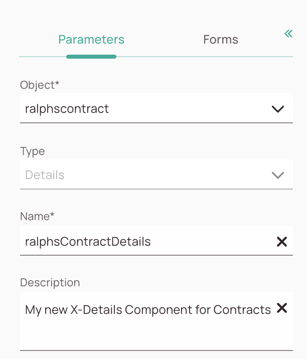
Object name dropdown: You can decide which model options should be available for your component.
-
Type field: You can decide which type of component you want to create for your model.
-
Name field: It is mandatory to enter a name for your new custom component.
-
Description field: You can enter a description for your new custom component.
About the Tags Section
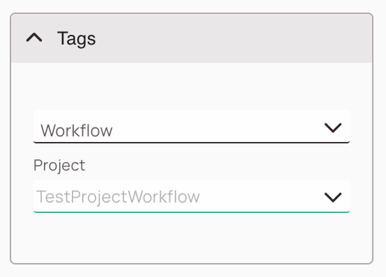
Tags control the scope of the inline form. The first time you create an inline form under a specific action type for your object, you must leave the Tags untouched (empty), so that this is provided as the default layout. If you want to define a specific layout for a workflow or project, after you’ve created a default inline form, create another specific inline form with the same action type. This allows you to change the appearance even on a workflow or project level.
-
Workflow dropdown: You can adapt the layout to a specific workflow or/and project. Leave it empty if you are creating a default inline form.
-
Project field: You can adapt the layout to a specific workflow or/and project. Leave it empty if you are creating a default inline form.
About the Forms Tab
-
Forms Search: You can search through existing custom forms via the search bar.
-
Form blocks: You can drag and drop your custom forms from the forms tab onto the Component designer.
About Tab Settings
-
Tab name field:When you create or edit tabs, you can name them in the Tab settings tab.
Translation Settings
You can add tab translations for other languages inside the translation settings.
-
Plus button: The plus button lets you add translations for other languages
-
Inline Editing: You can directly edit your translations by clicking inside them and typing.
-
Trash button: You can delete individual translations with the trash button.
Creating Custom Components
Components designer: You have various options inside the Components Designer. You can add for example tabs and subtabs by using the plus button. Inside the tab settings you can name your tabs as soon as you are interacting with them. Within the tab settings you can add your tab translations. Your goal is to move your custom forms to the right content spots such as Header, Tabs, and Sub Tabs.
Drag and dropping form blocks: What you therefore have to do is to drag and drop your custom forms to the right sections. In our example we move the Signoff inline form to the matching tab. In our example, we also use a custom header, which just displays a name. If you do not want to use a header at all, you could toggle the header switch off completely.
After clicking Save your custom component should be ready for usage and can be used for designing your view inside the Views Designer.
0 out of 5 stars
| 5 Stars | 0% | |
| 4 Stars | 0% | |
| 3 Stars | 0% | |
| 2 Stars | 0% | |
| 1 Stars | 0% |

