Tip: You can use filters for better results
-
Latest News
-
Getting Started
-
Work Place
-
-
-
- About Buttons
- Action Buttons
- Schedule Tickets
- Ticket Info and COMS Buttons
- Add Parts
- Assign Partners
- Remove Tickets from the Ticket Clipboard
- Inline Skill Editing
- Create Intervention Info
- Create Intervention Reports
- Cancel Tickets
- Cancel Appointments
- Clone Tickets
- Edit Ticket Details
- Edit Privat Notes
- Report Tickets
- Close Tickets
-
Admin Panel
-
FMA 2 App
-
Customer Portal
How to use the Workforce Insights Report
The Workforce Insights Report gives you insights to make the right short-term business decisions and assists you in the process of taking immediate crucial business-changing actions.
What is the particular purpose of the Workforce Insights Report?
With the help of Workforce Insights, you gain valuable insights regarding the performance of your engineers, absences of your engineers, on-call duty distribution, the productivity of engineers in graphical prepared views like plots and matrices, the productivity of whole dispatch groups, and workforce forecasts based on dispatched/non-dispatched tickets.
Who benefits most from the Workforce Insights Report?
These person groups can benefit most from the Workforce Insights Report: Team leaders of dispatchers, team managers of dispatchers, region managers, service delivery managers of areas, area managers, and short-term decision takers.
The Workforce Insights Report is best suited to team leaders who keep track of their dispatch groups and make short-term decisions (eg. organizing group structures).
Performance tab
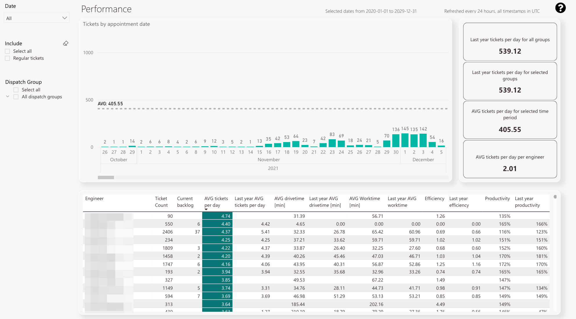
The Performance tab gives you general insights of your ticket distribution per group and per engineer.
-
Ticket count by appointment date
-
Average ticket count
-
Tickets opened per day for all groups
-
Tickets opened per day for selected group
-
Average opened tickets per day for selected time period
-
Average opened tickets per day per engineer
-
Detail view including individual ticket count, ticket backlog, last years’ average tickets per day, average drive time in minutes, last years’ average drive time, last years’ average work time, efficiency factor, last years’ efficiency factor, productivity, and last years’ productivity
-
Date filter
-
Ticket filter
-
Dispatch group filter
What is the particular purpose of this report?
To gain an overview of ticket distribution per group and per engineer.
What information can you get out of this particular report?
Tickets by appointment date, Last year’s tickets per day for all groups, last year’s tickets per day for selected groups, average tickets per day for selected time and period, average tickets per day per engineer, and rich detail stats for individual engineers.
What does all the information stand for and how to read it?
Numbers are rounded to two decimal places and are used for displayed stats and percentages are used for the productivity stats.
Which related reports might be considered to get a clearer/more detailed picture of the information?
All other Workforce Insights including all possible drill-throughs.
How can the report be customized using filters?
You can filter by date.
You can filter by regular tickets.
You can filter by dispatch groups.
You can combine all three filters.
Absences tab
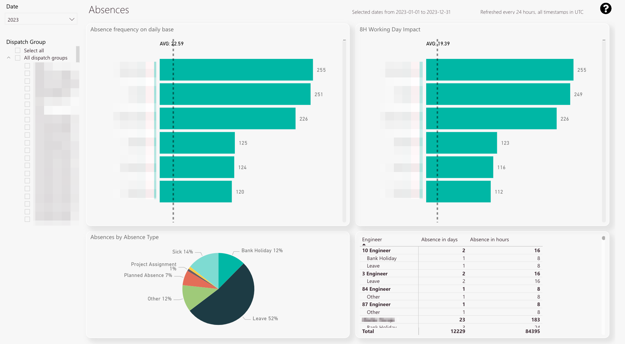
The absences tab displays an overview of your current impacts of sick days and displays percentages of different absence types. There are also tabs for on-call duties and Work times providing you with crucial stats.
-
Absence frequency on a daily base
-
Average of all collected absence days
-
Affected working days per engineer normalized to an 8 hours working day
-
Average of all collected absence days (8 hours working days)
-
Absences separated by absence type
-
Detail view with absence type, affected days, and absences in hours
-
Year/Month filter
-
Dispatch group filter
What is the particular purpose of this report?
To gain an overview of the absence situation of your engineers.
The view allows you to compare engineers and their absence situation.
What information can you get out of this particular report?
In the top view, you see the affected working days per engineer and an average line that indicates the average affected working days for your dispatch group.
In the bottom view, you see the affected working days per engineer normalized to the 8-hour work day. This even gives you a more precise idea than the top view.
The left-bottom pie chart displays the absences separated by different absence types. This helps you to identify the ratio of different absence types.
The right-bottom list view displays a detailed view of the group with the absence type and affected working days and gives you the absences in hours.
What does all the information stand for and how to read it?
Numbers are used as units. The numbers stand for days (top view, bottom view) or absences hours (right-bottom detail view).
Which related reports might be considered to get a clearer/more detailed picture of the information?
All other reports which are inside the Workforce Insights tab.
How can the report be customized using filters?
You can filter by months and years.
You can filter by a dispatch group or more dispatch groups.
You can combine the months/years filter with the dispatch groups filter.
Call Duties tab
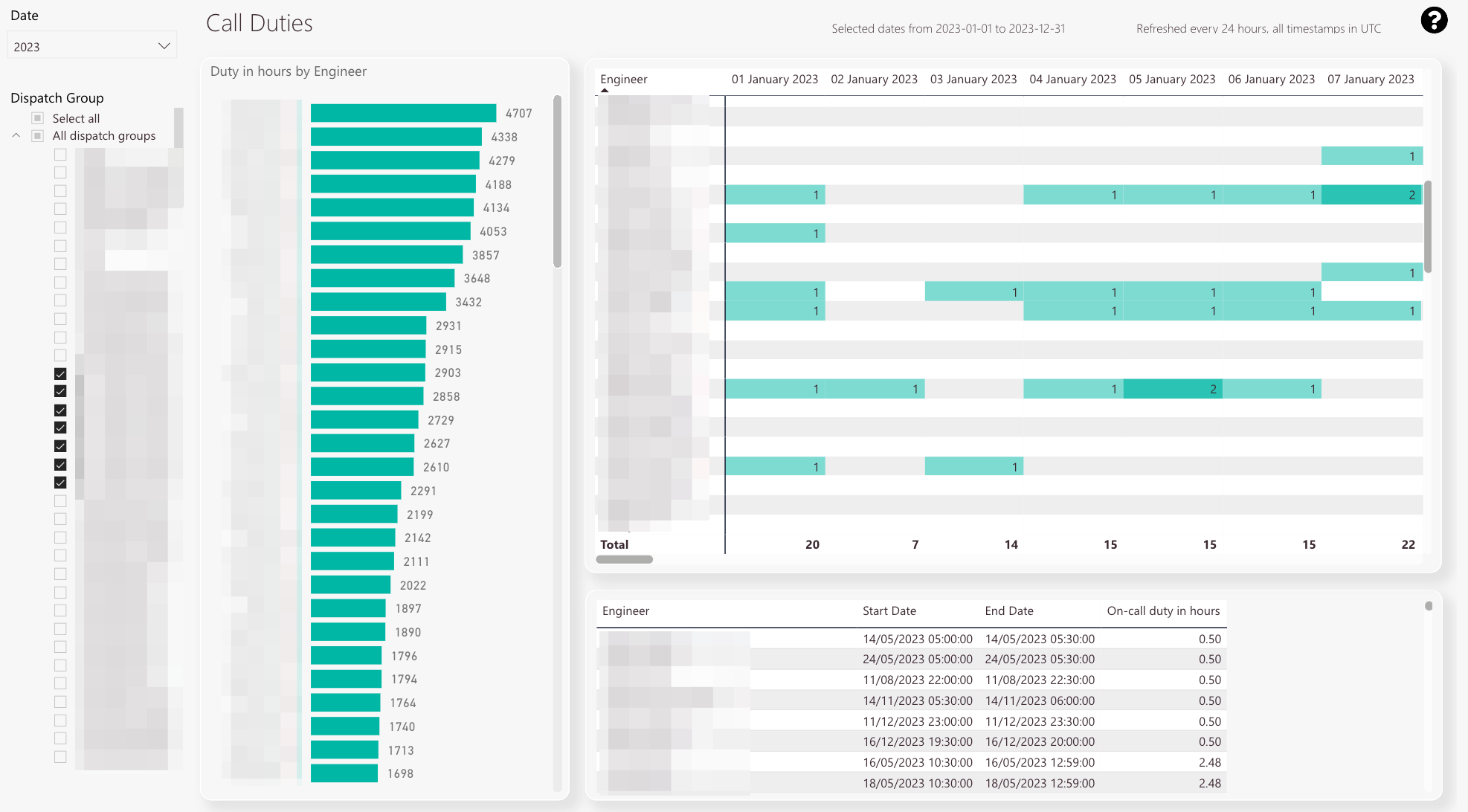
The call duties tab displays insights regarding the on-call duty distribution of your engineers:
-
Total call duty hours per engineer
-
On-call duty matrix by date and engineer
-
Detailed data about on-call duty start time, on-call duty end time, and on-call duty in hours
-
Date filter
-
Dispatch group filter
What is the particular purpose of this particular report?
To gain an overview of the on-call duty situation of your engineers.
The view allows you to compare engineers and their on-call duty situation.
What information can you get out of this particular report?
In the left view, you see the total call duty hours per engineer (in thousands).
In the right view, you see the count of on-call duty days by date and full name.
In the right-bottom view, you see detailed data like on-call duty start and end times and on-call duty in hours.
What does all the information stand for and how to read it?
Numbers are used as units. The numbers stand for hours (top view) or on-call duty days (bottom view).
Which related reports might be considered to get a clearer/more detailed picture of the information?
All other reports which are inside the Workforce Insights tab.
How can the report be customized using filters?
You can filter by months and years.
You can filter by a dispatch group or more dispatch groups.
You can combine the months/years filter with the dispatch groups filter.
Productivity Matrix tab
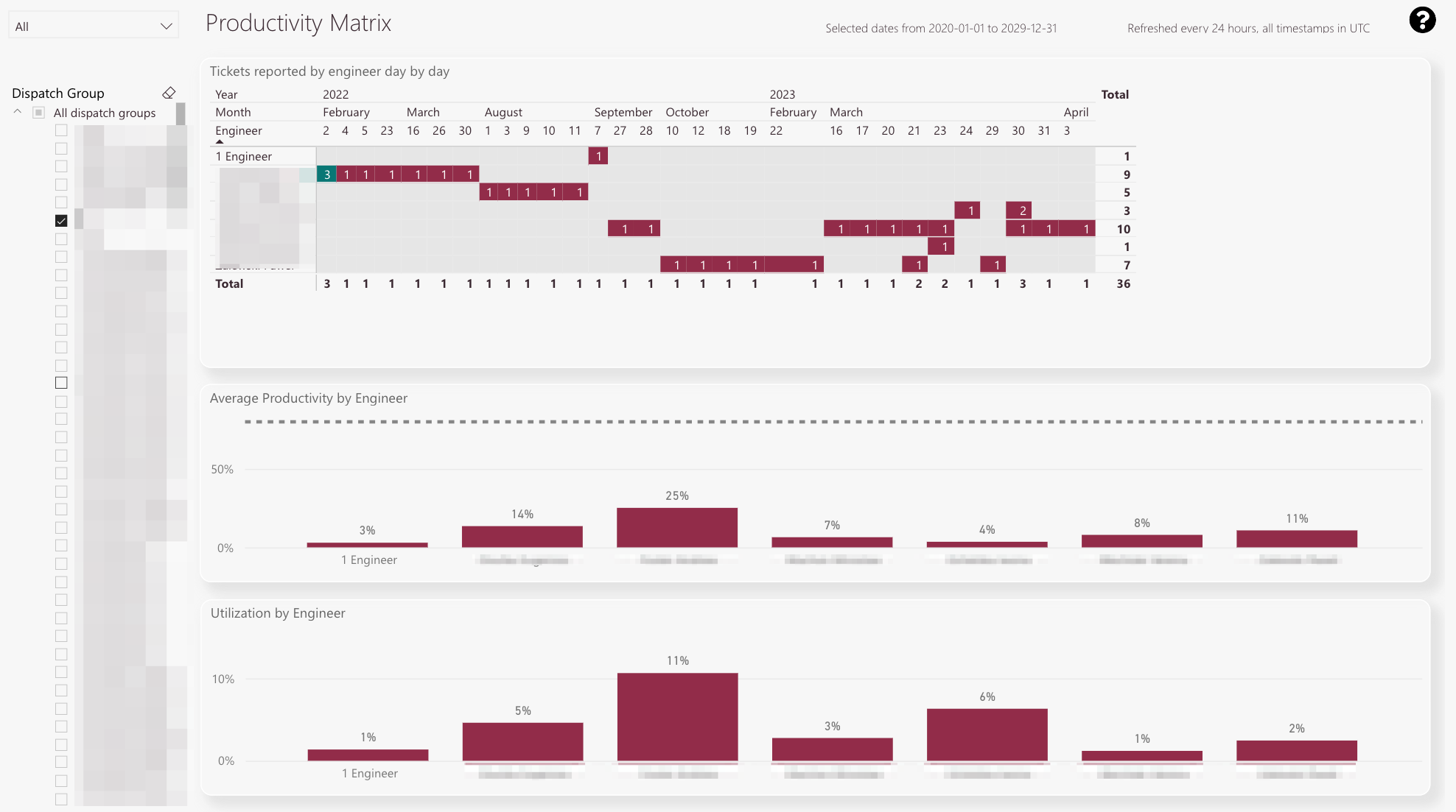
The productivity matrix tab displays a practical daily view of processed tickets by engineers and gives you the productivity for single technicians in percent.
-
The matrix displays how many tickets a particular engineer reported in a practical matrix view.
The default goal is set to three tickets. -
Green means the engineer fulfilled the ticket goal
-
Red means the engineer did not fulfill the ticket goal
-
Productivity for individual engineers in selected dispatch group and for selected time period
-
Utilization for individual engineers in selected dispatch group and for selected time period
-
Dispatch group filter
-
Year/Month filter
What is the particular purpose of this report?
To gain an overview of daily processed tickets by particular engineers and to gain an overview of the productivity and utilization of particular engineers regarding processed tickets.
What information can you get out of this particular report?
In the top view, you see how many tickets a particular engineer resolved (Matrix view).
The matrix displays if a particular engineer fulfilled the goal (green) or missed it (red).
In the middle view, you see the productivity of individual engineers in the selected dispatch group and selected time period.
In the bottom view, you see the utilization for individual engineers in the selected dispatch group and selected time period.
What does all the information stand for and how to read it?
Numbers are used as units. The number indicates the ticket amount.
Productivity: Amount of points collected by engineer compared with productivity goal.
Utilization: Time spent on working (drive time + work time) compared to all available time in standard 8h working time.
Which related reports might be considered to get a clearer/more detailed picture of the information?
All other reports which are inside the Workforce Insights tab.
How can the report be customized using filters?
You can filter by months and years.
You can filter by a dispatch group or more dispatch groups.
You can combine the months/years filter with the dispatch groups filter.
Engineer Productivity tab
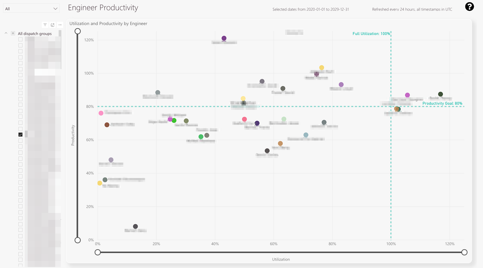
The engineer productivity tab displays individual engineers’ and engineers’ productivity and utilization.
-
The plot displays individual engineers and their individual performance in productivity and utilization
-
If the engineer crosses this border he is more than fully utilized
-
If the engineer crosses this border he surpassed the productivity goal
-
With the top and bottom knobs you can configure the displayed percentage span.
-
With the left and right knobs you can configure the displayed percentage span
-
Year/Month filter
-
Dispatch group filter
What is the particular purpose of this report?
To gain a graphical overview (in a plot) of individual engineers’ performance and utilization in order to compare individual engineers inside a dispatch group.
What information can you get out of this particular report?
In the plot, you can see selected engineers as dots.
The dot is placed on a utilization point (x) and on a productivity point (y).
You can use the slider to scale the x-axis and y-axis.
The set productivity goal is displayed as a horizontal green line.
The full utilization is displayed as a vertical green line.
What does all the information stand for and how to read it?
Engineers are displayed as colored points.
Which related reports might be taken into consideration to get a more clear/more detailed picture of the information?All other reports which are inside the Workforce Insights tab.
How can the report be customized using filters?
You can filter by months and years.
You can filter by a dispatch group or more dispatch groups.
You can combine the months/years filter with the dispatch groups filter.
Dispatch Groups Productivity tab
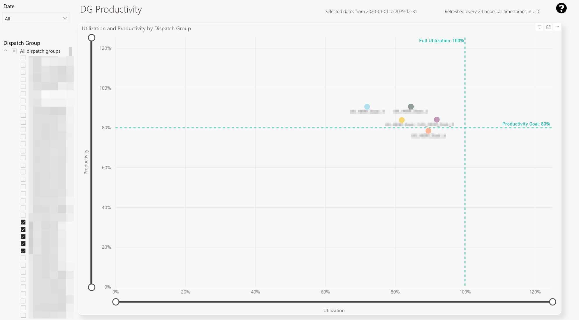
The dispatch groups productivity tab displays individual dispatch groups and the individual dispatch group productivity and utilization.
-
The plot displays individual dispatch groups and their individual performance in productivity and utilization
-
With the top and bottom knobs you can configure the displayed productivity percentage span
-
With the left and right knobs you can configure the displayed utilization percentage span
-
Year/Month filter
-
Dispatch Group filter
What is the particular purpose of this report?
To gain a graphical overview (in a plot) of dispatch group performance and dispatch group utilization in order to compare different dispatch groups.
What information can you get out of this particular report?
In the plot, you can see selected dispatch groups as dots.
The dot is placed on a utilization point (x) and on a productivity point (y).
You can use the slider to scale the x-axis and y-axis.
The set productivity goal is displayed as a horizontal green line.
The full utilization line is displayed as a vertical green line.
What does all the information stand for and how to read it?
Dispatch groups are displayed as colored points.
Which related reports might be taken into consideration to get a more clear/more detailed picture of the information?
All other reports which are inside the Workforce Insights tab.
How can the report be customized using filters?
You can filter by months and years.
You can filter by a dispatch group or more dispatch groups.
You can combine the months/years filter with the dispatch groups filter.
Engineer efficiency tab
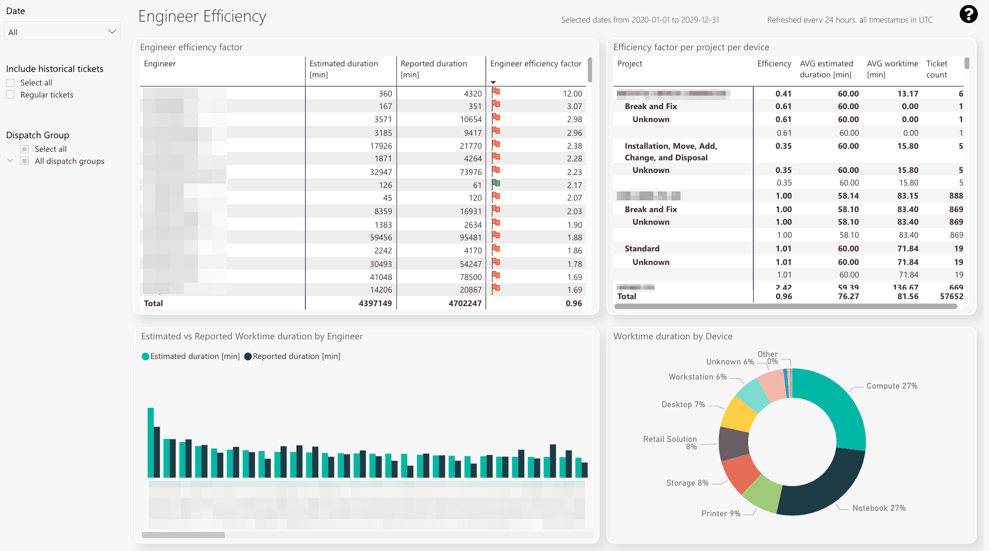
The engineer efficiency tab gives you an idea of how fast engineers are doing the actual ticket work.
-
The engineer efficiency table displays the estimated duration compared to the actual work time duration in minutes.
The calculated efficiency factor for the selected dispatch group and the engineer factor for the corresponding technician is also displayed in this table. -
The efficiency factor per project with average estimated durations and average work times in minutes
-
Estimated duration compared to work time duration by engineer
-
Work time duration by device.
The data assists you to better understand which devices take up most of the engineer’s work time. -
Date filter
-
Include historical tickets filter
-
Dispatch group filter
What is the particular purpose of this report?
This particular report can give you an overview of how fast engineers are doing the actual ticket work in the service field.
If the engineer’s efficiency is 1.00, it means the engineer’s calculated work time and the engineer’s actual work time are the same -> balanced
If the engineer’s efficiency is <1.00, it means the engineer’s calculated work time is higher and the engineer’s actual work time is lower -> efficient
If the engineer’s efficiency is >1.00, it means the engineer calculated work time is lower and the engineer’s actual work time is higher -> inefficient
What information can you get out of this particular report?
In the top-left, you can evaluate the engineer efficiency of particular engineers either for the dispatch group or general.
In the top-right, you can evaluate the overall engineer efficiency per project. You can also see average estimates and work times and also the ticket count per project.
In the bottom-left, you can evaluate the estimated duration by the engineer compared to the work time duration by an engineer in a graphical processed way.
In the bottom right, you can evaluate the required work time duration per device (in percent).
What does all the information stand for and how to read it?
The energy efficiency is calculated based on the relation between the estimated duration and work time duration.
Which related reports might be considered to get a more precise/more detailed picture of the information?
The driving efficiency tab lets you compare if the driving efficiency corresponds to the engineer efficiency and makes sense.
How can the report be customized using filters?
You can filter by dispatch group or dispatch groups.
You can filter by particular year(s)/month(s).
You can filter by historical tickets.
You can combine the three filters.
Driving efficiency tab
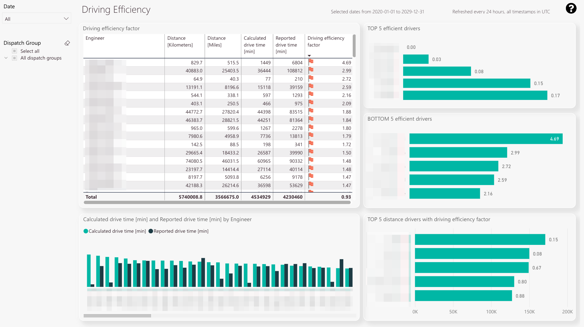
The driving efficiency tab gives you an idea of how efficient technicians shape their scheduled drive times.
-
The driving efficiency table displays the calculated drive time compared to the reported drive for selected parameters in minutes.
The resulting driving efficiency factor is also displayed. -
You can check the top 5 of the most efficient drivers for selected parameters.
-
You can check the least 5 efficient drivers for selected parameters.
-
The calculated drive time compared to the reported drive time in a graphical processed view.
-
You can check the top 5 distance drives for selected parameters with the efficiency factor compared between engineers.
-
Year/Month filter
-
Dispatch group filter
What is the particular purpose of this report?
This particular report can give you an overview of how fast engineers are doing the actual ticket work in the service field.
If the driving efficiency is 1.00, it means the engineer’s calculated drive time and the engineer’s reported drive time are the same -> balanced
If the driving efficiency is <1.00, it means the engineer’s calculated drive time is higher and the engineer’s reported drive time is lower -> efficient
If the driving efficiency is >1.00, it means the engineer calculated drive time is lower and the engineer’s reported drive time is higher -> inefficient
What information can you get out of this particular report?
In the top-left, you can see the full driving efficiency table which compares the calculated drive time versus the reported drive time for selected options.
On the right, you can check your top five efficient drivers/bottom five efficient drivers and their corresponding driving efficiency factor.
In the bottom-left, you get a graphical overview of the calculated drive time versus the reported drive time by an engineer.
In the bottom-right, you can check the top five distance drivers for selected parameters with the efficiency factor compared between them.
What does all the information stand for and how to read it?
The energy efficiency is calculated based on the relation between the reported drive time and the calculated drive time.
Which related reports might be considered to get a more precise/more detailed picture of the information?
The engineer efficiency tab lets you compare if the engineer efficiency corresponds to the driver efficiency and makes sense.
How can the report be customized using filters?
You can filter by dispatch group or dispatch groups.
You can filter by particular year(s)/month(s).
You can combine the two filters.
Workforce planning tab
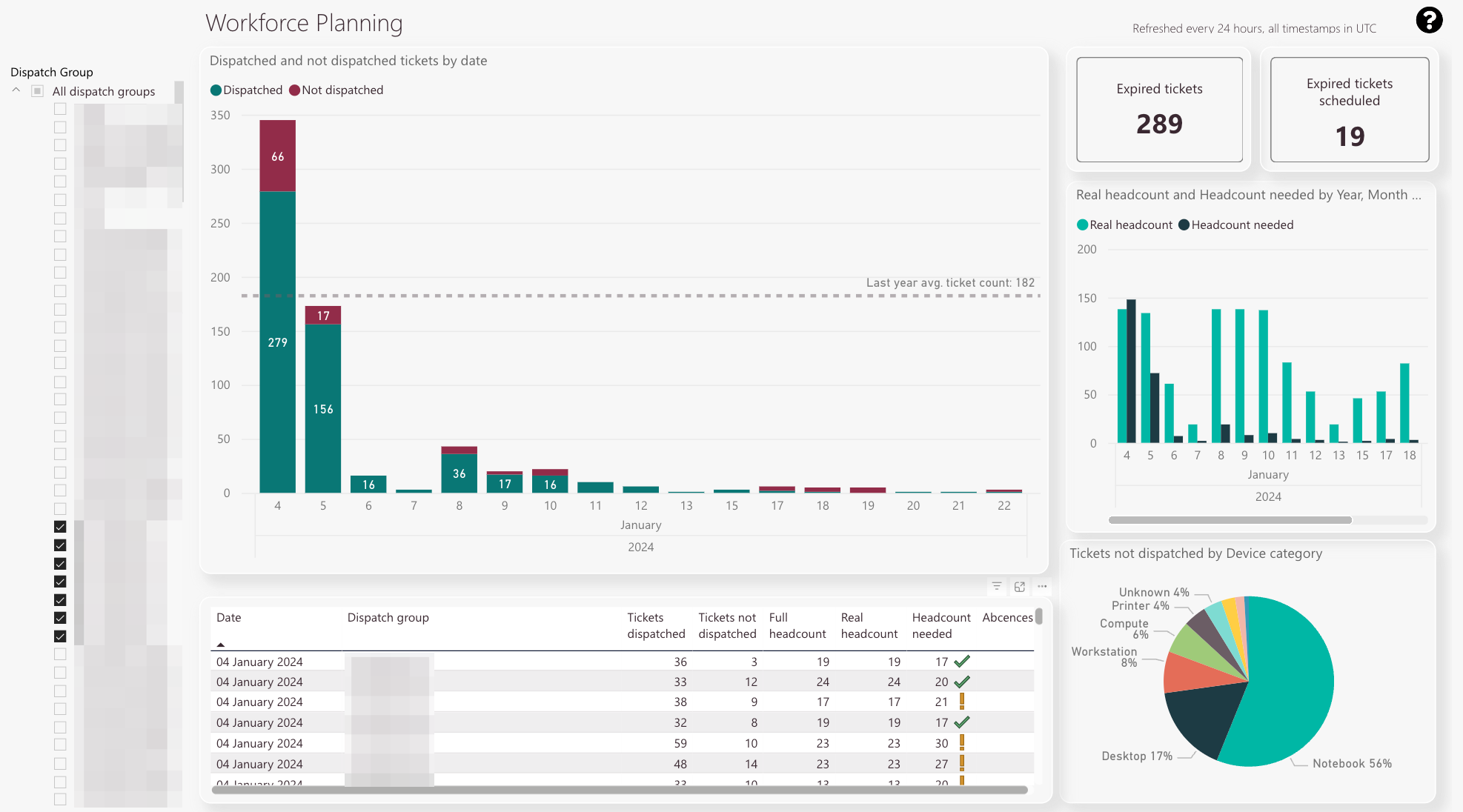
The workforce planning tab gives you an estimate of the needed workforce by the parameters: Tickets dispatched and tickets not dispatched.
-
The workforce forecast table displays dispatched tickets compared to not dispatched tickets by date.
The last’s year average ticket count is displayed with a line. -
Expired tickets count
-
Expired tickets scheduled count
-
Real headcount compared to required headcount
-
Tickets that were not dispatched separated by device category.
This pie diagram assists you in finding out which categories need attention in particular. -
The detail view gives you even more valuable insights with summarizing everything mentioned above in a table
-
Dispatch group filter
What is the particular purpose of this report?
This particular report can assist you in the process of day-to-day headcount planning.
What information can you get out of this particular report?
In the top-left view, you can see the tickets dispatched versus the tickets not dispatched for a group or groups. The last year’s average ticket count is also displayed.
In the top-right view, you can see the real headcount compared to the needed headcount. Your goal should be to always fulfill the needed headcount.
In the bottom-left view, you can see details for a particular dispatch group summarizing everything displayed in the graphs above.
In the bottom-right view, you can see tickets that have not been dispatched categorized by device category.
What does all the information stand for and how to read it?
Ticket count: Number of tickets.
Device percentage: Not dispatched tickets split by device category.
Headcount: Amount of engineers required to successfully solve the current ticket count.
Which related reports might be considered to get a clearer/more detailed picture of the information?
All other reports which are inside the Workforce Insights tab.
How can the report be customized using filters?
You can filter by dispatch group or dispatch groups.
Roles tab
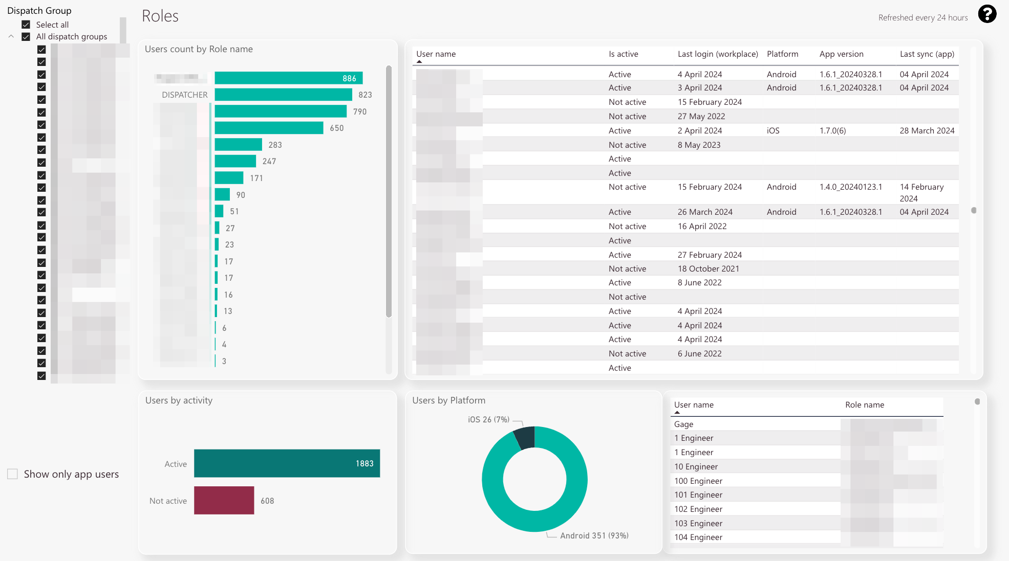
The roles tab gives you an idea of about the distribution of roles within your dispatch groups.
It also gives you an idea of the FMA app distribution and FMA app usage within your user base.
Having insights into those statistics can lead to strategic measures, eg. telling your users that they need to update their apps, etc.
-
You can check the user count for each created role
-
You can check which users are active in the system and when they last logged into the different Fieldcode applications. Additionally, you can check the app versions your users currently utilize. Having insights into those statistics can lead to strategic measures, eg. telling your users that they need to update their apps, etc.
-
Toggling this button allows you to show only the app users in the list view
-
You can check the active and inactive user count
-
A graphical comparison between iOS and Android usage for your selected dispatch group or dispatch groups
-
You can check which particular user has which particular role in the system in this chart
-
Dispatch group filter
What is the particular purpose of this report?
Checking the distribution of roles inside a dispatch groups or dispatch groups of your company.
Checking the distribution and usage of the Fieldcode FMA app within your company.
What information can you get out of this particular report?
In the top-left, you can check the user count for each existing role for the dispatch group or dispatch groups.
In the top-right, you can check your active users.
In the bottom-left, you can check the active and inactive user count.
In the bottom-middle, you can compare the platform usage.
In the bottom-right, you can filter by different user roles to check which user has what role.
What does all the information stand for and how to read it?
The user count is displayed in total numbers.
How can the report be customized using filters?
You can filter by dispatch group or dispatch groups.
Drill-through functionality
You can drill through your different user base by clicking inside the “Users by Platform” chart. This allows you to specifically show either FMA app Android or iOS users.
Skills tab
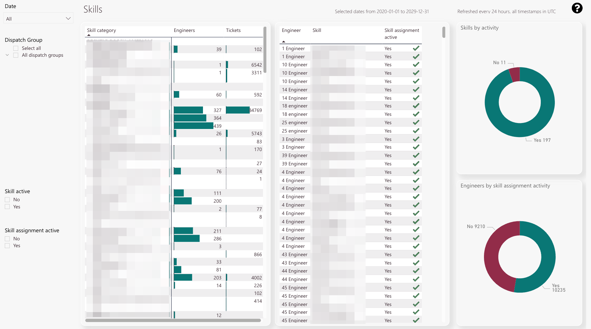
The skills tab gives you an idea of about the distribution of skills within your dispatch groups.
-
You can check skill categories, how many engineers have assigned the skill category, and how many tickets are opened with the particular skill category
-
You can check particular engineers and their skills and check if skill assignment is activated or inactivated for particular engineers.
Active engineers are indicated with a green checkmark.
Inactive engineers are indicated with a red x. -
Skills by activity pie chart
-
Engineer by skill assignment activity pie chart
-
Date filter
-
Dispatch Group filter
-
Skill active filter
-
Skill assignment active filter
What is the particular purpose of this report?
Checking the distribution of skills inside a dispatch group or dispatch groups.
What information can you get out of this particular report?
Checking actual skill requirements and how many tickets utilize a particular skill.
Checking which particular engineer has what particular skill.
With the Skills by Activity pie chart, you can check the ratio between active and inactive skills.
This describes if a particular engineer has a skill activated in the Admin panel at all or not.
With the engineers by skill assignment activity, you can check the ratio between skill assignment active and skill assignment inactive.
This describes if a skill is assigned to an engineer at all or not.
What does all the information stand for and how to read it?
The ticket count and engineer count are displayed in total numbers.
How can the report be customized using filters?
You can filter by dispatch group or dispatch groups.
You can filter by active or inactive skills.
You can filter by skill assignment active or skill assignment inactive.
You can combine all three filters.
Drill-through functionality inside the Workforce insights
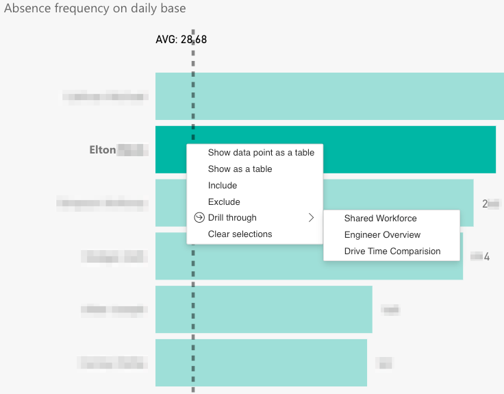
You can drill-through individual engineers inside the Absences tab, Call duties tab, Productivity matrix tab, and Productivity plot tab.
The drill-through functionality allows you to gain insights regarding individual engineers. There are currently three different drill-through dashboards available:
- Shared workforce
- Engineer overview
- Drive time comparison.
Here’s how to drill through to a certain engineer from the above-mentioned dashboards:
- Right-click on an engineer.
- Click on Drill through.
- Select the dashboard that you want to analyze.
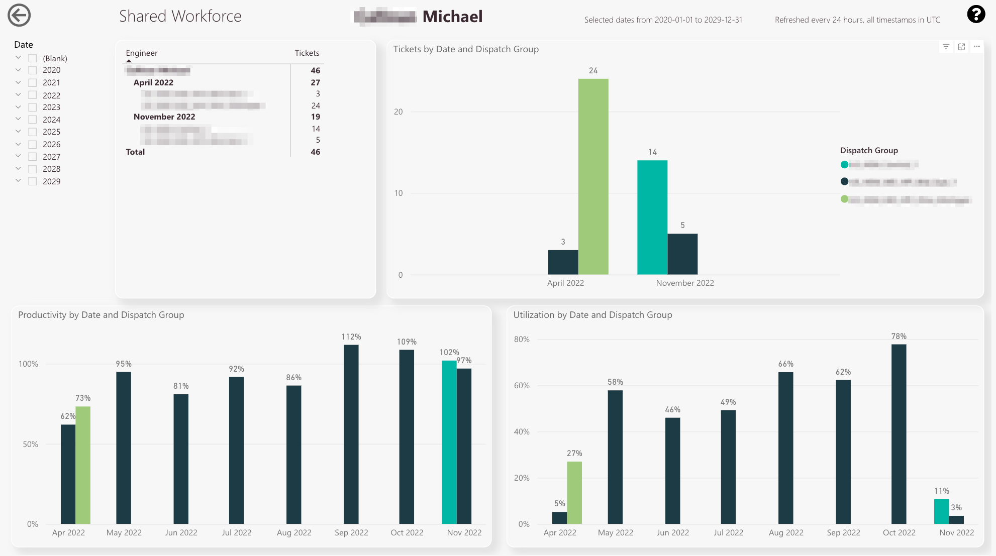
What is the Shared Workforce Dashboard?
The shared workforce dashboard gives you information on how an engineer compares between different dispatch groups in the factor tickets, productivity, and utilization. This could help you to find out how active/productive/utilized a particular engineer is compared to other dispatch groups, to where the engineer is assigned.
-
You can check the ticket count for the selected engineer
-
You can compare ticket counts separated by dispatch groups
-
Legend of dispatch groups
-
You can compare productivity percentages by different dispatch groups
-
You can compare the utilization percentages by different dispatch groups
-
Year/Month filter
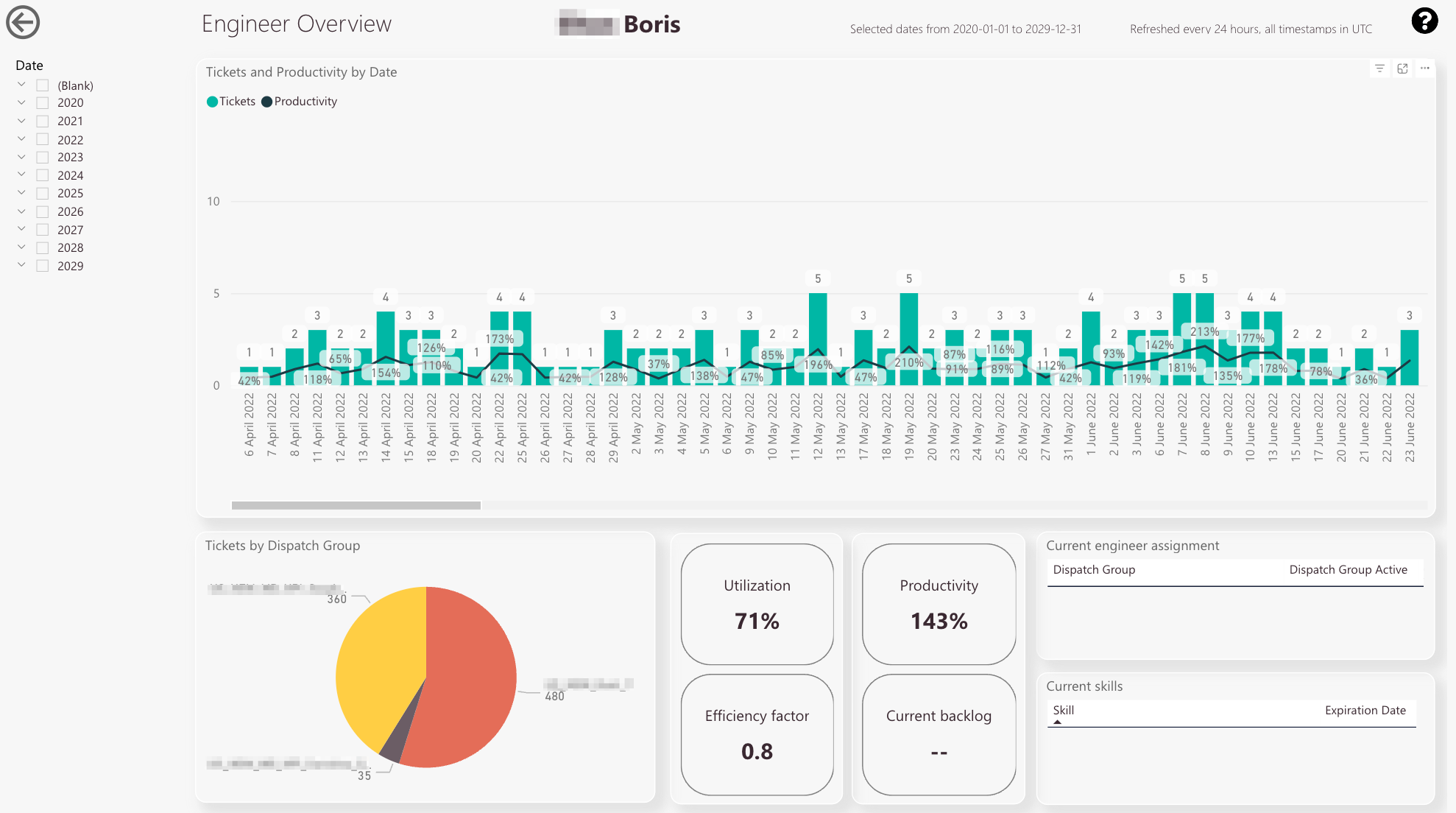
What is the Engineer Overview Dashboard?
The engineer overview dashboard helps you to see the individual performance of a selected engineer.
For example you have the possibility to compare how many tickets a engineer has done for a particular group compared to another group.
-
You can check the tickets done by an engineer on a per-day base, including the exact productivity percentage for the date
-
You can check how many tickets the selected engineer has done for particular groups. This is useful if the engineer is for example assigned to multiple groups
-
You can check the utilization, productivity, efficiency factor and the current backlog for the selected engineer
-
You can check to which dispatch groups the selected engineer is currently assigned
-
You can check which skills are currently assigned to the selected engineer
-
Date filter
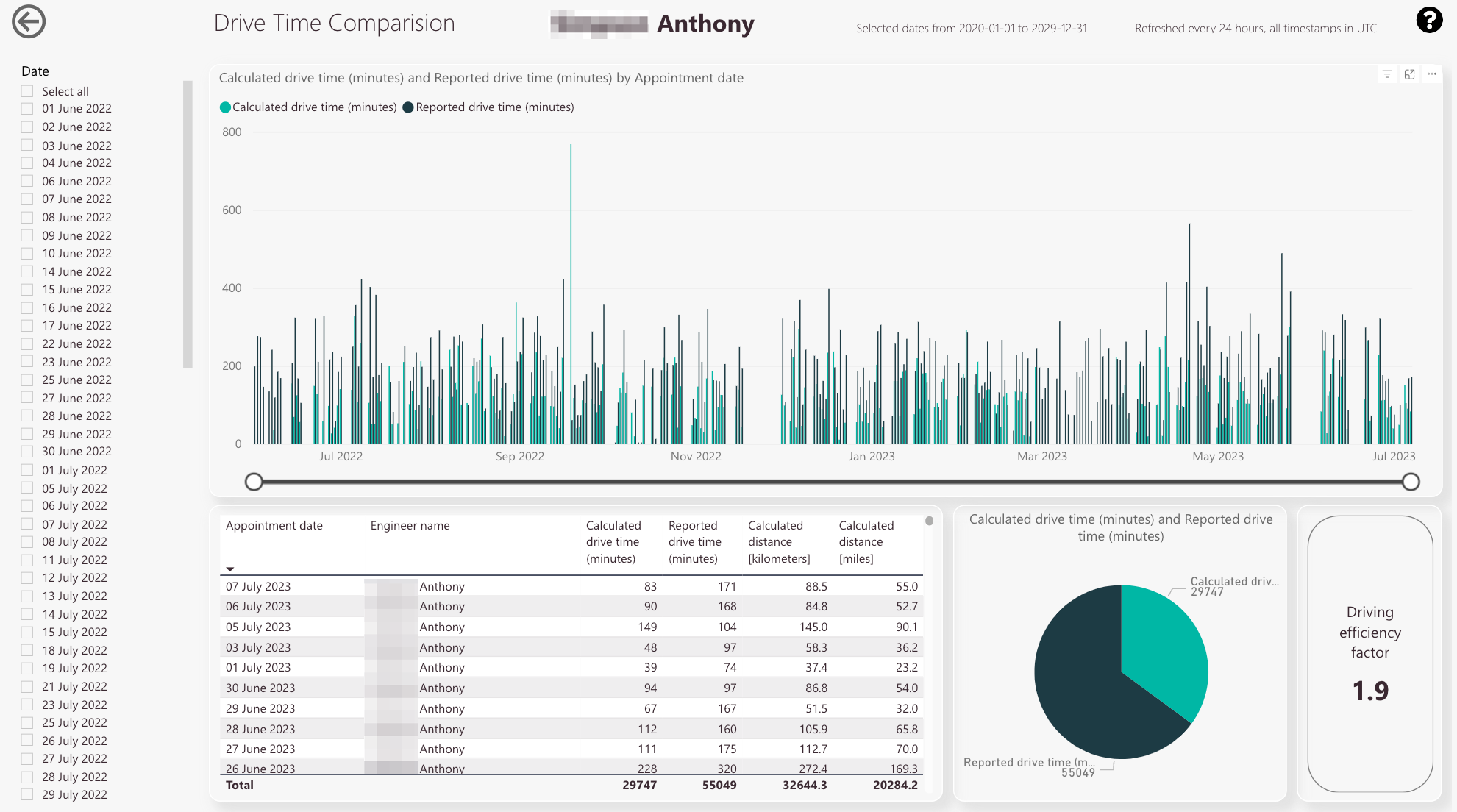
What is the Drive Time Comparison Dashboard?
The drive time comparison dashboard gives you information how an selected engineer performed with the calculated versus the reported driving times.
The calculated driving times are calculated by the system, while the reported drive time is the time that the engineer entered into the system manually.
-
You can compare the calculated drive time with the reported drive time for the selected engineer
-
The two knows allow you to drill down from macro view to micro view and vice versa
-
You can check the appointment dates and the matching calculated drive time/reported drive time/calculated distance in kilometers
-
You can compare the total calculated drive time to the total reported drive time
-
You can check the driving efficiency factor to the selected engineer
-
Year/Month filter
5 out of 5 stars
1 rating
| 5 Stars | 100% | |
| 4 Stars | 0% | |
| 3 Stars | 0% | |
| 2 Stars | 0% | |
| 1 Stars | 0% |
